Responsive web design ensures a site renders well on different devices and screens. Use responsive design tools to make sure your users have an optimal viewing experience.
Here is a list of responsive design tools. There are tools to build responsive web page elements, and tools to test your design on a wide variety of actual devices and screen sizes. There are premium and free tools.
Tools for Responsive Design
Responsive Design, Responsively Illustrated. Created by James Mellers of Adobe, this simple tool allows users to play with an illustrative example of responsive design. Resize your browser window to see the types of size constraints you’ll be utilizing. Price: Free.
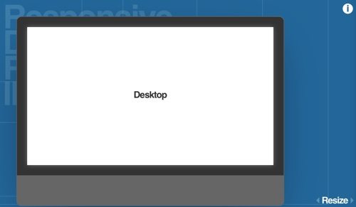
Responsive Design, Responsively Illustrated
Bootstrap. Build responsive, mobile-first projects on the web with one of the most popular front-end component libraries. Bootstrap is an open source framework for developing with HTML, CSS, and JS. Quickly prototype your ideas or build your entire app with Bootstrap’s responsive grid system, prebuilt components, and plugins built on jQuery. Price: Free.
Google Mobile-Friendly Test. Test how easily a visitor can use your page on a mobile device by using Google’s free Mobile-Friendly Test. Designing your websites to be mobile friendly ensures that your pages perform well on all devices. Price: Free.
Justinmind. Justinmind is an all-in-one prototyping tool for web and mobile apps. Define websites and apps for web, iOS, and Android with a drag-and-drop interface — no coding involved. Customize and adjust your wireframe with a dynamic layout to fit all screen sizes across all devices with Justinmind’s flexible events and actions. Justinmind will let you view and test your web and mobile app prototypes instantly from any browser, with native web display and different device skins. Price: Plans start at $19 per month.
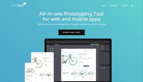
Justinmind
Gridset. Gridset enables designers to set up creative layout grids for the web without having to worry about the calculations. Gridset lets you tailor specific grids across breakpoints you define for effective responsive design, ensuring your content looks good on any screen. Price: Plans start at $9 per month.
Adaptive Images. Adaptive Images detects your visitor’s screen size and automatically creates, caches, and delivers device appropriate re-scaled versions of your web page’s embedded HTML images. It is intended for use with responsive designs, to be combined with fluid image techniques. No markup changes needed. Price: Free.
FitText. A jQuery plugin for inflating web type, FitText makes font-sizes flexible. Use this plugin on your fluid or responsive layout to achieve scalable headlines that fill the width of a parent element. FitText is for huge display text only. Price: Free.
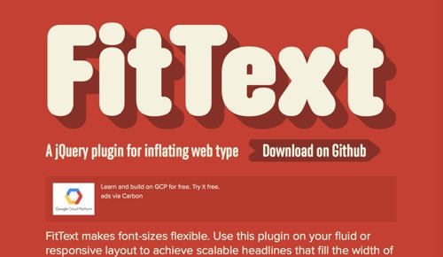
FitText
Ghostlab. With Ghostlab, you can test any website on various browsers and mobile devices simultaneously. Just drag the URL into Ghostlab and click the “Play” button. Start testing in one of the connected browsers or devices. All other browsers and devices will mirror your actions — clicking buttons, following links, scrolling the page, filling out forms, and hovering your mouse over special elements. Take a screenshot directly from within Ghostlab, annotate it in the integrated image editor, and drag it to whatever bug tracker you use. Price: $49.
Am I Responsive? Am I Responsive is a tool for quick screenshots on responsive design breakpoints. Simply enter your URL. Rearrange and reorder the devices by clicking and dragging on the device. Use the Am I RWD bookmarklet to check the responsiveness on any site with a single click from your very own browser. Price: Free.
Responsinator. Responsinator helps website makers quickly get an indication of how their responsive site will look on the most popular devices. However, it does not precisely replicate how it will look. For accurate testing always test on the real devices. Price: Free.
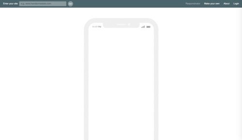
Responsinator
Google Chrome DevTools Device Mode. Google Chrome DevTools is a set of authoring, debugging, and profiling tools built into Google Chrome. Use the Responsive Mode during active development of your site and app and resize the viewport often to create a freely responsive design that adapts to even unknown and future device types. Test your site’s responsiveness using Device Mode’s screen emulator. Viewport controls allow you to test your site against a variety of devices, as well responsively. Price: Free.
Browser Stack. Browser Stack is a platform for live, web-based browser testing. Test on a range of physical Android and iOS mobile devices and tablets for the most accurate results. Test with 1,100 desktop browsers on real machines, with media streaming, developer tools, keyboard shortcuts, and more. Generate screenshots at actual device sizes on iOS, Android, OS X, and Windows. Price: $29 per month.
CrossBrowserTesting. CrossBrowserTesting gives you access to the browsers and devices your visitors are using. Perform interactive manual and exploratory testing on 1,500 desktop and mobile browsers. Take screenshots automatically across multiple browsers at once, comparing full-page responsive layouts. Take visual tests with every new change, and compare them to historical versions for easier regression testing. Price: $29 per month.
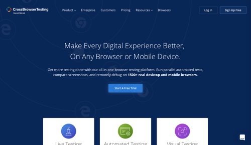
CrossBrowserTesting


 ChatGPT vs. Gemini for SEO Tasks
 SEO Takeaways from SGE's Partial Rollout
 5 Content Marketing Ideas for May 2024
 BNPL Competition Drives Wins for Merchants
 Google Ad Updates Reflect New SERPs
 New Ecommerce Tools: April 2, 2024
 The Profitable Seller: Mastering Amazon FBA