Email subscription forms should be simple and direct, encouraging site visitors to become opt-in participants in email marketing campaigns.
Email marketing is one of the best ways that ecommerce businesses have to engage shoppers, introduce new products, and make more sales. But these powerful campaigns demand a steady flow of new subscriptions to fuel success.
What follows are three tips for creating better email subscription forms. These suggestions are very tactical, and work best when they are combined with good site design, quality products, and newsletters that deliver what they promise.
1. Describe the Prize
Too many ecommerce sites include an email newsletter form as an afterthought, placing it at the bottom of the page and, effectively, doing nothing to promote it. If the only explanation offered for the form is “Get Our Newsletter,” why would anyone bother?
A blasé email subscription form is not going to excite visitors to opt in.
Instead, describe as succinctly as possible what the site visitor gets for signing up. Will there be a discount? Invaluable information? Let them know.
Jenier World of Teas offers a 10 percent discount and describes what users get.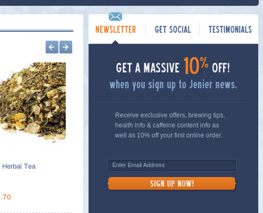
This description of the prize, if you will, does not need to be long, but it should be present.
Roxy gets the message across in just a few words.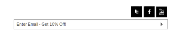
2. Get More Information Later
Email list segmentation is an important part of email marketing. Basically, the more a marketer knows about the customer, a better job that marketer can do of making relevant, high-converting offers that the customer likes. But avoid the temptation to ask a whole bunch of information up front.
Long email subscription forms kill conversion.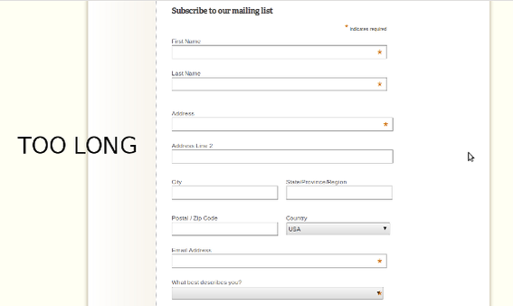
Instead, ask for just an email address up front, then on the email confirmation page, ask for additional information, like name or birthday.
Roxy gets additional subscriber information on the email subscription confirmation page.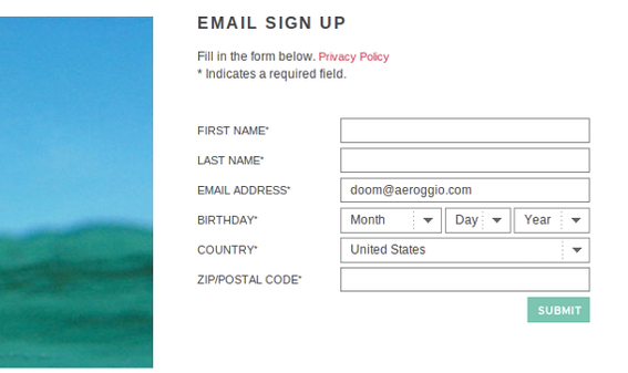
This technique makes the form easy to fill out, but still collects the information that marketers want and need.
Free People collects good customer data after the registration.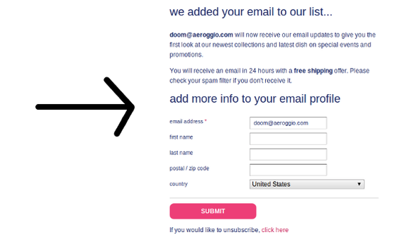
3. Make Sure the Form Gets Seen
Email subscription forms deserve top billing. Don’t place just place these important data collectors at the bottom of the page. Instead place it in a spot on the page that site visitors are sure to see.
WPMU.org places its email subscription form near the top of the home page.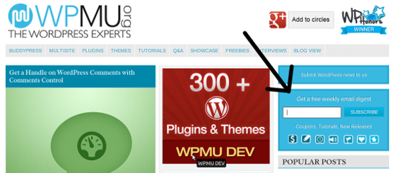
It can even be a good idea to place the email subscription form in a few different places on the page — for example, on the home page, in every page’s footer, and as an opt-in at checkout.
Summing Up
There is more to an email subscription form than just a text input and a submit button. To get more conversions (1) tell shoppers what they will get for join, (2) ask for just an email at sign up, but follow up with an information request on the confirmation page, and (3) and be sure to position the email subscription form so that it gets seen.
The opportunity to market to a shopper over time — repeatedly selling items — is huge.