Apple’s August 2015 website redesign emphasizes visual communication and advances several site design trends. Large photographs, meaningful graphics, and useful video abound.
When Apple.com relaunched on August 6, 2015, many reports noted the missing “shop” link. The site’s corporate and ecommerce sections had merged. While this was noteworthy, it is not too different from many other online stores.
Rather, how the site employs several current design trends may be more interesting or more impactful. Online retailers, marketers, and designers can use similar techniques on their own sites.
Massive Photographs and Graphics
Relative to screen size, the new Apple.com uses massive photographs and graphics. On many pages, a single image dominates the screen.
Like many sites, Apple.com features large, screen edge to screen edge images.
Apple even seems to favor these graphics over text.
For example, in the Apple Watch section, one of the images makes the overlaid text unreadable. The picture shows a couple embracing, kissing. Two bright light sources in the photograph wash out the word “Notifications” and a guided tour link.

Bright lights in the photograph wash out the text, making it hard to read. This may have been a design choice.
It is unlikely that this was a mistake. Legions of Apple personnel from myriad departments would have reviewed each page on the new site. Rather, there was a conscious decision to give the image priority.
Perhaps, there is even a subtle message in that choice. The female model wears an Apple Watch. Its notifications feature is for her benefit, and at the moment captured in the image, it is less important.
Large — communicative — images have been a design trend in 2014 and 2015, and Apple is not new to the movement. The company has always emphasized the visual, albeit in a clean, sleek way. The resigned site could further fuel the trend, encouraging Apple adherents and big-picture site designers (pun intended).
Apple also does a good job delivering these screen-filling pictures. For example, the site’s music hero image weighed in at a reasonable 195 kb. It took an average of 239 milliseconds to load over a consumer broadband connection.
Thoughtful Mobile Optimization
Mobile devices far outnumber desktop and laptop computers. In the United States, Internet users are just as likely to visit a site from an iPhone as a desktop. Mobile optimization is not a competitive advantage; rather, mobile-first design is the standard.
Yet, even in this mobile-centric environment, Apple.com stands out.
A good example comes from the site’s iPad landing page. If you scroll down a bit, you’ll find a couple of promotional sections like iPad for education or iPad for business.
Viewed on a laptop or desktop computer, these sections feature a large image with overlaid copy.

Built to be responsive, Apple.com shows some titles and copy on top of images on large screens and below images on small screens.
On a mobile device, the copy moves down off of the picture. The image is still large in the context. The copy is unchanged, but now more readable on a mobile device.
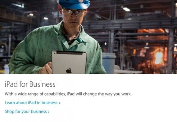
Although the content, including the picture, is small, the positioning is changed to work better on a small screen.
Purposeful Parallax Scrolling
Parallax scrolling can add depth to an otherwise flat, two-dimensional scene. The technique moves foreground content, like pictures or text, faster than background content.
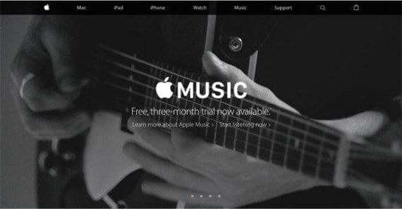
Some site designers believe parallax scrolling creates a more immersive user experience. Too often, however, its application is superfluous. One can even find what might be an unnecessary use of parallax scrolling on the Apple.com Music landing page. But elsewhere, Apple uses parallax scrolling with purpose.
The iMac with Retina 5K display landing page features another immense image. The picture fills your screen.
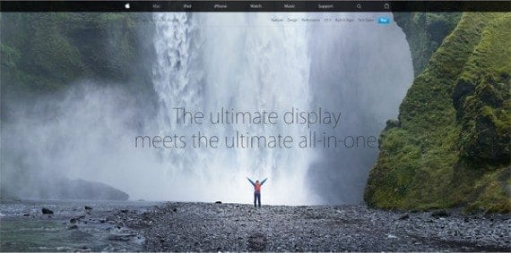
The landing page for the iMac with Retina display starts out similar to other pages on Apple.com.
As you scroll down the image shifts, and you realize that its photograph is even more expansive.

Scrolling repositions the image. You see a lot more.
As you continue to scroll, the header is static while the photograph seems to move back. It even pulls in a little from the edges of your screen. You appear to be getting farther away. The parallax scrolling, however subtle, is working.
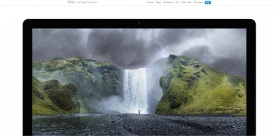
The parallax scrolling is working. The image pulls away from the edges of the screen. There is a feeling of depth.
More scrolling reveals that the image is on an all-in-one iMac. Point made.
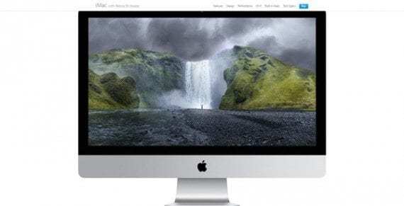
In this case, the technique helped to communicate the product’s value.
In this case, the feature — parallax scrolling — helped spotlight the product.
Useful Videos
Apple’s Macs, iPads, and iPhones are familiar products. The company’s customers know a lot about them. They know what they look like. How they work, for the most part. Even how they impact your daily routine.
The Apple Watch is a newer product. It is certainly not short of press coverage or advertising support, but it is still lesser known.
To help describe the Apple Watch, the redesigned Apple.com includes several excellent videos. These guided tour videos show shoppers how the Apple Watch works. In the end, the videos help Apple customers decide if they want to buy one.
Video content marketing is not an Apple invention. But on its new site, the company is again serving as a good example.

Apple.com uses video content to describe products to relatively unfamiliar shoppers.
Scrolling is Mandatory
The spruced up Apple.com also affirms the trend toward more scrolling.
Not so long ago, website designers crammed content above the “fold.” The idea, of course, came from newspaper publishers that put lots of content on the top of the front page to attract readers.

The Apple.com support page has navigation, one picture, and a short welcome message above the fold. You must scroll to reach the meaty content.
Site designers adopted the concept, stuffing lots of products or information at the top of a page. Site visitors could do just about anything from above the fold.
In the mobile era, the fold is more difficult to identify. What appears on the top of an iPhone’s screen is distinct from what appears on a desktop’s screen. Shoppers have to scroll if they want content, and no one seems to mind.


 SEO Takeaways from SGE's Partial Rollout
 ChatGPT vs. Gemini for SEO Tasks
 BNPL Competition Drives Wins for Merchants
 Google Ad Updates Reflect New SERPs
 New Ecommerce Tools: April 2, 2024
 5 Content Marketing Ideas for May 2024
 The Profitable Seller: Mastering Amazon FBA