When analyzing your ecommerce site, make sure that all pages can act as both a destination and a gateway to what shoppers really want. Dead ends leave shoppers wondering what to do next. Confusion turns into frustration, which prompts shoppers to head back to the search engines and shopping directories.
Here are five common dead end practices that may be costing you sales.
1. ‘Add to Cart to See Price’
Even Amazon requires a cart add to display lower prices on some products. This is typically done to get around manufacturers’ minimum advertised price requirements, but it’s frustrating for shoppers. Some online retailers practice this to keep competition from getting pricing information automatically (by scanning pages). No matter the reason — and there’s a great deal of argument between retailers and manufacturers about the practice — it all boils down to the shopper, who doesn’t want to take action on purchasing a product until he sees all the facts.
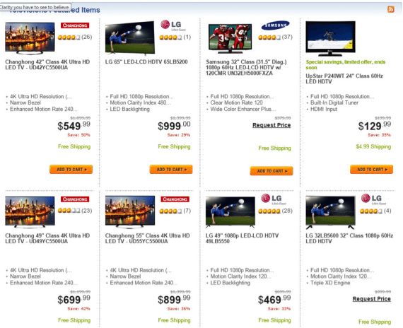
Newegg uses a “Request Price” feature, which requires the visitor to provide an email address or mobile phone number to find out the price of select items.

Most shoppers don’t want to provide information unless they are in the checkout process. They certainly don’t want to enter data just to find out how much something costs. Source: Newegg.
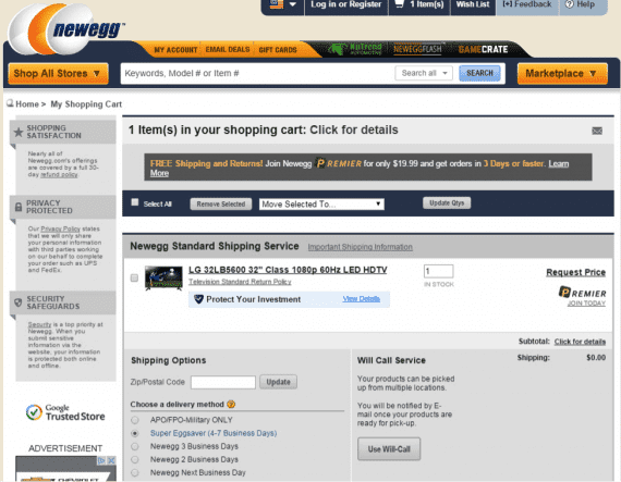
Whether the price was emailed or not, the shopper is left to check out, unsure of the price of the item. Source: Newegg.
When placed under price restrictions, use other methods to sell products at below minimum advertised prices, such as offering free shipping, instant savings, or coupon discounts. Remember that product listings in Google Shopping can include terms such as “Free shipping,” which can help direct traffic into the store.
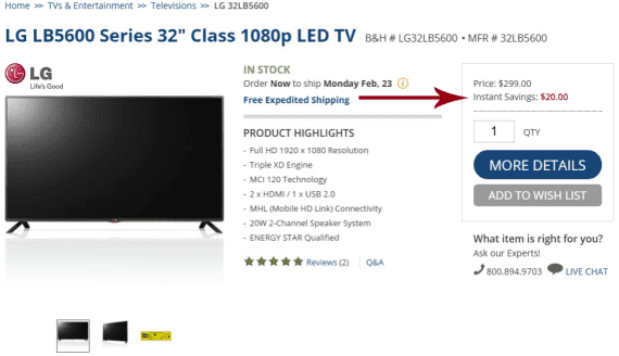
B&H displays “Instant Savings” as a way to keep the price competitive. Since the $20 savings is displayed on the page, it can feed a price of $279 to Google Shopping and other engines. (Newegg’s listing was not included in Google Shopping results.)
2. Empty Search-result Pages
People make mistakes, and a well-designed online store will work around them. This can be tricky when shoppers spell product names and brand names incorrectly, but advanced search tools and services can help deduce one’s intent.
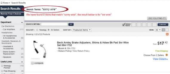
After entering the term “sonry wire” Newegg’s search system returns items for “snr wire.”
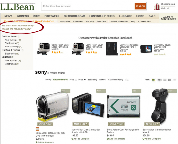
L.L. Bean makes the error less apparent, and assumes the user meant “Sony.” It’s an on-target assumption, though a shopper could have meant something else.
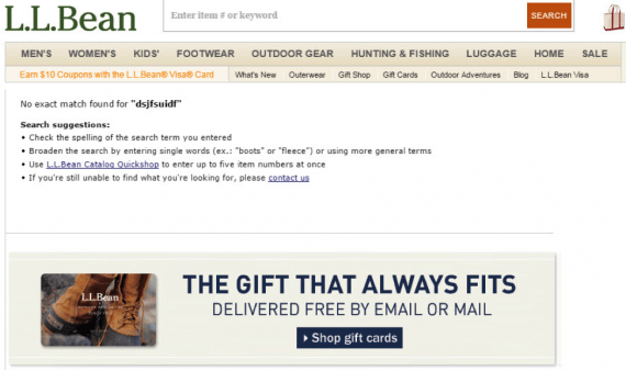
When its system can’t figure things out, L.L. Bean’s results page provides instructions. This is a good start on directing the shopper, but this section should also include links to popular products and an entry box right next to or beneath the search suggestions.
3. The Non-existent Page (the 404)
Years ago, the average 404 page shamed visitors for either incorrectly typing a URL, or clicking a bad link from another website. Then blame shifted to the site or company itself — storeowners started being accountable for all problems. It’s always best, though, to provide reasons for a 404 page, as well as provide other options.

L.L. Bean’s standard 404 page gives the impression the store is down. This can prompt visitors to quickly leave and shop elsewhere.
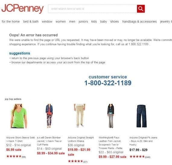
While it does list a handful of top-selling products, J. C. Penney’s error page screams for a phone call.
When writing content for the 404 error page, consider the best way to convey the message. Since visitors will commonly read just the first line or two, you don’t want to give the impression the website is actually down, but rather that a particular link is not working. Also include links to popular items or departments, and, also, include a search input field prominently.
The most common reason for a 404 return on a product page is the discontinuance of the product. Rather than display an error, consider displaying a clear message that the product is no longer available, accompanied by related items the shopper should consider.
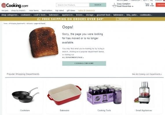
Cooking.com makes it clear that the page simply doesn’t exist, and invites shoppers to shop various departments. Another useful feature here would be a search input box (in case the shopper doesn’t look at the top of the page).
4. Categories with One or No Products
Unless they know exactly what they want, people like choices. Comparing products is just as common as comparing prices. When visiting a category, shoppers expect to see a range of items.
If you stock only one of a certain item that warrants a listing in category menus and navigation, change the link to load the product directly.
5. Contact Form with No Other Information
Contact forms are a good way to gather information into an easy-to-manage system, but some consumers would rather pick up the phone or write you a letter. Be sure to include alternative means of reaching out.
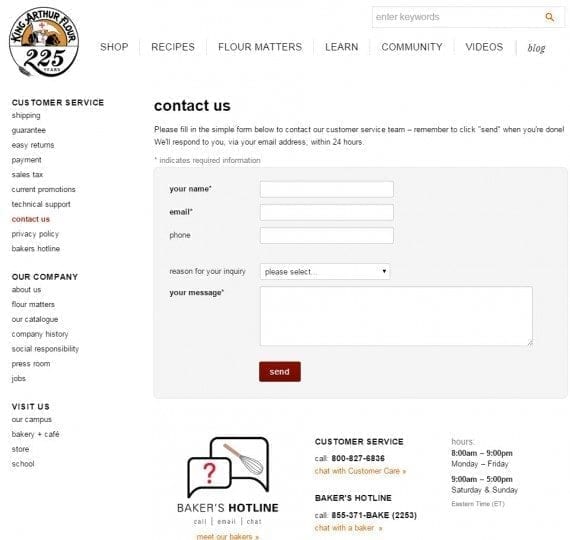
King Arthur Flour includes phone numbers and hours of operation, as well as live chat.
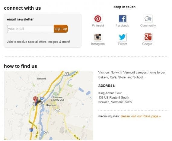
The company also provides social links and its address on its contact page.
Find your store’s dead ends. Besides analyzing the store, study customer feedback and chat transcripts to find problem areas throughout the store. That, coupled with analytics — look for high bounce rates and little time spent on the page — can help identify pages that are not good gateways to the rest of the site.
Also, be sure to place test orders and study the final invoice page to make sure it also provides key information. The receipt page should include links to order tracking, support pages, and contact information, as well as a means to re-shop the store.