
Email design has changed over the years. It has evolved from basic text, to beautiful design with great images, to hybrids that balance images and text. With the majority of shoppers previewing or reading emails on their smartphones, many ecommerce merchants wonder what the best practices in email design currently are.
In this article, I’ll review four examples — two “good” and two “bad” — of email design.
In preparing this article, I first viewed emails on my iPhone. When designing emails for smartphones, follow these key points.
- Small width. Make sure the emails are no more than 400 pixels wide.
- Minimize images. Keep images small to decrease the overall size of the email.
- Finger-based navigation. Buttons and calls-to-action should be large enough to click with your finger without hitting the wrong button. An average adult finger is 45 pixels wide; buttons should have 15 pixels of surrounding white space to prevent tap error.
- Use responsive design. Consider a responsive design, which will automatically detect the screen size the email is being displayed on and serve the appropriate version. We’ve addressed responsive design previously, at “Getting Started with Responsive Web Design.”
- Keep simple. Email itself should be simple and actionable for a smartphone.
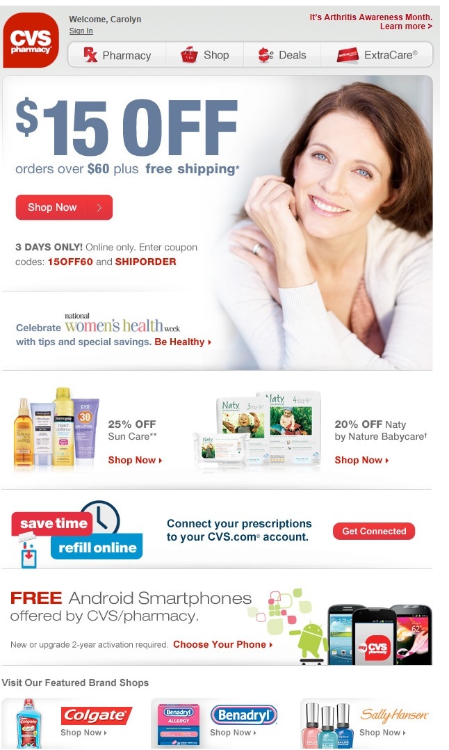
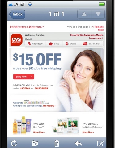
Good: CVS Pharmacy
For this email, CVS Pharmacy executes all of the key points well. Its offer is large and obvious. The “Shop Now” call-to-action is isolated in the middle of the email, making it easy to click with a finger. There’s also a menu bar at the top with additional options if you aren’t ready to shop, including a link to the pharmacy or other deals. The email loaded very quickly and was easy to read. This is an example of an effective and nice creative from CVS.
CVS email on a desktop. Enlarge This Image
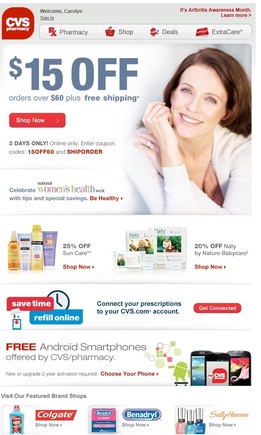
CVS email on an iPhone. Enlarge This Image
—
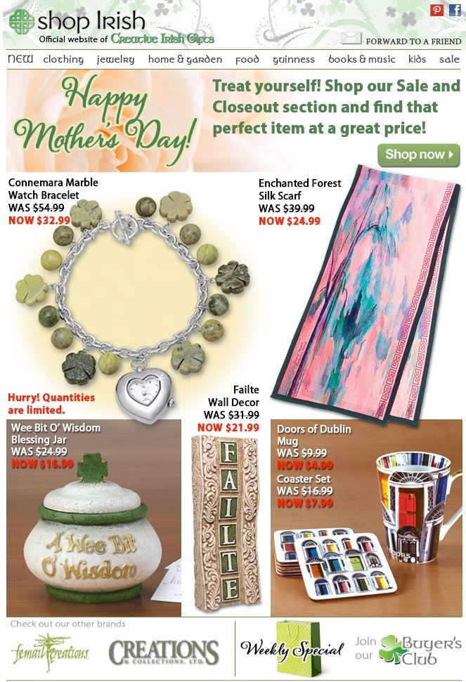
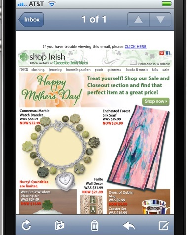
Bad: Shop Irish
When I first loaded this Shop Irish email, it took a long time — roughly 15 seconds — to completely display on my phone . This may not seem long, but consumers now expect near instant accessibility. They will not wait for emails to load if they take too long.
When the email finally did load, I noticed many things wrong, including:
- The email was busy, without a clear direction;
- The featured products featured took too much space with an awkward and confusing layout;
- The call to action — “Shop now” — is buried in the header; the email has no other obvious place to click.
Shop Irish email on a desktop. Enlarge This Image
Shop Irish email on an iPhone. Enlarge This Image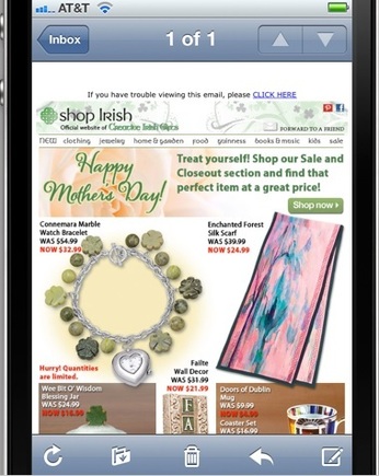
Recipients may not purchase the actual item featured in the email, especially for a site with a large and varied product selection. To be sure, an appealing product with a nice discount or offer will likely see some sales.
But shoppers tend to use email as a way to access your site, to shop for the products they are interested in, and to take advantage of a free shipping or a discount. Featuring specific products will spark interest, encouraging clicks and further shopping. So it’s important to continually test new or interesting products.
—
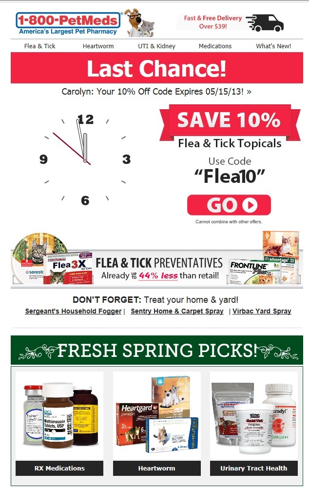
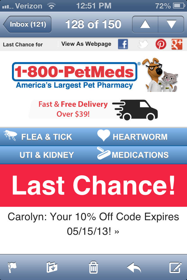
Good: 1-800-PetMeds
I picked this email from 1-800-PetMeds because of its responsive design. The email displays differently on my iPhone than on a desktop client. First, on an iPhone it shrinks to a column format with the most important elements at the top. I can continue to scroll down the email to view the rest of the information. Because of this, the images come out large and clear.
1-800-PetMeds used four links at the top for categories that are likely the most popular, such as “Flea & Tick.” Reviewing what areas your email recipients click can help decide the navigation elements to include in future emails. Pick the 3 or 4 most-clicked links and include them in every email. Omit those navigation options with fewer clicks.
1800-PetMeds email on a desktop. Enlarge This Image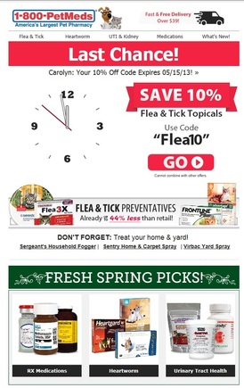
PetMeds email on an iPhone. Enlarge This Image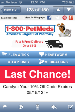
The email also uses a compelling feature of an animated clock to emphasize the offer’s expiration date. Sending last-minute or last-chance emails just before an offer expires typically generates higher conversions. Using the clock in this email was a different and interesting way to convey that message.
—
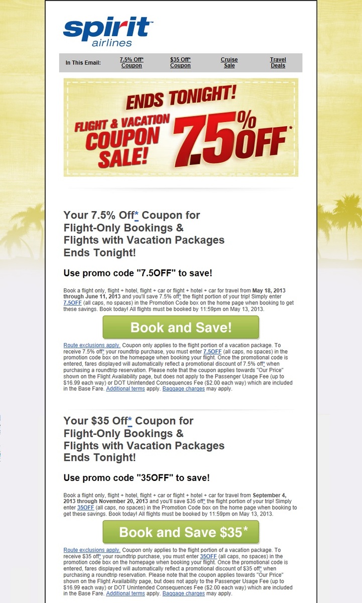
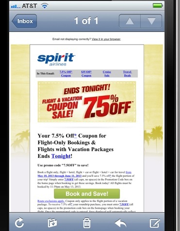
Bad: Spirit Airlines
This Spirit Airlines email was designed to be viewed on a desktop. When I viewed it on my iPhone, all elements were too small to read or take action on. Here are the areas that need improving.
- Remove empty space. There is too much white space at the top of the email, which pushes the main part down too far.
- Not smartphone friendly. The email is designed to be viewed on a large desktop screen. The background images on the sides of the email waste valuable space.
- The offer is odd. 7.5 percent off doesn’t sound exciting; it’s an odd number for consumers to understand.
- Small text. The text explaining the offer is too small to read.
Spirit Airlines email on a desktop. Enlarge This Image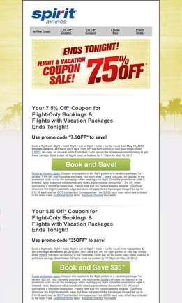
Spirit Airlines email on an iPhone. Enlarge This Image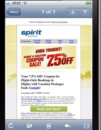
Overall, my immediate reaction to this email is simply to delete it because I can’t quickly understand the benefits. The text is too small and confusing, as is the offer.
—


 ChatGPT vs. Gemini for SEO Tasks
 5 Content Marketing Ideas for May 2024
 SEO Takeaways from SGE's Partial Rollout
 BNPL Competition Drives Wins for Merchants
 Google Ad Updates Reflect New SERPs
 New Ecommerce Tools: April 2, 2024
 The Profitable Seller: Mastering Amazon FBA