Many products sold online come in different colors, sizes, and flavors. When it comes to displaying such items to shoppers, it is important to make clear the options as well as variations in price.
There are two primary ways to display differences in price for items with configurable options. One is to display the upcharge amount — i.e., additional cost — and the other is to display the actual price for each configuration, such as the size.
While the first option requires some math, it does show product pricing without the need to click any of the options.
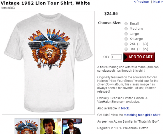
In this example, the shopper sees that a 2XL shirt is $3 more, and a 3XL size is $5 more. Source: Van Halen Store.
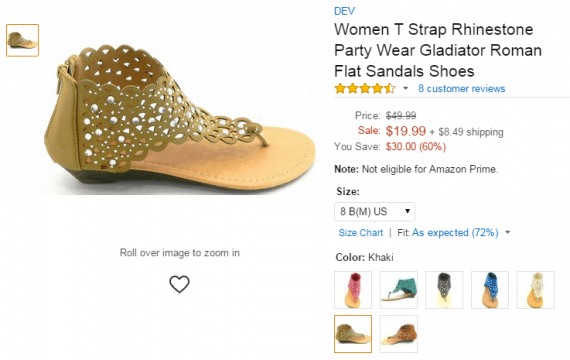
Amazon tackles the sized pricing issue a bit differently by displaying a low to high range for the same item in different sizes.
Throughout the site, shoppers can see the lowest and highest price for an item available in various sizes. On the product page, the actual price is displayed after the size is selected. Source: Amazon.
While a price range isn’t as clear as definitive prices next to each option, it’s a better solution because it doesn’t require thinking on behalf of the shopper.
Once the size (and sometimes color) are selected, the actual price is displayed. Source: Amazon.
But what about how we display the price in general? The psychology of using color to close sales is quite real, and so is the size of numbers. Look no further than successful service sites that provide plan prices.
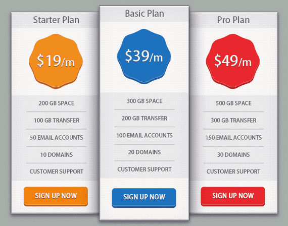
Example of a plan choice for service sites. Source: sitepoint.
When prompted with the options above, the majority of users will select the basic plan. This is for three key reasons.
- The column is called out from the group.
- The color used is blue, which instills trust, responsibility, friendliness, and security.
- It is the middle ground – not the cheapest and not the priciest.
Marketers have spent decades using colors and placement to guide shoppers to the right selection. It has worked in print and it works online.
There are dos and don’ts when it comes to using colors for pricing and calls to action. The most common colors are blue, red, green, orange, and black. Yellow is actually considered one of the least favorites due to its association with warning signs. Red is the most common for price displays because it conveys a since of urgency.
The exact location of the price of a product, whether or not it has options, is key. Typically it is located below the thumbnail on listing pages, and to the upper right of the main product image. When attributes and options change pricing, though, you need to be clear.
By displaying price ranges on category pages, search results listings, and landing pages, you help the shopper determine if he should look further.
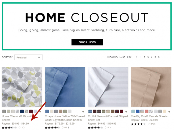
When prices are determined by product options display a range. Source: Kohl’s.
On product pages consider the location of the “Add” button to determine the best placement for the price. Kohl’s uses a much larger font size for the product price, which works well for standalone products. On products with options, though, it is easy to miss that the pricing changed when selecting an option. Also, since this site uses the same layout for all products, the Add button is sometimes pushed too far away from the price.
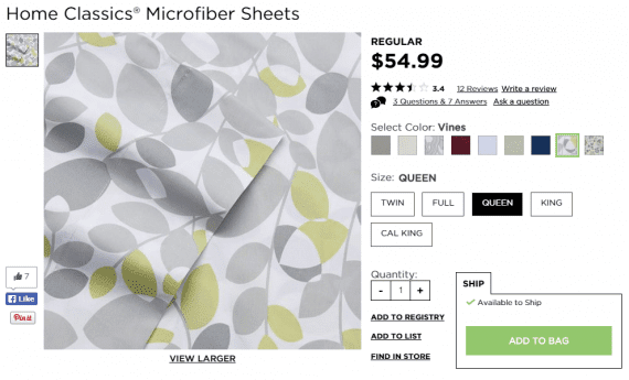
Here the shopper sees all purchase options at a glance. The price is nice and big. A different color would help make it stand out better. Source: Kohl’s.
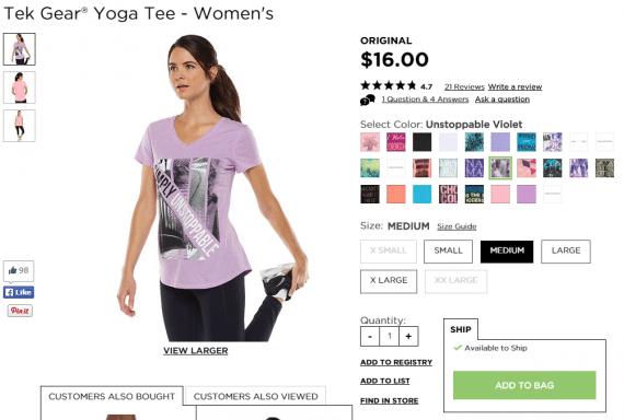
On this page, the ADD button is down further, so the price change could easily be missed. Source: Kohl’s.
On the shopping cart page, and during checkout, it’s ideal to display an inclusive price, even if you provide a breakdown of costs.
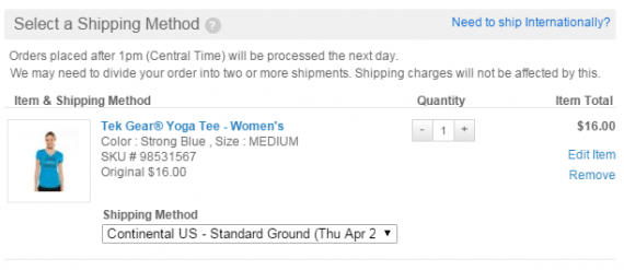
Display the total product price in checkout. Source: Kohl’s.
There’s another benefit to displaying the actual price, inclusive of options. If someone visits your site from a Google shopping listing, the price will match what he initially saw.
Every store, whether it sells clothing or technology, is different. After making any changes in pricing displays, be sure to test the results. A/B testing comes in handy when trying to figure the best color and location for product prices, as well as how to display option pricing. At the very least, though, you want to track conversions for specific pages to see if such changes were for the better or worse.