Cart abandonment rates remain high. I’ve seen estimates in 2021 ranging from 50% to 80%, depending on the product and industry. A common culprit is sticker shock from excessive shipping and handling fees. Another is distractions: unnecessary or confusing checkout fields.
In this post, I’ll address steps to streamline checkouts to save the sale.
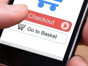
Lowering Cart Abandons
Ditch the coupon code field. This prominent field begs for input, often sending shoppers to search engines or coupon sites to find a discount code. But interruptions happen, including finding the same product elsewhere for a lower price or better shipping.
Alternative methods for coupon redemption include website popovers, navigation links, and product-page fields. These tactics automatically add a coupon to the order; the customer never enters a code at checkout.
For example, Amazon promotes coupon availability on categories and search results and uses a simple product-page checkbox to apply appropriate discounts.

Incorporating coupon insertions on product pages means you can ditch the field at checkout. Source: Amazon.
Many shopping carts support plugins and apps that allow for variable placement of coupon code fields and one-click additions to the cart. Then, at checkout, discounts display, regardless of any additional discount fields. As a bonus, persistent carts can display the actual total, with discounts, as people shop.
Use drop-down links for gift card, discount, and store credit fields. Rather than clutter checkout pages with unnecessary fields, consider simple links that reveal the inputs when clicked. Brevite (pronounced “brevity”) has a breezy, mobile-first checkout that displays only essential fields and hides others behind a link. Since there’s no box asking the shopper to enter something, more people move directly to the “Pay now” button.

Expandable fields put more focus on the prime call-to-action. Source: Brevite.
Upsales and add-ons belong on product pages and post add-to-cart functions. It was once popular to insert a page between the cart and checkout to increase the order total. The page contained one to three relevant offers, available for a limited time. Many store owners measured the performance of the page by how many people took the offer rather than the impact on cart abandonment.
The best time to offer accessories and related items is in conjunction with adding a product to the cart.
Show them what they’re ordering. In a quest to streamline the process, some stores have either skipped the cart page or miniaturized the cart contents at checkout. But shoppers want to see what they’re ordering. Displaying the cart contents helps customers catch mistakes, such as forgetting to add another item. Don’t skimp on product photo sizes, as they are as important as the name and price.
And list selected options, such as size and color. Ideally, the product images in the cart should match any selected options. If not, call more attention to the details.

Don’t leave shoppers assuming what they’re buying. Source: Peak Design.
Save non-critical messaging after the call-to-action. Donating trees for every purchase is terrific. However, don’t interrupt the checkout process to discuss it. Address causes you support below the final purchase button, or provide the info on invoices or confirmation emails.
Get Out of the Way
There will never be an acceptable rate of abandonment because the goal is always to close every sale. But merchants can get out of the way when shoppers are finalizing purchases.
Always track how checkout changes affect three core components: conversion rates, total revenue, and unfinished cart sessions. It’s the only way to determine the overall impact.