I’m always excited to hear business owners wanting a blunt, no-holds-barred analysis. It means they’re serious about being competitive. The team at How-To-Plans asked Practical eCommerce to grade the usability of its website.
How-To-Plans sells do-it-yourself plans for all sorts of home and garden improvement projects. From garden décor to work sheds, it offers in-depth designs mailed right to your door.
Do-it-yourself projects continue to grow in popularity, not only because of the economy, but because doing something yourself just makes you feel better. Thus, this online store stands to serve way more than the 1,000+ visitors it receives each day.
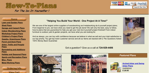
How-To-Plans.com, home page screen capture.
The plans from How-To-Plans are very affordable (most are $10 or less); there’s a plethora of plans ranging from the simple to the ornate, from small to large projects; the site primarily features the use of natural products.
Even though their plans are more detailed, this store still competes with many sites offering free information. Many people don’t put a value on their time, thinking, “Why spend $10 when I can get something else for free?”
Now, let’s look at the message the How-To-Plans store conveys and the overall usability.
Logo
The idea of a wooden logo itself is creative, but the implementation is lacking. The tagline, “For The Do-It-Yourselfer!” is in an outdated font. The logo and tagline also take up a considerable amount of space – prime real estate – weighing in at 420 pixels wide by 80 pixels high.
Navigation
Top navigation is non-existent. All that’s included are payment method icons, which are not using a transparent background, and a search box, which is off center. There are no links to view the shopping cart, checkout or to review store policies. Instead, a great deal of space is wasted, and the shopper is left wondering how to check out when not on the cart page.
The category navigation includes a wood-grain “home” button (which would be better served at the top), and several categories. All category links include the word “Plans” which I assume is done for search-engine-optimization purposes. However, since it’s already established these are plans, that word could be dropped (you can always include “plans” in a title tag for the hyperlink).
Home Page
The home page includes key information, such as details about the type of store, a phone number and various images. But shoppers hate to read. This page would be better served by using a wider, finished-product image at the top, with bullet points or a graphic pointing out that the plans are easy to follow and satisfaction is guaranteed.
It’s always nice to see a real person completing a project, but this image would be put to better use on the company’s profile page.
The layout of the page should follow the rules of a newspaper, being that everything should create a virtual rectangle. This means standard image sizes, tighter spacing and aligned text.
Category Pages
Many category pages are missing key header information. For most, it’s just instructional text, telling the shopper to click an item for more information. Note that if you have to tell visitors to click on an item, then you’re assuming they’re idiots or it’s just not evident. On these pages, it is evident that text is linked.
There are alignment issues on categories, due to the fact that not all of the thumbnail images are being sized consistently. It would also be nice to see more details on this page, such as finished sizes and difficulty level. This can help shoppers gage right away if the project will fit in an allotted space or if it’s something they can start as a first-timer.
Another key feature would be the ability to hover over a thumbnail and see a larger image. This will save shoppers time by being able to review a finished project without having to click back and forth between category and product pages. Some may argue whether or not these pages should include an “Add to Cart” button, but considering that reading all the details is very important, it makes sense why it is omitted.
Product Pages
Key information is included (kudos for that), but the layout can be greatly improved by performing the following:
- Include a link to a larger image. People want to see real details.
- Segment the product description by including one or two lines, then bullet points, then the additional text.
- Drop the details of Features, Size, Plans Include and Skill Level to start on the next line.
- Use a more professional “Add to Cart” button, put the price in black, and align the button and text on the same line.
The idea is to make it easier for shoppers to see the actual details of the plans.
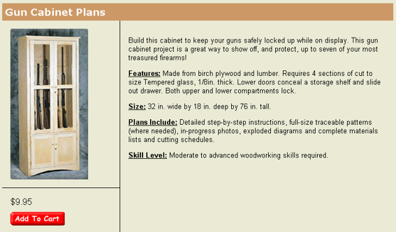
Product page screen capture, How-To-Plans.com
Search
There are key problems with the site search. First, since this site uses a shared SSL certificate (instead of one dedicated to the actual domain), there are alerts when searching from a secure page. Also, the search is maintained by a third-party, which takes the shopper directly out of the site. The search results are prefaced by Ads by Google, which can be a culprit in driving customers away.
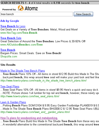
Search results screen capture, How-To-Plans.com
Checkout Process
When an item is added to the cart, the shopping cart page loads. The “Back to Store” and “Checkout” buttons should be further apart and the “Checkout” button should be larger and more creative so it’s clear what clicking on it does.
The first step of checking out is to complete Name, Address, Phone and Email. However, this page does not show any details about what is actually being ordered. Customers need the reminder of what they’re about to purchase.
There is a box on this page to check if the billing address is the same as the shipping address. However, there are no billing address fields to complete, should it be different.
The back button on this page takes the shopper elsewhere, instead of back to the shopping cart. And, the “Checkout” button should, again, be larger and say, “Continue Checkout.”
From here, the system states it’s looking up shipping rates. But the site doesn’t offer method options; all plans are shipped via USPS.
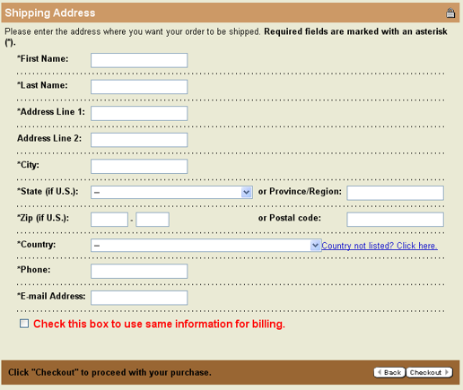
Shipping address checkout page, screen capture.
The customer is immediately taken to a payment method page. In my test, I selected PayPal as the payment method and was told I would need to manually send payment after placing the order, so it seems the shopping cart doesn’t support integration with PayPal directly.
On the review page, I was a bit frustrated. Since I didn’t previously check a box stating that the billing address is the same as the (unnecessary) shipping address, I am now prompted to provide a billing address. This should have been presented to me on step one so it was clear I needed to confirm two addresses.
With the order completed, I am presented with lengthy instructions on actually paying (manually) via PayPal.
Overview
Since I don’t have analytics reports, I can’t definitively say just where or when shoppers are leaving this site. But I am of the opinion it happens at several stages:
- At the category or product page because you can’t always view – at detailed size – just how the finished product will look.
- On any page, because it’s not clearly stated that you’re purchasing plans that will be mailed. Many sites also offer PDF plans, so customers may think that is what they will receive. Thus, it’s possible that shipping rates are turning them off.
- On any page other than the cart page, since shoppers have difficulty locating a view cart or checkout button. There is a view cart button buried below the category navigation (you have to scroll to see the link).
- On any page because the top navigation is missing key links – Shipping Information, Customer Service, View Cart/Checkout, etc.
- On any page because the site lacks key messages telling visitors why pay-for-plans are worth the money. It needs to be made clear that they’re actually printed plans, and much more detailed than what they’d receive on a free site.
This site also includes some extras that aren’t marketed properly. Sample plans, customer photos, testimonials and upcoming plan designs are all linked from the bottom left of the page. All of these features, however, can actually entice people to shop.
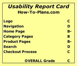
Usability Report Card
How-To-Plans.com
Logo C
Navigation D
Home Page B-
Category Pages B
Product Pages B-
Search D
Checkout Process C
Overall Grade C
Request a usability report card by emailing usability@practicalecommerce.com.