
“Go ahead… hurt my feelings.”
That was the subject of the message request by online store director Will Knott. He obviously understands my no-holds-barred approach, as his message concluded, “Punch me in the eye and bloody my nose…”
Well, Will, I’m not that abrupt (at least, I don’t think), but I give you a ton of respect for taking that first step—admitting that your site has a problem and wanting me to cut to the chase.
Old Will Knott Scales sells all types of scales, from postal and food scales to devices that measure our dreaded body weight and mass index. Manual, electronic, battery operated? Will’s got it. Finding just what you need, however, may prove difficult.
Navigation
The core navigation of this online store is logical by the placement of buttons and menus. But everything blends together due to a lack of key coloring and specially shaped buttons that would stand out. In short, there’s no real call to action because everything is grouped together as a single element.
The logo is simple, yet timeless. Integrating the owner’s name into the site (and company) and using a more modernized western-style typeface lets shoppers know they can find even classic-style scales and measuring devices.
It’s below the top masthead where everything falls apart. There’s a rule of thumb in web design: Information should be “blocked,” like that on a newspaper page. Unfortunately, there’s too much blocking on this site, and too many elements get buried.
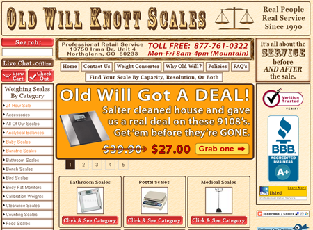
Navigation on home page.
The top navigation takes up an astounding 250 pixels in height. The average navigation area should take up 120 pixels or less. At first glance, it’s not apparent shoppers can enact a live chat, and the “View Cart” and “Checkout” buttons are cramped.
A more streamlined top navigation can be had in this mockup, below. Keep in mind, this is just me messing around with PhotoShop for approximately 10 minutes. Still, you get the idea.
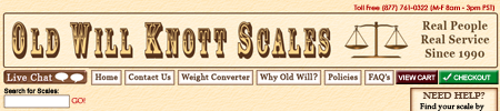
Mockup of a smaller top navigation.
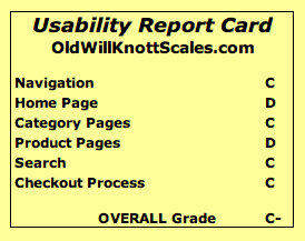
Navigation Grade: C
Home Page
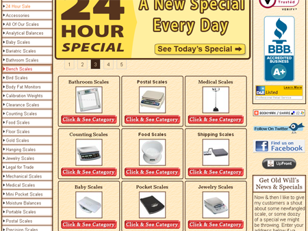
The home page includes a rotating slider (it’s CSS based, by the way, which is way cool) and boxed-in categories in the middle. A great deal of space is wasted with buttons that read “Click & See Category.” One should always avoid using the words “click” or “click here” because the directive should be obvious. These buttons could easily be dropped.
Home page, partial view.
The BBB accreditation image also takes up too much space, forcing social icons and news updates down the page (one needs to scroll to see the Facebook link).
At the very bottom of the page are “6 Hottest Selling” items. The chances of people even getting this far down are slim.
Ideally, the home page is a place to spotlight what you sell – both popular/new categories and products. The listing of 27 parent categories (with images) is a complete duplicate of what’s found in the category tree.
I recommend choosing 2-3 top categories and a few products to spotlight. Make sure everything important is above the scroll line.
Home Page Grade: D
Category Page
There is a great deal of wasted space on this page.
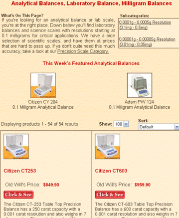
Sample category page.
The most important thing here is that the shopper sees only the two featured items before needing to scroll. If nothing appeals to a visitor, the chance of exiting the page increases. This is why it’s wise to display more items above the scroll line.
The product layout on these pages could easily go three across, with a “More Info” or “Details” button (rather than “Click & See”).
Category Page Grade: C
Product Page
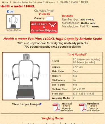
Sample product page.
This layout is extremely confusing. It appears that there’s more than one product listed on the page and the “Add to Cart” button is way too big. (It shouldn’t be larger than the product image displayed in the preceding column.) The “Old Will’s Price” message before the product price conveys that the item usually costs more. If this is the case, the retail price should be displayed, with a strike-through or in smaller text.
The page needs a better location for social media sharing buttons, and the one, large product image should replace the smaller one.
This page is also missing reviews or expert recommendations, which are key in helping consumers make purchasing decisions.
Product Page Grade: D
Search
The search results page carries the same layout as the category page. Changing both to the recommended three-across display and tightened layout should help.
There are other problems, though. By default, the search feature is set to load the first 100 products. That’s a hefty load, especially for those on slower Internet connections. You can sort by name and price, but not by other popular methods like “newest” or “most popular.”
An ideal feature would be the ability to filter searches. For example, I ran a search on the term “hanging,” expecting to find scales that, well, hang. But there are several digital scales that include hooks (allowing users to hang items). With a filter, I could have narrowed my search by a set price range, or by opting to view only manual scales rather than digital ones. This is food for thought, since my initial search returned a whopping 255 results.
Search Grade: C
Checkout
When an item is added to the cart, the shopper is taken directly to a page that is overly cluttered.
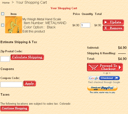
Sample checkout page.
There’s simply no direction to the shopper. The checkbox – which is required for any changes to take effect – is not labeled. The product name isn’t linked to allow the shopper to return to the product’s page, and the “Edit this Product” link is confusing (it’s actually for editing the options on the product).
There are many other glaring issues here, like a zip code box that’s quite small and a coupon entry field that is not logically placed near the checkout button and order subtotal.
The biggest issue is the many large, red buttons. Red is an alarming color. Red and big screams, “Hey, look here… I’m important.” However, there are too many elements on the page labeled important. What’s not that important? The product “Remove” button (should be a smaller text-style link), the “Calculate Shipping” button (can be a bold text-style link) and the coupon box (people will look for the box if they have one, so it’s best not to over-promote the potential of a discount). The “Continue Shopping” button should be in a different color (like brown).
While completing the billing and address fields, the “State” pull-down menu defaults to Alabama, and the “Country” to United States. It’s always better to use a <select> option so people outside those areas aren’t confused.
Then, things get hairy. After completing contact information, the shopper is taken to a page that prompts him or her to enter a Gift Certificate or Coupon Code. Placing coupon prompts on separate screens calls too much attention, leaving customers wondering why they don’t have one. It is easy to lose a sale because a shopper went to Google, searching for a coupon code.
This store accepts all major credit cards, but also allows orders to be placed by check or money order. There’s no service being used – one can select “Check” and get a receipt. Unfortunately, this isn’t clear on the payment selection page. Shoppers may be expecting to enter routing and account information on the following screen, not a directive to mail in payment.
Checkout Grade: C
Overview
The core design (in the top banner) of this site suits its purpose. Unfortunately, it’s all downhill from there. While red has successfully been used as a primarily color on many sites, it doesn’t work here. Instead, it’s as if red were used to make every button shout out to the shopper. There are just too many elements that don’t need to be an alarming directive.
This site also loads slower than most. The average category page takes more than 30 seconds to load on a standard DSL/cable connection. The biggest culprit is uncompressed script files.
Other problem areas include:
- There’s little directive given to the shopper when it matters most. Headers on the Cart and Checkout pages should be used to give customers guidance.
- There’s an inconsistency of fonts and type sizes.
- Most pages have a great deal of wasted real estate.
- There are many, many categories, but no real callout for sales and full product listings (these can be separate buttons elsewhere on the page).
- The social aspect of the site isn’t as aggressive as it should be.
Old Will Knott Scales carries many products, and practically everyone needs at least something that it offers. Unfortunately, until time (and money) is spent on creating a truly impressive design and “guided” experience, the business owner may never realize the potential of this ecommerce site.
Request a usability report card by emailing usability@practicalecommerce.com.


