Mobile commerce is here and with it comes a steady stream of new mobile browsers. There are device-specific browsers like the BlackBerry browser, Android’s browser and Palm’s WebOS browser. There are also popular desktop browsers that are also available for mobile devices like Firefox, Internet Explorer, Opera and Safari.
Like their desktop big brothers, not all mobile browsers are created equal, nor do they function the same. A merchant’s website may look and function differently on each one, which can lead to lost revenue.
Try these mobile browser compatibility-testing tools, below, to see how your own website looks and functions on various devices and browsers. These tools can test speed and function across various device browsers and test how your site looks in both portrait and landscape views.
We’ll look at Gomez.com’s Cross-Device Compatibility Test, BrowserCam’s Cross-Browser Screen Capture Test, Perfecto Mobile’s Handset Cloud Test, [CrossBrowserTesting.com’s (http://crossbrowsertesting.com/) Browser Compatibility Test, [Multi-Browser Viewer’s](http://www.multibrowserviewer.com/) software-based mobile browser emulators and [Usability Science’s](http://www.usabilitysciences.com/) third-party usability testing services. All of these have limited free trials that can roll into a monthly or flat fee.
Gomez.com Cross-Device Website Compatibility Test
The Gomez.com Cross-Device Compatibility Test produces a simple screenshot from a limited group of four device browsers. However, the test is free and the devices are the most popular four on the market: Nexus One Android running Chrome NX1 2.2, Apple iPhone running Safari 4.0, Apple iPad running Safari 3.2, and BlackBerry Storm2 running BlackBerry OS5 browser.
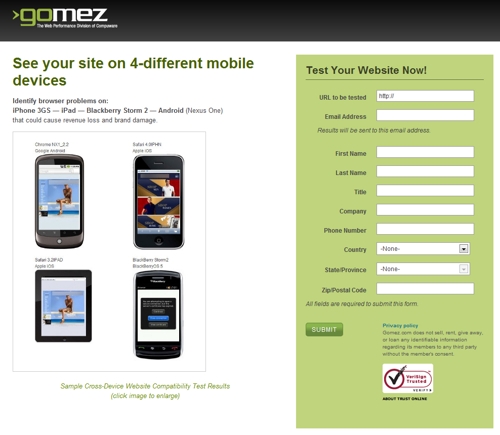
Gomez.com cross-device mobile browser test page.
- Begin testing by going to the Gomez.com Instant Test Center at the top of the “Resources” drop-down. Or copy and paste this URL to access directly: http://www.gomez.com/resources/instant-test-center.
- Next, click the “Cross-Device Compatibility Test” at the lower right corner of the test center.
- Fill out the required information, including URL of the website you’d like to test. You will receive an email from Gomez within 24 hours with access to the test results.

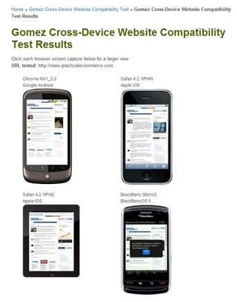
Gomez.com cross-device browser test results.
- When the email is received, click the “View Results” link. The test results will appear in your browser at Gomez.com. Click on the thumbnails to see a large screenshot of how your website looks on four different mobile devices running four different mobile browsers.
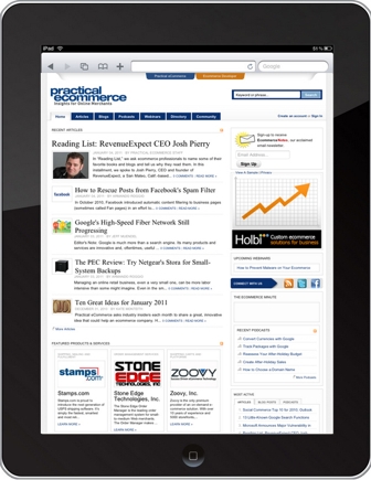
Gomez.com iPad screenshot.
BrowserCam’s Cross-Browser Screen Capture
BrowserCam’s cross-browser test produces a screenshot of how your website appears on fifteen different versions of the most popular device browsers.
Test BlackBerry devices running OS 5 and OS 6 browser for the Bold, Curve, Storm2 and Torch. For Apple, test the iOS devices: iPad Safari browser version 4.2.1 and the iPhone Safari browser version 4.2.1.
Test Google Android OS devices including the mobile Chrome browser version G1 1.6, NX1 2.2, NXS 2.2. And finally, test the Windows Mobile devices running OS 5.0, 6.1 and 6.5 browsers including Internet Explorer 5.0, 6.1 and 6.5 as well as mobile Opera 9.5b2 and 9.7b.
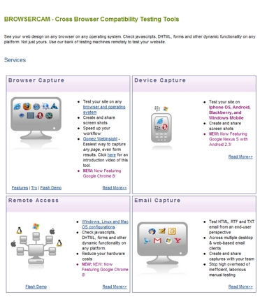
BrowserCam.com home page.
- Begin by going to BrowserCam.com’s Device Capture center and set up an account.
- From BrowserCam’s Device Capture, you can enter a URL address of your website, or test up to ten URLs simultaneously. This is especially handy if you want to test more than just the home page of your website. For example, you could test the home page, customer feedback URL, the various shopping cart page URLs — from viewing a cart to checkout to ensuring each page looks correct.
- You’ll then select the screenshot file type, and save screenshots as BMP, JPEG or PNG files.
- Next, you’ll select the view — landscape or portrait modes — and the resolution of the device screen.
- Select all browsers available or target specific browsers that support Flash, based on popularity or release date.
- An email will be sent to you when the testing is complete. Download and view all screenshots in your “View Projects” folder.
Perfecto Mobile Handset Cloud Test
Perfecto Mobile is a testing service that allows merchants to test a website for mobile compatibility across hundreds of real mobile devices. Merchants can also test across geographical locations, including the United States, United Kingdom, Canada, France and Israel.
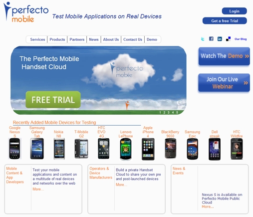
PerfectoMobile.com home page.
- To begin, go to PerfectoMobile.com, create — or log in — to your account.
- Select the handset from multiple device models from most of the major brands.
- You’ll make a reservation for a testing session on a specific date and time for testing across the selected variety of mobile devices.
- Once your testing session begins, you can control the devices you have selected and test your website’s look and function across these multiple device platforms.
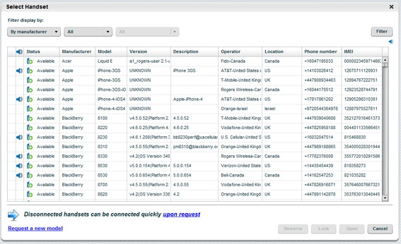
PerfectoMobile.com handset selection menu.
CrossBrowserTesting.com Cross Browser Compatibility Test
CrossBrowserTesting.com offers limited browser options to test: iPhone 3GS, iPhone 4, iPad and Android mobile platforms. The Apple devices are all running Mobile Safari and the Android device is running both Android Browser and Opera Mini. However, users can perform live testing of a website on all three of these device’s browsers and get a clear idea of how your website functions beyond a simple screenshot.
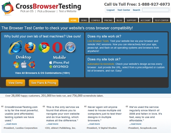
CrossBrowserTesting.com home page.
- To begin, go to CrossBrowserTesting.com and once you’ve created your user account, you are ready to begin mobile testing.
- Choose to run a live test and do interactive testing of functionality and appearance by clicking “Run Live Test.”
- You’ll see the Android, iPad and iPhone options at the top of the list.
- Each device has a different screen size from 320 x 480 (Android and iPhone 3GS) to 640 x 960 (iPhone 4) to 1024 x 768 (iPad) allowing for a relatively full range of functionality and appearance testing.
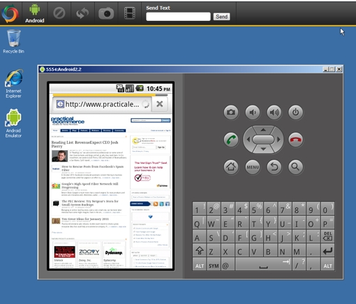
CrossBrowserTesting.com Android emulator.
- For this example, we tested our own website – www.practicalecommerce.com on the Android Browser.
- With mouse-clicks, emulate the experience of a user might have on a mobile device. Click around, navigate around the pages of your site or load up a shopping cart and quickly see if your website is ready for mobile.
Multi-Browser Viewer
TWD Solutions has produced the Multi-Browser Viewer, which offers a software testing solution. Taking the test offline (off the web) can offer more security and control over the testing process. Like, CrossBrowserTesting.com’s solution, Multi-Browser Viewer allows for an interactive experience on the devices available, offering much more than just a screenshot of a home page.
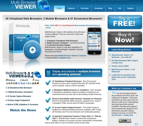
Multi-Browser Viewer home page.
The testing software is limited to four mobile device emulators with their respective browsers for testing: iPhone mobile Safari, BlackBerry Storm2 browser, Windows mobile Internet Explorer 6.5 and Android Browser 2.1.
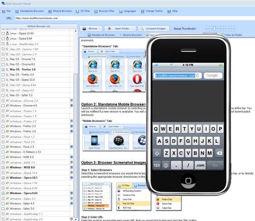
Multi-Browser Viewer iPhone emulator.
- Go to MultiBrowserViewer.com and download the testing software.
- From there choose the device you wish to test.
- The device emulator will launch. Type any URL into the device’s mobile browser and begin exploring your website on a mobile device.
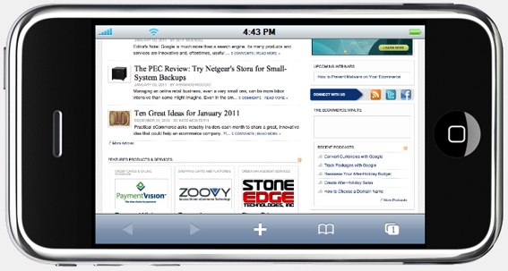
Multi-Browser Viewer iPhone emulator – landscape view.
Usability Sciences Mobile Usability Testing
If you have a larger budget or hands-on testing is not an option, Usability Sciences offers an alternative, in-house, third-party comprehensive mobile usability testing solution with professional analysts.
Usability Sciences will host test sessions where it will recruit test participants specific to your needs and have them engage with your website on the mobile device and browser of your choice. The team of analysis will observe and report the (a) interaction of the participants with your website, (b) any problems that were encountered, and (c) any user confusion that arose.
According to Usability Science’s website, the testing period generally lasts several days and a final report is produced for reference.
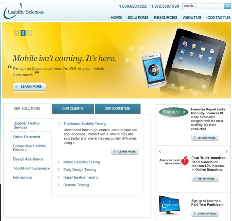
Usability Sciences home page.
Summary
A growing number of consumers access the Internet with their mobile devices. Ecommerce merchants should know how their websites render and function on these devices, especially those that are most popular among their customers. A quick look at analytics data will tell a merchant which devices are most popular. Merchants can then test the appearance and functionality of their sites on those popular mobile devices, using the mobile browser compatibility-testing tools described above.


 AI-powered Internal Linking Tools
 SEO Takeaways from SGE's Partial Rollout
 New Ecommerce Tools: April 2, 2024
 Google Ad Updates Reflect New SERPs
 How to Discover Shoppers' Questions
 5 Content Marketing Ideas for May 2024
 7 Steps to Checkout Success
 The Profitable Seller: Mastering Amazon FBA