
Today’s superphones finally make mobile search a reality. After all, they sport 1GHz processors, 4 inch screens, 4G data connections and browsers that can execute Flash and JavaScript with relative ease.
Recent studies show that somewhere between 10 percent and 15 percent of searches are mobile, and Google — which claims 97 percent of all mobile searches — reported a 130 percent increase in mobile searches in the third quarter of 2010. Searchers use their phones to answer questions, access reviews, compare products and search for deals. All of this begs a couple of questions: First, can your site be found in mobile organic search; and second, what kind of experience greets the mobile searchers who do find your site?
Mobile SEO No Different
Mobile search engine optimization is much like other forms of SEO. Mobile SEO requires a crawlable site architecture that contains indexable content relevant to the phrases that mobile searchers seek, with valid external links to vouch for its popularity. Each major engine has a mobile version, such as Google Mobile and Bing Mobile. The front-end is nicely formatted to a mobile screen size, but the results are disturbingly similar to desktop search.
The image below compares Google desktop search results for Champion Lue Sport — a brand of women’s sandals — on the left,
compared to Google mobile search results on the right.
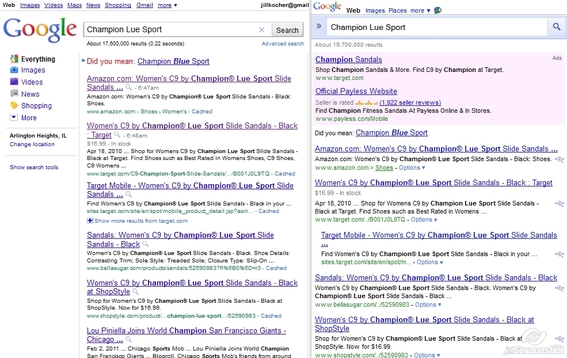
Google desktop search results on left are very similiar to Google mobile search results, on right.
Notice that the mobile and desktop search results are very similar. Most of the changes are variations in format for screen size, the order of the listings on the lower half of the page, and the removal of some universal elements like social results in the mobile version. Also notice that none of these results is specifically for a mobile version of the site. Based on these observations, it’s hard to argue that mobile search optimization requires a mobile site.
Do You Need a Mobile Site?
Ask a roomful of ecommerce executives if they need a mobile version of their sites, and most of the replies usually start with “I think my customers….” Whether the rest of the statement is for or against the need for a mobile site, business decisions based on the phrase “I think my customers…” always raise red flags. Whether or not those doing the thinking use mobile sites or mobile search themselves tends to color their opinions of whether their businesses need a mobile site. A better way is to head straight to the web analytics program to analyze the data first, then overlay the thinking.
Every web analytics program allows analysis of how many mobile users come to the site, either explicitly or via a combination of screen resolution, browser and operating system metrics. For example, consider an actual online shoe store that uses Google Analytics. A report showing screen resolutions and operating systems narrows down the number of mobile browsers versus desktop browsers, identifying that 11 percent — 7,177 out of 57,992 — of the site’s visits come from mobile phones and tablets.
On the surface, 11 percent doesn’t seem like a very large segment of the audience for which to build a specialized version of the site. The site’s business goals will obviously play a big role in the decision, but there’s another piece of data to consider. The dramatically lower conversion rate for mobile browsers — .86 percent for mobile versus 7.99 percent for desktop — points to either a vast difference in the way mobile visitors use the site, or a major issue in the way they are able to use the site.
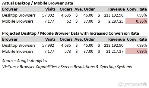
Data from an online shoe store showed 11 percent of traffic comes from mobile devices, but the conversion rate is much lower — 7.99 percent for desktop visitors versus .86 for mobile.
On-Site Mobile Experience
Assuming a site is fully indexed, contains relevant content and enjoys a healthy backlink portfolio, mobile organic search should drive some traffic. But what do those searchers do when they get to the site? Attracting visitors earns an ecommerce company zero dollars until that visitor converts to a customer or completes some form of transaction in the sales funnel, such as subscribing to a newsletter.
Mobile browsers are handy for finding information, but completing transactions on a 4 inch screen is unpleasant even when all the JavaScript decides to execute. The impulse to transact can die quickly if navigation is too complex, formatting requires excessive scrolling, or forms simply don’t work.
Returning to the shoe store example, the search for Champion Lue Sport showed Amazon and Target at the top of Google’s search results. Both the desktop and mobile results ranked the same pages:
• http://www.amazon.com/Womens-C9-Champion-Sport-Sandals/dp/B001J0L9TQ
• http://www.target.com/C9-Champion-Sport-Slide-Sandals/dp/B001J0L9TQ
But clicking through the results yields a different experience for Amazon, thanks to a redirect for mobile browsers to the mobile version of the page (http://www.amazon.com/gp/aw/d/B001IZMA0O). Target continues to serve mobile browsers the desktop version, a far less usable experience.
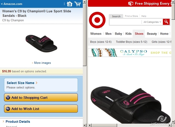
Amazon redirects to a mobile-optimized page on left; Target does not.
At left, above, Amazon’s mobile landing page for a Google search for Champion Lue Sport, compared to Target’s desktop page on a mobile device on the right. I have no idea how Target’s mobile search conversion rate actually compares to Amazon’s, but I’d be shocked if Amazon’s conversion rate wasn’t much higher than Target’s — based on the mobile user experience.
For example, where is Target’s “Add to Cart” button? It’s two-page widths on the right, just under the tiny, hard to click “select size” drop down menu. If I actually manage to add these sandals to my cart, a big window pops up showing my cart – handy for desktop users but really inconvenient for mobile users.
At this point this issue is more about mobile usability than mobile SEO. But if a site can’t convert the traffic it drives from SEO there isn’t much reason to drive it. A poor user experience arguably does more harm than the increased but conversionless traffic is worth.
When viewed in this light, the question of whether mobile search requires a mobile site begs a different answer. Remember that mobile visits, 11 percent of visitors overall, convert at .86 percent. If the experience they encounter is like Target’s, it’s no wonder. Improving conversions, either by creating a mobile site or using a mobile style sheet to format the same site differently for mobile users, could dramatically improve conversions for mobile users.
Worth the Money to Create a Mobile-Optimized Site?
Now the question is simply based on return on investment. If the same number of visitors converted at a rate consistent with the desktop site based on a user experience customized to give mobile visitors the same ease of purchase as desktop users, would the projected increase in sales offset the cost of the project? In the case of our actual shoe store, increasing mobile conversion to equal the desktop rate would increase revenue only $19,000 a month, or $228,000 a year. Only doing similar calculations with your site’s data and overlaying your business goals can answer this question for your site.
However, developing a mobile site does open a whole new world of SEO possibilities, as those new pages can be optimized differently than the desktop pages to target the unique phrases that mobile searchers seek. The Google Keyword Tool offers an option to research mobile keyword data. This mobile keyword data can be used to project potential increases in traffic, which would also add to the ROI equation for developing a mobile site.
Summary
Developing a mobile site isn’t a slam-dunk for SEO, and it isn’t an expense that every site needs to incur. But a mobile site does open up opportunities to drive additional organic traffic, ensure that mobile visitors have a great experience, and sell products to users across desktop and mobile platforms. Royal Bank of Canada analyst Ross Sandler, in a TechCrunch article, predicts that 20 percent of all searches will be mobile by 2012. Will your site be open for mobile business?


 Google's AI Cart Will Remake Ecommerce
 AI Shifts Product Discovery, not Loyalty
 New Ecommerce Tools: May 20, 2026
 For Brands, AI Is the New Shelf Space
 How Content Marketers Misuse GenAI
 FAQs for Google's 'Preferred Sources'
 SEO for AI, Low Traffic, No Clicks