The color-concept terms I discussed in “Understanding Color Theory,” my previous article, will come in useful here while learning about color schemes in web design.
The standard color wheel is helpful when analyzing different color schemes.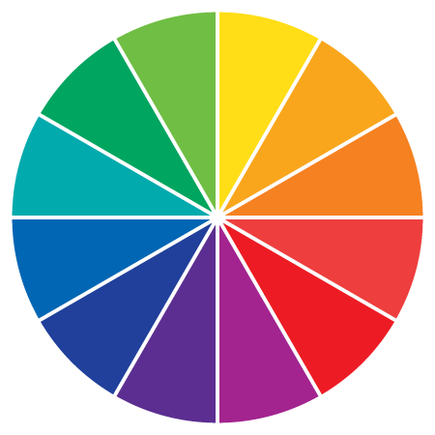
First I am going to cover some traditional color schemes.
Analogous
Analogous color schemes are one of the easiest to create. They are created by using three colors that are next to each other on the traditional 12-spoke color wheel as the base of the scheme. Analogous colors can be adjusted by manipulating their tone, shade, and tint.
Analogous colors: orange, red-orange, and red.
Monochromatic
Monochromatic schemes are based off a single color. The hue is always the same, but the scheme will contain different tones, shades, and tints of that hue.
This monochromatic scheme uses various shades and tints of green.
Triadic
Triadic color schemes use three colors that are evenly spaced throughout the color wheel. Picture an equilateral triangle intersecting the color wheel at three points to create the three base colors for this scheme. Like the other color schemes we’ve discussed, the tone, shade, and tint of these colors can be changed to adjust the scheme.
This triadic scheme uses yellow, red, and blue.
Complementary
Complementary color schemes are made up of colors that fall opposite each other on the color wheel. Picture a straight line running through the color wheel at any point. Colors along this line can make up a complementary color scheme.
Blue and orange: a complementary color scheme.
Split Complementary
Less common than the complementary color scheme, split complementary schemes use a base color and the two colors adjacent to the base color’s complement. These, again, can be adjusted by tone, shade, and tint to modify the scheme.
Split complementary scheme: Yellow-green vs. red and blue-violet. The base color is the bright green.
Tetradic
The tetradic color scheme is similar to the triadic color scheme but uses a rectangle instead of a triangle to pick the base colors from the color wheel. Using a tetradic color scheme provides two pairs of complementary colors as the base colors for the scheme. Tetradic color schemes usually work best if one color is more dominant than the others.
Tetradic schemes: Blue-green and blue-violet vs. red-orange and yellow-orange.
Making Adjustments
Even using a traditional color scheme, it is still possible to end up with jarring or ugly color combinations. This is where customization and the human touch enter in and adjusting the tone, shade, and tint becomes important. For example, the following analogous color scheme doesn’t break any “rules” per se, but without any contrast, it isn’t very visually appealing.
Low-contrast analogous color scheme.
Compare that with this analogous color scheme using the same hues but with different tones, shades, and tints.
Analogous color scheme adjusted for higher contrast.
As you can see, this color scheme is much more appealing and has the necessary contrast for using in web design.
Custom Color Schemes
Not all color schemes are based off these traditional models. In fact, some of the most striking color schemes simply use a neutral palette with one bright accent color. Sometimes using human intuition and starting from scratch results in more striking color schemes than the traditional models could have provided.
Neutral custom color scheme with accent color.
Often, a good place to start when creating your own color scheme is with one of the traditional models. Set up a base scheme using one of the models described above and then make changes to the hues.
Also, you may have noticed all the example schemes I’ve shown thus far have each contained five colors. While this isn’t an ironclad requirement, it is a good general rule to follow when starting a color scheme. Once you have five base colors, add or subtract as many colors as your site calls for. This is another place where human intuition plays a big role.
Adobe Kuler
Adobe Kuler is a helpful online resource for creating color schemes. For starters, you can use “Rules” to visually create color schemes based on the traditional models described in this article. Kuler also makes adjusting each color in the scheme simple with sliders and text entry fields
Kuler also allows you to create swatches using an image, which can yield some interesting results.
Use Adobe Kuler to pull color schemes off of an image.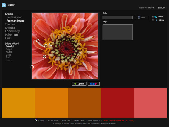
Once you have your color scheme created, you can either copy the HEX codes for each color in your scheme or sign in to Kuler and download a swatch file for use with Adobe Illustrator or Photoshop.
Contrast
One last thing to remember when creating color schemes for web pages is contrast. The comparison between the two analogous color schemes I provided earlier is a good example of the importance of contrast. Creating a color scheme with hues that all have the same value produces a very boring site design. So when creating color schemes, keep contrast in mind.