
There’s a reason that an ecommerce site’s checkout process is one of the most popular analytics topics. Once a person initiates a checkout, she has self-identified herself as a visitor with a high intent to purchase. Chances are, you’ve already spent money acquiring that potential customer. You’ve likely invested in (a) marketing efforts to make her aware of your site, (b) the paid search click that got her to your site on this or a previous visit, and (c) the overall investment in your site so that she was able to find a compelling product or service. But, visitors are often fickle. Even a minor speed bump on their checkout paths can be enough to cause them to abandon the effort, in which case the investments you made were for naught.
There are many ways to identify those speed bumps so they can be flattened out or removed. This article will cover three of them: funnel analysis, error message capture, and simple usability testing.
Google Analytics Funnel Visualization
Hopefully, you already have a Google Analytics funnel set up for your checkout process. The process is straightforward.
- Set the order confirmation page as a destination URL goal.
- For that goal, configure each step — i.e., page — in the checkout process as a step in the funnel
Depending on how your site works, you may want to set the first step in the funnel as your shopping cart page, or you may want to set it as the first step in the actual checkout process.
For more information on the mechanics of setting up goals and funnels, refer to Google’s documentation on the subject.
Once you have the goal and funnel configured, you can view the fallout that is occurring along the purchase path with the “Funnel Visualization” report under “Conversions > Goals.”
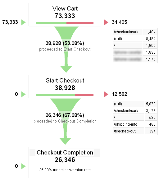
The funnel visualization can help find low-functioning steps in the conversion process. Enlarge This Image
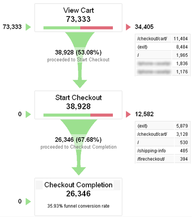
The funnel visualization shows of all the visitors who started down the purchase path — viewing the cart in this case — who reached each step in the process and how many fell out of the process at each step. The visitor can view other pages in between two steps, such as navigating to the site’s return policy before completing the checkout. As long as she gets to the next step in the process during the visit, she will be counted as having progressed in the funnel.
A second visualization of the funnel that is available in Google Analytics is the “Goal Flow” view, which is also found under “Conversion > Goals.”
The "Goal Flow" view allows you to follow the checkout path of specific groups. Enlarge This Image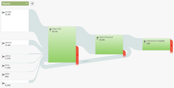
Two things that this view provides that the standard funnel visualization doesn’t are:
- A visualization of “loopbacks.” How often visitors move backwards in the funnel. In the example above, one of these is shown in the arrow that goes from “Start Checkout” back to “View Cart.”
- Segment traffic in a range of ways. Both by viewing the funnel only for visitors in a specific segment, or by changing the dropdown to split out the traffic by one of many dimensions. In the example above, the traffic is split by “Source.”
If there is more falloff in the process than you would reasonably expect to see, digging into the “Goal Flow” may help you isolate it, if it is a particular step in the process, traffic from a particular source, users of a particular browser, or some other factor that seems to be problematic.
The example above shows a one-step checkout. One-step checkouts aim to simplify the checkout process, which is good, but they introduce a challenge from an analytics perspective: a funnel visualization only shows that some percentage of people are abandoning the process on the key page, without providing any specifics as to what it is on that page that tripped them up. One way to dig into that page is by capturing and analyzing warnings and error messages that get presented to visitors.
Pushing Error Messages into Google Analytics as Non-Interaction Events
Most checkout processes have some level of error checking and validation built into the process, since the order can’t be completed if a credit card is invalid or a billing city is missing, the process is designed to prompt the user if she clicks to complete an order with missing or invalid information. Often, this is achieved by the page reloading with an error message at the top, error messages next to the specific field(s) that need correction, or some combination of both of these.
All too often, site owners make three mistakes when it comes to these error messages.
- They assume that the implementation of the error messages is sufficient to get users over the speed bumps of a mis-completed form.
- They assume that the error checking process itself is perfect. If the site presents the user with an error message, then the user must have indeed made a mistake and the burden is on the user — rather than the site — to address it.
- They fail to capture the frequency and detail of those error messages in a way that allows them to monitor and analyze them to identify ways to improve the site.
Most every consumer has experienced a site that sends them into an endless and frustrating loop of trying to fill out an online form, presenting vague, unhelpful, or even nonsensical error messages, with no clear path to advance the process. In these cases, the user has no choice but to abandon the experience entirely.
In other cases, the layout of the form itself is such that a field is easily missed or misinterpreted, meaning the user submits the form, gets an error message, addresses the error, and is then able to complete the process. But a few visitors will be confused by the messaging and wind up abandoning entirely.
Since the error messages are usually presented using JavaScript, it makes sense to capture the error detail as a non-interaction event — here’s Google’s explanation — in Google Analytics. The event that occurs during any of these errors or warnings can be identified in Google Analytics using something like the following.
_gaq.push(['_trackEvent', 'Checkout', 'Error: Checkout', '[error detail]', 1, true]);
The [error detail] should be populated with a value that describes the actual error. Below is an example of the resulting data from such an implementation.
Viewing error occurrences helps with finding specific problems. Enlarge This Image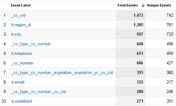
There are two ways to use this report.
- Identifying the most common errors that users encounter. In the example above, the most common error is that customers do not enter the security code — i.e., “CID” code — on their credit cards. This could be because they don’t know what it is — in which case adding a note or overlay that provides more detail might be useful — or they’re simply not seeing the field, in which case adjusting the checkout form layout may be in order.
- Identifying the errors that visitors are getting repeatedly in a single session. By comparing the “Total Events” value to the “Unique Events” value, you can see cases where the error message appears to be unclear. In the example above, on average, visitors who receive the CID error get it twice — 742 unique events compared to 1,472 total events — indicating that, even with the error message was presented to visitors, it was still not obvious to them as to how to address the issue.
You can also segment the traffic to the site — here’s Google’s explanation — to focus on the visitors who received a specific error. What is the conversion rate for those visitors? How did they get to the site? What browser(s) or mobile devices are they using? You may have a case, of which you were unaware, that is causing the experience to break for a portion of your visitors.
You can also use this data to set up a custom alert — Google explains that here — so that Google Analytics sends out a notification if the number of total errors or the number of specific errors suddenly increases.
While adding these non-interaction events does require a bit of additional coding in the checkout process, it provides valuable information and can be both an early warning and a rapid diagnostic tool when issues with the checkout process crop up.
Usability Testing
One final way to look for speed bumps in the checkout process is through usability testing. In its most rigorous form, usability testing involves an expensive facility, complete with one-way mirrors and eye-tracking hardware. Users are given a specific task to complete — e.g., “From the home page of this website, find and purchase Widget X.” — and then every action they take is scrupulously recorded. They may be asked to verbally explain as they work through the task, and they are generally interviewed after they have completed it.
Usability testing almost never fails to surprise site owners with what it uncovers. Unfortunately, full-scale usability testing is also time-intensive and expensive, which can make it a non-starter for site owners operating with limited time and budget.
The good news is that even cheap, crude usability testing can yield surprisingly valuable information. All it takes is a little time, a handful of willing volunteers, and a bit of discipline. The process is simple.
- Get a video camera. This does not need to be fancy. It can even be the video camera from your smartphone. You will use the video to show others what you found — not the whole video, but specific segments as warranted.
- Identify an appropriate use case. Pick a specific product and how/where it should be shipped. Be prepared to cancel these orders if you do not have a mechanism to allow for dummy orders to be placed.
- Identify 3 to 5 testers. These should not be people who work on the site regularly. Friends and family are a good source, and, regardless of the products or services sold by the site — adult content excepted — try to find one tester who is an 8 to 12 years old. Children have the highest expectations of websites, and they are generally more naturally unfiltered with their thoughts.
- Conduct the test. Give each test subject the same instructions, including what task you want them to accomplish, to think out loud as they go through the process, and to not ask you any questions along the way. Tell them that you will be videoing them, but that you will not be providing any guidance or further instruction. Resist the urge to help the tester out during the test. Be silent.
- Discuss with the tester afterwards. After the task has been completed, ask the tester about specific spots where she appeared to get stuck or even mildly tripped up.
While this sort of usability testing can seem crude and imperfect, you will be surprised by the information you’ll receive from it.
Summary
If you haven’t given your checkout process a good, hard, data-driven look lately, it may be time to do so. Even if you haven’t made any changes, the process is constantly being subjected to external factors, such as (a) updates to the software and systems that run the site, (b) new browser versions, and (c) new mobile devices. All of these may introduce glitches that you were not aware of.


