
In “Optimizing Ecommerce for Tablets and Smartphones,” my article last month, I addressed responsive design, the practice of coding a website to automatically adjust to the size of a user’s Internet device.
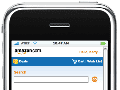
This month, I extend that discussion to include outbound emails, so that the appearance of those emails adjusts automatically to smartphones and tablets. The concept is important to merchants who rely on email marketing. Roughly one-third of all emails are now opened on a phone or tablet. That percentage will likely grow. An email that can’t be easily read by those recipients is a waste.
Making an Email Responsive
You can adjust the appearance of your email by utilizing CSS media queries within your email code. This will trigger responsive layouts. While older smartphones and tablets do not embrace CSS media queries, a well-thought-out responsive strategy is backwards compatible, ensuring you’re still putting a good experience in front of users with older, legacy devices. But with the average life span of a cell phone being 18 months, most of your customer base is likely already using devices that will take full advantage of your responsive tactics.
The CSS @media declaration allows you to write custom rules for elements based on the size of the viewing window. While the most popular devices have consistent window dimensions, there remains much variance in the rest of the market. So be sure to use strategic size ranges when writing your media query rules to achieve greater flexibility.
Another good idea is to leverage a more modular approach in how you structure your HTML elements. This will allow you to easily dictate with a CSS rule an item to drop down beneath another in smaller devices, and side by side in larger ones. It’s also a good idea to be cognizant of the size of your interaction points — i.e., links and buttons — keeping them a minimum of 44×44 pixels.
Fluid vs. Fixed Width
The last tip is to create a more fluid layout within your email templates, allowing elements to adapt to the size of the window based on a percentage, such as 70 percent of width. This approach, unlike fixed-pixel layouts, gives emails the freedom to adapt to different device or browser dimensions, which allow elements to render horizontally across the available space. Bear in mind, however, that when rendering in a narrow window size, smaller percentage-based elements could render very small. So be sure to test your layout in a wide range of sizes.
Summary
Many ecommerce merchants rely on email marketing. Increasingly, recipients of those emails are reading them on smartphones and tablets, not laptops and desktops. Use these tips to help ensure your emails are readable on all devices. Note that responsive email templates are available for purchase at ThemeForest and other template providers. Also, many email service providers offer responsive templates in their core products.


 Google's AI Cart Will Remake Ecommerce
 AI Shifts Product Discovery, not Loyalty
 For Brands, AI Is the New Shelf Space
 New Ecommerce Tools: May 20, 2026
 How Content Marketers Misuse GenAI
 FAQs for Google's 'Preferred Sources'
 SEO for AI, Low Traffic, No Clicks