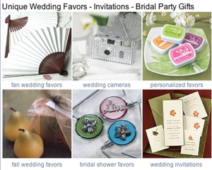
WeddingThings is an established ecommerce company that sells the unique gifts wedding guests traditionally take home, as well as other wedding essentials for the perfect wedding such as invitations and bridal-party gifts.
Eugene Mar, vice president of WeddingThings, wants some insight for increasing referrals from search engines and increasing conversions from visitors to customers and he’s requested this site grade. Lets take WeddingThings through our conversion scorecard and see what opportunities exist.
Findability
Qualified prospects must first find your website, and once at your site it must be easy for them to locate the products they are seeking. A broad search for “wedding favors” does return WeddingThings.com on the first page of Google results, but broader need-based queries such as “eco friendly wedding favors” or “wedding reception guest ideas” does not return WeddingThings in the first few pages of Google search results.
When performing these searches we noticed a distinct lack of AdWords campaigns suggesting that a campaign based on some specific needs might be a cost-effective way of reaching qualified prospects.
We noticed category pages within the website sometimes had a generic meta-description. Google will often display the meta-description on the search results page, and there is an opportunity here to write a compelling and persuasive meta-description for each category listing.
Once at the WeddingThings website we found the navigation and selection of individual products a fragmented experience which could be much improved. Looking at the big picture, many products can be found from the “main” wedding things website, but there are also (at least) five ‘white labeled’ ecommerce engines from which individual searches must be performed. Small details are important as well, for example the search term is not remembered on search result pages leading to a clumsy experience when people refine their search results.
Design and Aesthetics
Weddings are an emotional experience. Done well, a successful aesthetic will tap into and take advantage of this emotional connection. WeddingThings does have a fitting overall color scheme, but otherwise doesn’t make full advantage of design and aesthetics. Weddings often follow a theme, and while WeddingThings does acknowledge this with theme-based categories, the category landing pages could be improved by visually matching the themes they are representing.
The home page looks very similar to other category pages and the current tagline below the logo “Shipping worldwide since 1999” does not sum up the purpose very well, where as the more useful heading “Unique Wedding Favors – Invitations – Bridal Party Gifts” is likely to be overlooked.
Within product detail pages there is a poor visual hierarchy, and important elements on the page – like the ‘add to basket’ call to action and link view and checkout the basket – could be given a much stronger visual prominence.
Each of the white-labeled ecommerce engines has a different layout leading to a very confused and unprofessional shopping experience.
Ease of Use
In terms of usability, WeddingThings does a good job in some areas. For example, pages are fast to load, there are no flashing promotions or obstructive pop ups, and people can add items to their basket without being forced to sign up.
Unfortunately, there are some serious usability issues with product option selection and within the check out process that are undoubtedly adding barriers to customer conversion.
Within the website their also appear to be some conflicting messages. At one point we are told payment is accepted by PayPal or by credit card, but during the check out process only a credit card option was visible. The home page also states “No Min. Order” however for many products a minimal order is required.
Persuasion
There is a range of compelling reasons to purchase from WeddingThings. These are, however, presented on the home page where people are more likely to be looking for pathways to suitable products rather than persuasion to buy. These should have visibility on the home page, but also on product detail pages and at relevant stages of checkout where they will help mitigate common customer fears.
WeddingThings runs a reoccurring weekly sale, a discounted price is a great persuasive strategy, however it could be used too much greater effect. Displaying how much longer the discounted price will apply for, or the scarcity of remaining stock are two methods to get people to act.
Product descriptions could also be more persuasive to increase conversion. For example looking at a product that is included within “Eco-friendly green” there is no explanation as to why this product is eco-friendly as compared to the other products.
As well as converting sales, WeddingThings also has goals for newsletter signups and requesting a mail order catalogue. These are both great services but very little effort is used in persuading people to these goals.
Promotion
At the time of this review the website was having a sale to celebrate it’s 9 year anniversary, however there was no visibility of this on the home page at all. WeddingThings also has some great cost-saving benefits for Canadian customers because of their Vancouver based warehouse, however again this is not adequately promoted.
Product details pages include a space for promoting related products, however, instead of using this to cross-sell other products that might be of interested (for example a photo album when looking at disposable cameras), this is used to show options within the same product (for example, more disposable cameras but in different themed casings.)
Safety and Trust
WeddingThings has some great content to promote safety and trust. As examples, the ‘About us’ page is an honest and open letter from Connie Mar, the founder of WeddingThings, and at the top of every page there is a free-call phone number and also live-chat functionality.
Mar also runs a good blog and there are honest and believable testimonials from customers. However, there is still room for improvement. The free-call phone number should include a way to see other contact details (such as an email address for global customers) and instead of hiding the blog and testimonials in their own section of the site these could be given much more visibility throughout the website.
Conclusion
WeddingThings has a great range of products but people may not be making it to the site, or once arrived may have difficulty finding what they are looking for. Addressing the issues we have identified would help WeddingThings reach more qualified prospects and also increase conversion.
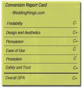
Conversion Report Card
Weddingthings.comFindability C-
Design and Aesthetics C+
Ease of Use C
Persuasion C+
Promotion C
Safety and Trust C+OVERALL GPA C+
Want your site graded? Email conversion@practicalecommerce.com.