Editor’s Note: This article was originally published by Web Marketing Today. Practical Ecommerce acquired Web Marketing Today in 2012. In 2016, we merged the two sites, leaving Practical Ecommerce as the successor.
Choosing the right font for your website not only impacts how visitors feel about your site but also how they comprehend your content.
Picking the right font is also a way of deciding how you want visitors to perceive and understand your company. Different fonts convey distinct emotions and can provide site visitors with a clear sense of your company culture and professionalism just as quickly as when using colors or graphics.
In recent years, the web has evolved beyond the web safe fonts now ubiquitous across the Internet. Web font services, such as Adobe Typekit or Google Fonts, have become widely accepted and open your site to a variety of typefaces that can enhance the look and legibility of the text.
Get the Vocabulary Straight
A quick “distinction” lesson is important before we begin.
Font and typeface. The term “font” refers to a particular member of a type family, such as bold or italic, while the other commonly used term, “typeface,” designates a grouping of fonts generally known as a “family.” This distinction will be significant when discussing the difference between fonts and how to use them.
Serif versus and sans-serif. Another important distinction is the difference between a “serif” and a “sans-serif” typeface.
A serif typeface has small lines at the end of the stroke on the characters. This style originated in Roman antiquity when letters were carved into stone, sometimes leading it to be referenced as “Roman” typeface. In contrast, sans-serif typeface has no lines at the end of strokes and is referred to as “Grotesk” or “Gothic.”

Serif typeface

Sans-serif typeface
Script and decorative. Another distinction is between “script” and “decorative” typefaces. Script typefaces mimic handwritten or calligraphy styles where letters lead or connect to each other. Decorative typefaces focus more on ornamentation or whimsy than legibility.
Using More than Just Web Safe Fonts
For many years, web designers were constrained by only 10 or 12 web safe fonts, which limited creativity. Now, modern web browsers support the use of web fonts that can be embedded into a website, allowing the utilization of a wide variety of typefaces and fonts.
Many services provide access to free web fonts for commercial purposes. Font Squirrel and Google Fonts are two of the most popular. Paid services, such as Adobe Typekit or Fonts.com, were also developed. These companies, commonly referred to as “foundries,” offer a large selection of typefaces with many different font options.
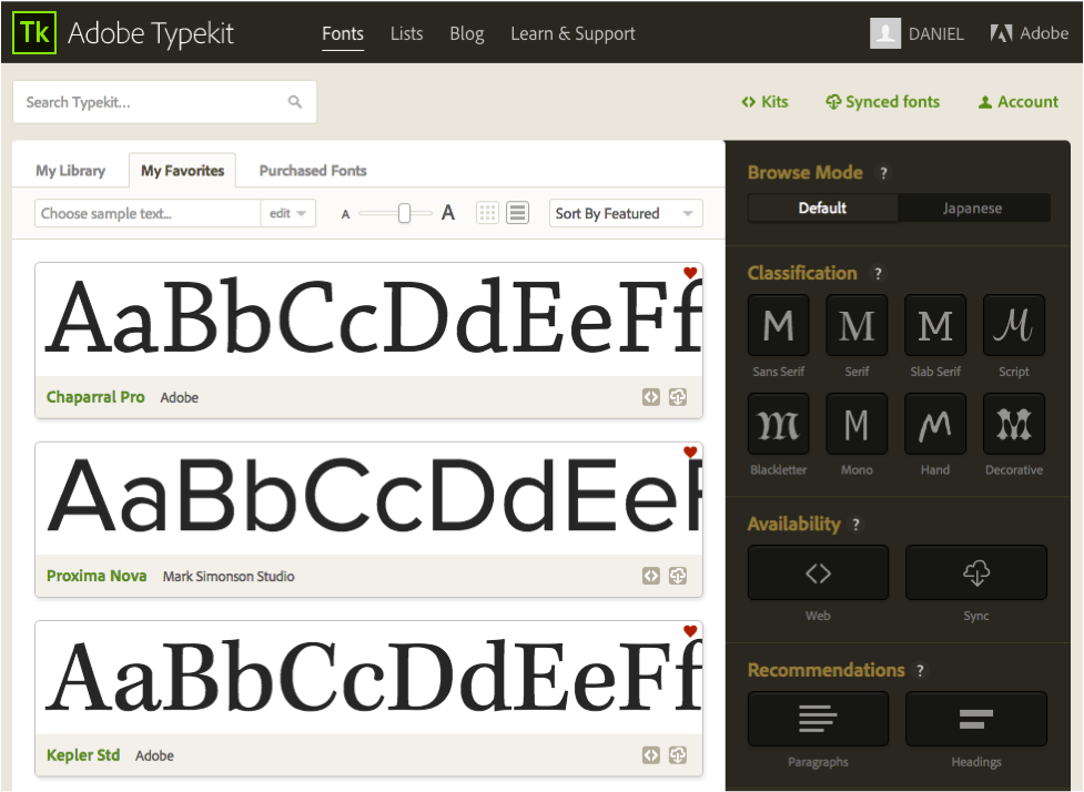
Adobe Typekit
Adobe Typekit also grants the ability to sync fonts with your local computer to aid in the design process. Paid services allow you to select multiple fonts and easily bundle them together to add to your site.
Both Google and Adobe have WordPress plugins that make adding web fonts extremely easy. Also, many services allow users to take sample text and try different font options, weights, and styles before adding them to the site.
How Type Affects Emotions
A study by MIT researchers (PDF) discovered that “good” or “bad” typefaces affected a person’s mood as well as his ability to retain information cognitively. Typefaces can present a broad range of emotion, so it is important to choose the one that gives users the experience you desire.
Serif typefaces are seen as more traditional and formal while sans-serif type is more informal, modern, and playful. This doesn’t hold true for every serif or sans-serif typeface, however, as some have been designed to elicit one particular type of emotion.
For instance, serif can sometimes bring a sense of friendliness to a design that only utilizes sans-serif typefaces. Another study, from PLOS.org, found that larger font sizes can elicit a stronger emotional connection for the user.
Ensure that your typeface is correct for your industry or business. Professional service firms, such as attorneys or financial consultants, should use serif typefaces to convey trust and professionalism.
Technology or modern companies should use a sans-serif typeface to provide a sense of being forward-thinking and futuristic. A government entity, or business that regularly works with governmental agencies, should employ sans-serif typefaces like Helvetica, which is the one currently used by the IRS for all tax forms.
Mix and Match Typefaces
In my experience, mixing and matching two typefaces helps bring variety and balance to the design.
Jessica Hische, a well-known type designer, notes that it is important to pick an “anchor” type first. Settle on the typeface for the type that is most prevalent in your design (most likely your body copy), and then choose a typeface for the remainder — headlines, pull quotes, or captions — that work with your anchor type.
It is also best to mix a sans-serif and serif font instead of two of the same kind as this gives diversity and hierarchy to the type styles.
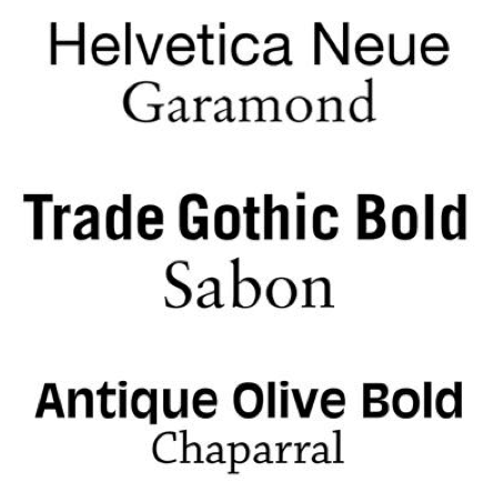
Mix and match type styles to bring variety and balance to the design.
Legibility and Readability Online
“Legibility” is the capacity for a font’s individual characters and words to be distinguished from one another easily. “Readability” speaks to the arrangement of words and sentences on screen and how comfortable they are to read continuously.
A single typeface may contain multiple fonts such as bold, semibold, italic, and condensed that can work best for different applications. When using sans-serif type for headlines or short blocks of text, a condensed or bold version works better.
For long-form text, like page copy or blog posts, a serif typeface will help for sustained reading. The spacing between individual letters, known as tracking or kerning, can make text much more readable. In type that is all caps, more letter spacing may also make the text easier to read.
Two other concerns for website readability include the size of the type and the line length.
Although a hotly contested item, most professionals agree that type should be bigger than 12pt, to be more readable. I recommend 16pt type, but many sites with large amounts of text, like Medium, use 22pt fonts.
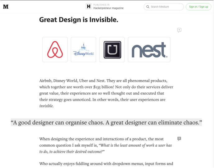
Medium has a type size of 22pt and a short line length for best readability.
Lastly, make sure that your lines of type aren’t too long. On a desktop, keep each line to 50-75 characters; mobile should be 30-40 characters. This prevents users from getting tired or losing their place when reading multiple lines of copy.