The natural movement of the human eye is a key factor when designing the visual structure of an ecommerce site. That movement nowadays is faster and less forgiving, given the avalanche of content we all face daily.
In the West, we read and write from left to right. Our eyes start on the top left of a website and move to the right before repeating the pattern.
As our eyes move down the page, graphic elements provide cues on where to pause through contrast, color, and shapes. Knowing this, the placement of those elements — calls-to-action, buttons, alerts — is critical.
You can intentionally break the rule once you know it to guide your visitor through elements that show the essential parts of a page or section.
Examples
What follows are examples of graphic components capturing and guiding the eye.
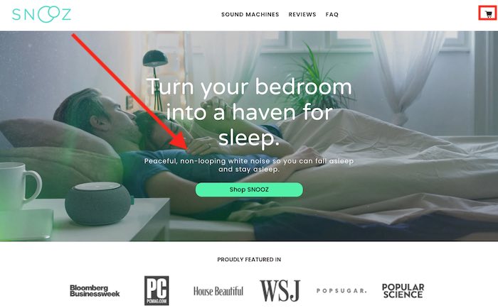
Snooz’s home page.
In the case of Snooz, we see a clear “Shop Snooz” button diagonally from the logo in contrast with the subtle shopping cart icon on the top right corner. This indicates that the icon is not relevant or important, guiding us to look at the button first and scroll down from there.
—
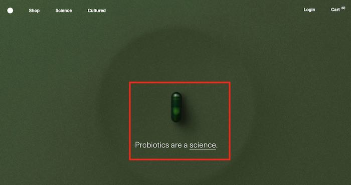
Seed’s home page.
Seed is a good example of breaking the zig-zag rule, as there’s no strong graphical reference, such as a logo, at the top left. This reduces the importance of the top bar, giving extreme preference to the “Probiotics are a science” tagline and the strong pill image in the center of the page. The design guides our eyes straight to the middle, telling us to skip the top left.
—
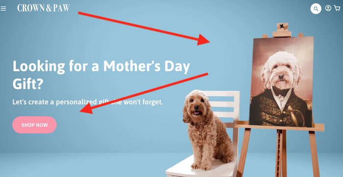
Crown & Paw’s home page.
Crown & Paw follows a conventional zig-zag pattern where our eyes navigate from the logo at the top left to the dog portrait, then back to the “Shop Now” button.
Prioritize Elements
Consider the elements of your website and prioritize them. Remember, if everything is important, nothing is. By emphasizing visual elements, you can design them to guide the visitor through the experiences you want.
Consider an element’s position, not just its color, contrast, and size. Knowing visitors are starting at the left, consider placing the next important element on the right as their eyes naturally gravitate to it.
Cluttered websites cause stress as users subconsciously look for the invisible diagonal line as a guide. By inserting competing information, we force them to figure out what’s more important, prompting many to assign a lower value to that whole section and move on.
Thus consider breaking down a section into two or more parts and guiding visitors diagonally from one to another.
We seek page navigation that requires little effort. That’s why websites are now commonly designed for long scrolling with sections or blocks, each dedicated to a single purpose, such as social proof, testimonials, or benefits. We then look for the most prominent element (or headline) to decide whether to stop or continue scrolling.
Review Your Site
Review your website. Trace a line between the most prominent elements of each section. Does it flow effortlessly? Is it a natural eye movement?
Look for places where the zig-zag pattern fails or where two elements compete in the same line.
By fine-tuning this invisible guiding line, you remove resistance and increase conversions.


