If you want more people to create accounts, subscribe to your mailing list, and actually complete the checkout process, you have to stop telling them what they should do, and let them tell you what they want to do. Especially when the desired outcome is exactly the same.
Calls to action written in first-person — “me,” “my,” “I” — most always result in higher conversions. This is because people react more positively when they are the ones in control. It’s a simple concept, and it’s one that seasoned marketers use to drive conversions on nearly any type of website.
Instead of having visitors “think” about your request to, say, sign up for your mailing list, let them complete the phrase:
“I want to ________________________”
or
“I want you to ______________________.”
With this, a subscribe button that by default reads “Sign Up Now” completes the “I want you to…” with “Send Me Updates!”
For visiting the shopping cart, change “View your Cart” or “View Cart” to [I want to] “View My Cart.”
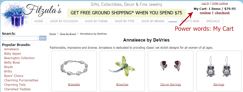
“My Cart” tells the shopper she has items ready to purchase. The example is from Fitzulas.com, a gift and collectibles ecommerce site. Source: Fitzulas.com.
Why Does First-person Text Improve Conversions?
Shopping online can be quite impersonal — much more so than browsing a physical store, where you can touch the product and (hopefully) converse with a salesperson. Using first-person calls to action helps visitors connect with their own emotions. It’s really the difference between talking at a shopper, and conversing with one.
Last year Michael Aagaard, founder of ContentVerve, a conversion optimization firm, ran various split tests and found that using first-person verbiage on buttons increased sales, account creations, and free trial signups, in some cases as high as 90 percent. In many cases only a single word is changed, such as “your” being changed to “my”, to make a clickable button more enticing.
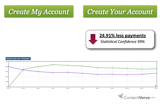
Split test revealed that using “Your” opposed to “My” resulted in nearly 25 percent less payments. Source: Unbounce.
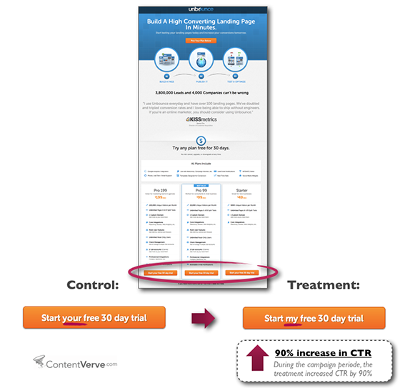
In this test, changing “your” to “my” resulted in a 90 percent increase. Source: Unbounce.
Ironically, Aagaard’s findings were a results of some “failed” A/B tests, which means negative test results can be just as revealing as positive ones.
Don’t stop there, though. Headings and related links should also follow suit when it makes sense. In other words, the “Wish List” page becomes “My Wish List” and “Shopping Cart” becomes “My Shopping Cart.” This reminds the shopper that she is in control, and eliminates the potential for any confusion.
That’s not to say instructional copy should be rewritten, but any time you can eliminate the words “your” or “you’re” is a plus. (But don’t confuse this with marketing text, which typically relies on the word “you” to convince visitors that a product or service is worthy of their attention.)
Take, for example, this typical header for a shopping cart page.
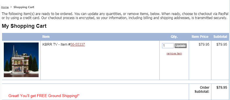
Snapshot of shopping cart header, which reads, “The following item(s) are ready to be ordered. You can update any quantities, or remove items, below. When ready, choose to checkout via PayPal or by using a credit card. Our checkout process is encrypted, so your information, including billing and shipping address, is transmitted securely.” Source: Fitzulas.com.
While the instructions listed in the above example are explicit, they talk “to” the shopper.
Instead, try this.
The following item(s) are ready for purchase. After making any necessary changes, choose to checkout via PayPal or with a credit card – our checkout process is encrypted, so all information is transmitted securely.
There are times when you’ll want to mix the two, like we did in the mini-cart, below, on the first page of checkout. This provides details the shopper needs to know (his shopping cart contents), and a link to edit his cart. “I’m ordering…” would not work here.
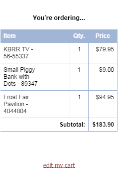
“You’re ordering” works better in this case than “I’m ordering.” Source: Fitzulas.com.
As for that final submit button? The word submit is so vague it likely doesn’t get anyone excited to make that final click. Consider “Place Order” or “Place My Order”.
Make it easy to self-serve after checkout with links that read “My Order Status” and “Track My Order”. These should be included in the email confirmation as well as on “My Account” pages.
Remember to Test
You’ll want to A/B split test any changes you make on your calls to action, no matter how minor. If your shopping cart solution does not currently allow for this, be sure to watch stats closely prior to and after making alterations. (You should always be able to quickly roll back changes.) You’re looking for increases or decreases in conversions of each button. Keep in mind that colors play a role as well, which means that a decrease may not necessarily mean word choice is bad. Test, test, test.
Which brings me to one, final point. If it doesn’t sound right when you say it out loud, it probably isn’t. That’s why using template questions of “I want to” and “I want you to” is key. The call to action is only completing the sentence, which makes it easy to determine which directives to change.


