A company logo is often the face of the business. While logos come in a variety of styles, a strong logo will adhere to certain basic principles. Strong logos are unique, balanced, easily identifiable, simple to understand, and easy to read — if they include text. Logos should also be scalable and presentable in both color and black and white.
Logos generally fall into one of three categories: iconic, logotype, or a combination of both. Iconic logos use simple images without that require a strong brand identity linking the image to the business without the use of text. Logotype logos use stylized text or custom fonts to present the business name. Combination logos use both iconic imagery and logotype to build the logo.
Here are 25 excellent examples of corporate logos.
Iconic Logos
Iconic logos must be strong enough to connect the logo to the brand without the use of text. A strong iconic logo has very high brand equity.
Nike logo.
The Nike “swoosh” logo is one of the best examples of iconic logo design and a testament to brand building. The swoosh has no inherent meaning, but is indisputably tied with the Nike brand.
—
Apple logo.
The Apple logo is another example of strong iconic logo design. The Apple logo is immediately tied to the Apple brand even without any text to link the two together.
—
NBC logo.
The NBC logo also utilizes negative space to create the neck and beak of the NBC peacock.
—
Shell logo.
—
McDonald’s logo.
McDonald’s uses its “golden arches” as both an iconic and combination logo.
—
Playboy

Playboy logo.
—
The Olympics logo.
—
Starbucks
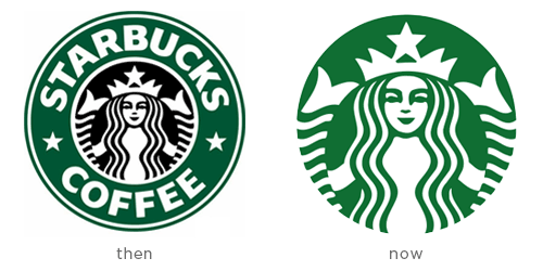
Starbucks logo.
Starbucks recently redid its logo to be purely iconic, dropping the “Starbucks Coffee” text from the logo.
—
Logotype Logos
Often the name of the business alone is not enough. Logotype logos have the challenge of using text in a unique way that a brand can be built around. Custom typography becomes especially important with logotype logos.
Dell logo.
The skewed “E” in “DELL” makes this logo unique enough to stand apart from other logos, while remaining simple and easy to read.
—
CNN logo.
—
Microsoft logo.
Subtle changes to the Microsoft typography help build a brand identity around an already prominent name.
—
eBay logo.
—
Mountain Dew logo.
—
Disney logo.
The Disney “signature” logo is a fantastic example of unique logotype logo design. The script typography has enough quirks to stand out from other handwritten fonts, while remaining easy to read.
—
Exxon logo.
—
Google logo.
—
Combination
Combination logos combine iconic imagery with text. This is perhaps the most common type of logo and can sometimes act a stepping stone towards iconic logo design — take the previously mentioned Starbucks logo as an example.
UPS logo.
Though shown here in full color here, the UPS logo could function as both a two-color and one-color logo.
—
Best Buy logo.
—
Pizza Hut logo.
—
Elmer’s logo.
—
Negative Space Logos
The use of negative space has become an especially popular trend in logo design. By utilizing negative space, a logo can display multiple images at once without becoming cluttered. Clever use of negative space is also an excellent way to make a logo more memorable.
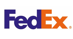
FedEx logo.
One of the more famous and subtle uses of negative space in logo design, the FedEx logo has a forward arrow located between the “E” and “x”.
—
USA Network logo.
—

Wine Forest logo.
—
Spartan Golf

Spartan Golf logo.
—
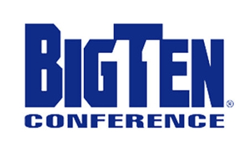
Big Ten Conference logo.
Though the Big Ten Conference unveiled a new logo last year and though it now accommodates 12 schools, its previous logo included a negative space “11” to indicate the 11 schools of the Big Ten Conference at the time.
—
Simple But Elegant
Note how each of the logos above is simple without being overbearing, yet unique enough to be easily distinguishable. Each logo also works in color or black and white, an important consideration for branding across different media.
Logo Redesigns
Corporations sometimes update their logos to be more current or to follow logo trends. This should be done carefully, as you can inadvertently discard brand equity by too drastically changing a logo. The Pepsi logo redesign in 2009 and the GAP logo redesign in 2010 both came under fire for moving too far from the old brand. After much criticism, GAP abandoned its new logo within a week.

Gap logo: Redesigned logo on right.
If you decide to revamp your logo, take care not to accidentally discard brand equity and design with the future in mind. If a logo is indeed the face of a business, it should be given much careful consideration.


