Editor’s Note: This article was originally published by Web Marketing Today. Practical Ecommerce acquired Web Marketing Today in 2012. In 2016, we merged the two sites, leaving Practical Ecommerce as the successor.
Web design trends are never static but change constantly. Here are six new trends that you can expect to see in 2016.
1. Death of the Rotating Banner
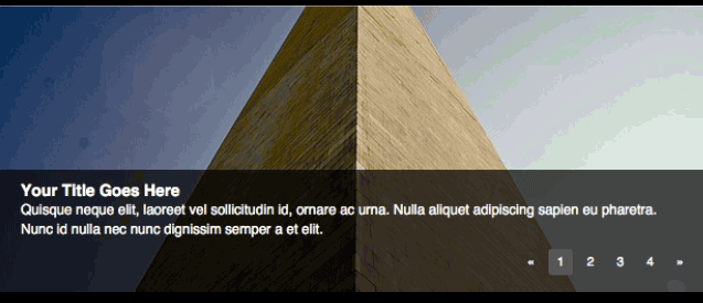
Many websites have utilized rotating banners over the past few years as a way to provide imagery, movement, and content on a home page while not overwhelming users with too much material on their first view. It is becoming more apparent, however, that people don’t notice the banners and will, consequently, skip the content.
Studies show that a phenomenon known as “banner blindness” has developed in most users as a result of the saturation of online advertising. Expect to see these banners replaced by full-screen backgrounds or videos that focus on providing general context to visitors instead of trying to communicate specific information.

Expect to see rotating banners replaced by full-screen backgrounds or video.
2. Blending Mobile and Desktop Patterns
Many companies spent this past year rolling out responsive websites to ensure users had a consistent experience on desktops, tablets, and mobile devices. If 2015 was the year of mobile growth, 2016 will be the year of blending elements typically seen on mobile devices with desktop designs.
This trend has already begun to appear on DIY web design platforms like Squarespace, through its use of the traditionally mobile-only navigation method known as the “hamburger” menu, which references a menu icon with three horizontal lines. This technique can be useful if your goal is to drive people to a small set of pages while all additional pages are secondary.
Squarespace uses mobile navigation on both desktop and mobile versions.
It can also be risky, however, as studies show that some users don’t recognize the hamburger icon as a menu button. You can fix that by adding the word “Menu,” making the icon’s purpose more readily apparent.
3. Long Scrolling
The term “above-the-fold” is a holdover from the newspaper industry to indicate the content that is visible without opening the paper.
This concept has dominated web design for years, but with the advent of responsive web design, many are ignoring this caution in favor of sites that require scrolling.

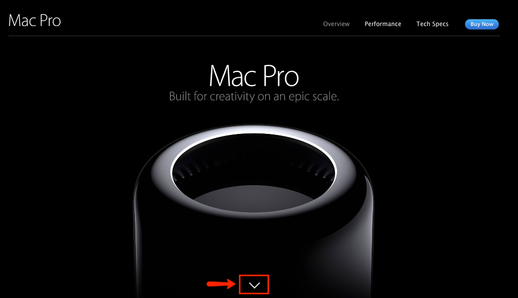
The Mac Pro site uses long scrolling. An animated arrow indicates there is more content to view.
Long scrolling sites have become especially popular due to the emergence of countless WordPress themes designed with one-page use in mind. Unfortunately, it is not a concept that we can abandon just yet.
While site visitors will scroll to see more content, they need a compelling reason to do so. This means using a design element or storytelling device to indicate that more information is available below the fold.
(It’s worth noting that a study by Nielsen Norman Group showed that elements above the fold were viewed 102 percent more than the elements just below the fold.)
4. Animations and Micro-interactions
After the drop in usage of Flash on many websites, designers began to seek ways to continue the practice of animations.
CSS has evolved, so many Flash-only animations have become cross-browser supported in CSS3. These small animations paved the way for designers to include more “micro-interactions” on their websites.
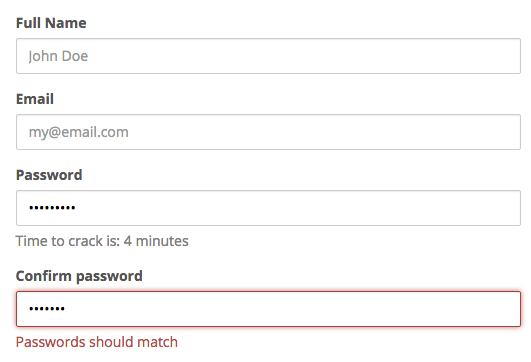
Micro-interactions are small actions that a website visitor starts, which triggers an animation or movement that provides feedback to the user. Examples of micro-interactions include a signup form that changes colors to indicate the strength of a password or a paragraph of text that expands when clicking the word “more.”

This signup form uses micro-interactions to indicate password strength.
Many websites have added these types of elements to help users interact with the site and gain better feedback on their actions. Expect more designers to start finding ways to bring animations and interactions into websites, now that it is easier to do.
5. Cookie-cutter Design
One negative trend, brought about by the spread of low-cost templates, is sites that look remarkably similar to each other, except for differences in colors and graphics.
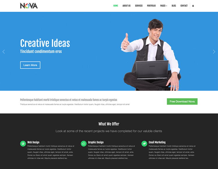
For example, having a large “hero” image (a large banner image, prominently placed on a web page) and three smaller features, located beneath the image, have become standard on so many sites that these patterns are beginning to lose their effectiveness.

Cookie-cutter design themes have lost their effectiveness.
To stand out visually, many sites have adopted the use of either a full-screen hero image or video background, but it can be very easy to confuse a given site with others that utilize the same technique.
As such, design your site in a way that you don’t fall victim to similar patterns being used over and over.
6. Deeper Focus on Content
Businesses are finding ways to bring quality content to the forefront, to drive engagement.
Not only are companies developing more text content for people to read but are also focusing on content that users seek out, such as “explainer” videos, which demonstrate how to best use their products. Other forms of content include whitepapers, case studies, infographics, research studies, and, in the example below, recipes.
The ultimate goal is to provide users with information that they are already looking for, to increase brand loyalty and affinity. This also means that website design will need to adjust to provide better reading experiences through the use of larger type or the creation of landing pages where users can request content.


