The Boulder Running Company is a Colorado-based specialty retailer with three stores across the Front Range. It has been operating an e-tail store since 2006. Director of ecommerce Jason Halberstadt explains that the company’s biggest challenge is getting consumers to move beyond the shopping basket and he has requested this review.
When doing a “Conversion Review,” we visit the website as if we were a potential customer and assess how well the site does at converting visitors into buyers. For this review, I’ve assumed the following scenario: “I don’t know a lot about shoes but I want to get into running, so help me choose the right shoes for me.”
First Impressions: Am I at the Right Place?
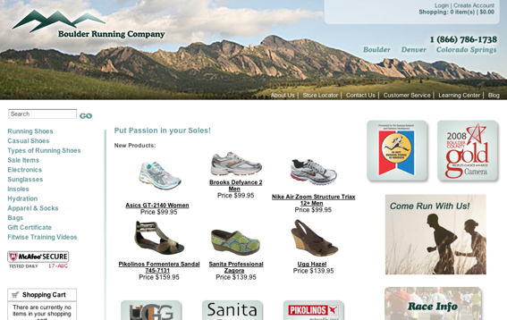
When I first land at the site I do not get the feeling that I’ve landed at the right place. It feels quite “budget” and it is not at all clear that this is a specialty running company. Most of the products presented are not running shoes, but rather women’s casual shoes and boots. Furthermore, the home page lacks any emotive or persuasive imagery, such as photos of people enjoying running.
It’s important to make your home page simple and with clear pathways to product and information. After closer inspection, I see many of the required elements are, in fact, there (i.e., new products, description of the store, and running shoe brands), but they just aren’t arranged in a meaningful way. Rearranging the content on the home page with a greater emphasis on the products would encourage customers to explore.

Boulder Running Company home page.
Do I Trust This Company?
It’s not immediately obvious this is a trustworthy company, although there is a phone number and links to physical store locations at the top of the page, which are good. But, an online store needs a lot more to inspire trust and credibility. For example, it can include testimonials about service, privacy statements, or number of years in service.
After reading very small text at the bottom of the home page, I find out that the company has been in business for over 12 years, and has been consistently top-rated in an independent competition between 40 stores on its customer service, friendliness, knowledge and professionalism. This is a great selling point that conveys trust and it should be better promoted.
Can I Find the Right Product?
Because I don’t really know what I’m looking for, I went into the types of running shoes available and I’m presented with three options that I don’t understand, since, in this scenario, I know little about running. In small red text there’s a link to help me select a good shoe, so I click that and I’m transported to a large page of very small text that felt more like a terms-and-conditions page and was otherwise quite intimidating. As someone who is exploring products and needs help, I found the site unhelpful. It would help to have user-friendly guides that explain the different types of running shoes and how they match to the different types of running activity.
When browsing products, I had a similar difficulty, as the category and product pages give no indication of what running application the shoes are suited to (e.g., track, road, cross-trail, and so on).
Will I Get Good Service?
If I were to buy some running shoes, do I know how long they will take to arrive? How much I will pay in shipping? And what would I do if I were not happy with them?
The company does provide free ground shipping (conditional), a range of other shipping options, and a 30-day, money-back guarantee policy. All of this is great, but it’s not easy to find or understand as the information is not prominent, buried and somewhat confusing.
The product pages could provide much better emphasis on shipping and returns, and the relevant information could be rewritten with a greater emphasis on explaining shipping and returns in simple, plain-English terms.
How Easy Was It for Me to Buy?
The most important part of any store is the actual checkout process, so it’s important to make it quick and painless. Once I’ve added an item to my shopping cart, I can keep browsing the site, but I found getting back to the shopping quite difficult. The problem for me was that, when navigating running shoes, the expanded side navigation on the left pushes the shopping cart panel below the bottom of the screen and hence it could not be seen. This could explain why the Boulder Running Company is experiencing a problem with people not moving beyond the cart. Placing access to the shopping cart in a prominent and consistent place, such as top right, should improve things considerably.
The checkout process also had a number of potential barriers, including a start page that gives options to register, check out as a guest, or sign in as an account holder. Simplifying this step to two options, and leaving the option to register to a later step, would be beneficial, as there’s less thinking to do for customers who just want to get on with their transactions.
I also found the Order Summary and Payment page to be unwieldy. This step focuses on obtaining payment, and therefore this page should be redesigned to make it really easy to do just that.
Conclusion
Boulder Running Company has good products and is otherwise a credible company that knows its stuff about running. But the current site is not taking advantage of this expertise and is losing potential customers who visit it. Quick wins would be gained from redesigning the home page and moving the cart panel. Further improvements would be gained from providing better product selection and help guides, improving shipping and returns information, and removing barriers in the checkout.
Request a conversion review by emailing conversion@practicalecommerce.com.


