Merchants have options when it comes to mobile optimization. Although W3C has released a list of best practices for the mobile web, there are many different ways to implement them.
Experts sometimes recommend developing a separate mobile-optimized site with different content and serving that content to mobile users automatically via a user agent that detects whether the user is on a mobile device or not. But what if you want to use just one site that is accessible to all users?
Some businesses are making use of this strategy, optimizing their current sites for mobile without serving unique content. If done correctly, it can make a better user experience than some exclusively mobile sites.
Custom Direct
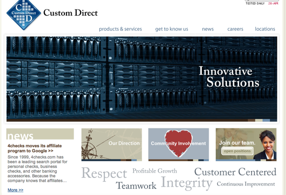
Custom Direct, regular site.
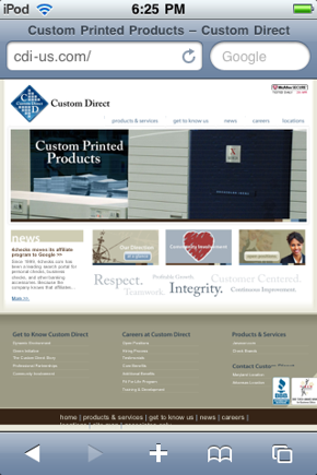
Custom Direct, mobile site.
Custom Direct is a custom printing business with locations in Maryland and Arkansas. Its main site is also its mobile site, although you might not guess from its ease of use. Several large images are present on the homepage, and yet there is enough room for them and fairly legible header tags to fit on the homepage without zooming. In general, this site does a great job of balancing the needs of mobile and computer users.
Navigating the site is simple, and it requires very little zooming or scrolling. The traditional site uses beige sidebars, and removing these from the mobile site centers the most important content. The images load well, and the menu options are all of a legible size. Most users (at least those with good eyesight), can read them without zooming in any further. And as a purely aesthetic note, the watermark words outlining the company’s values are a good way to fill white space.
Cold Air Products
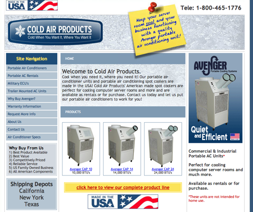
Cold Air Products, regular site.
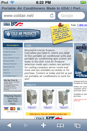
Cold Air Products, mobile site.
Based in Norfolk, Va., Cold Air provides portable air conditioners and other cooling products. Its site is definitely more appealing to computer users, yet not at the expense of mobile. The company posts its hyperlinked toll-free number at the top of the page, which makes placing a call on a mobile device simple. The “Welcome” section on the home page has large enough text that mobile users won’t be frustrated trying to read it.
In general, there is a little too much information on the site for a mobile user, especially on the homepage. Cold Air Products might have a more mobile-friendly site if they were to cut the lengthy product description from its homepage and remove the blue sidebars on either side. These simple changes would greatly contribute to a positive mobile browsing experience.
OneUpWeb
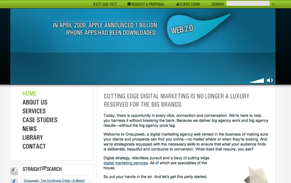
OneUpWeb, regular site.
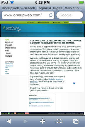
OneUpWeb, mobile site.
OneUpWeb is a Michigan-based digital marketing company, specializing in social media, SEO, PPC and other marketing services. Its site provides an excellent example of what to do with a Flash graphic that will not load on Apple products—turn it into an image. On the standards home page, a Flash animation introduces users to the company and its services. The mobile homepage shows this graphic converted to a header bar with the company’s logo in the upper left corner.
This is much better than the standard “plug-in failed” image that shows up whenever iPhone, iPad or iPod Touch users attempt to view a Flash graphic. You can see this blue cube graphic on the lower right part of the site, where another Flash graphic failed to load on my iPod Touch. This exemplifies how designers should utilize Flash where it is useful and abandon it when it is not.
Again, a large font enables users to view the site without excessive zooming or scrolling. The left menu and even the body text are legible (at least to someone with 20-year-old eyes) without zooming in at all. Again, a phone number is present at the top of the page. I also like how there is a social media menu below the main menu. Mobile users spend quite a bit of time on social networking sites, so this is another good way to appeal to their interests and provide an easy way for them to stay updated with your company.
Counterexample — Ramada
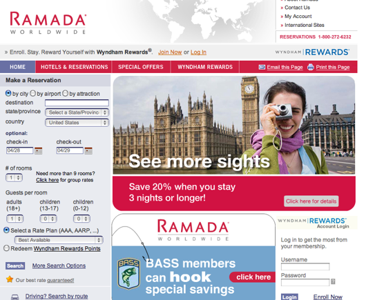
Ramada Hotels, regular site.
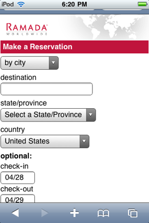
Ramada Hotels, mobile site.
Ramada, the hotel chain, may have been better off sticking with its traditional site than using the mobile site they developed. It’s a good thing they have a link to their main site visible on their mobile home page. While the site is easy to navigate, it’s because there is very little to it. After messing around with the reservation tool and its multitudinous menu options, I decided if I were to book a Ramada reservation, I would much rather do so by phone. In this case, Ramada’s needs probably did not call for a separate mobile site.
Summary
As mobile continues to expand and develop, best practices will become more apparent as developers learn user preferences and address usability and security concerns. However, merchants should keep in mind the possibility of making a few minor design tweaks to their existing site and serving it to their mobile users.


