
Responsive design was conceived a couple of years ago to allow users to view websites across all devices — computers, tablets and smartphones. Since then, large sites like Starbucks and Boston Globe have adopted responsive design. But adoption by the small business community has been low, due presumably to (a) lack of understanding and (b) the initial investment required.
In this article, I’ll explain responsive design and describe how a small business can get started.
Benefits of Responsive Design
Responsive design adjusts a single website based on the device used to access the site. This is accomplished using cascading style sheets, which can automatically detect the screen size and adjust the output accordingly.
This leads to several benefits.
Saves money. Instead of building separate sites to support each device — laptop, iPhone, tablet — a single site can be designed and developed to support the current and future devices. This not only reduces development costs but also the operational costs of maintaining multiple sites.
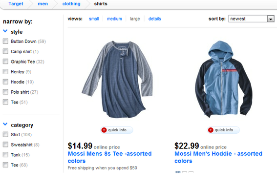
Take the example of Moises Wines, below.

At full size, the Moises Wines site shows images in several columns, and features a photo of vineyards in the background.

On smaller screens, photos are compressed into fewer columns.

At its minimum width, the Moises Wines site shows only a single column of photos, and no longer highlights the background image.
Note the same content and images for MoisesWines.com are reformatted to adjust to different device widths.
Improved search engine optimization. In “SEO Benefits of Responsive Web Design,” we explained how responsive design can improve search engine rankings. Having a single consolidated site can result in that site ranking higher and getting more traffic.
Consistent user experience. Since the same user experience is adjusted across all devices, it presents a consistent appearance to your visitors. This helps them navigate the site in the same familiar fashion, regardless of the device they are using.
Higher conversion rate. Support for all devices, ranking higher in search engine results, and a consistent user experience will result in higher conversions, as consumers will be able to engage better with your site using their devices of choice.
Integrated analytics. Responsive design uses a single site to serve all devices, resulting in the ability to build integrated analytics reports — from different devices. This leads to better management of the site and better measurement of the results from cross-channel campaigns. It allows a business to define a single set of key performance indicators to measure across the board, for all devices.
Responsive Design: Planning Considerations
The benefits from responsive design are many. But it also requires careful consideration and planning.
Separate mobile functionality. There are instances when consumers prefer the mobile site having separate functionality from the main site. A good example is the store locator function that is accessed more frequently from smartphones. Hence the smartphone site might be designed to highlight the store locator functionality, and hiding sections that are not typically accessed, like corporate information.
In some cases, customer expectations will drive the creation of a separate mobile app that utilizes the native features of a mobile device. The example below shows how Target has built a separate mobile app to offer more focused functionality for the mobile consumer; note no filtering options on the left.
Target’s website offers a full range of options.
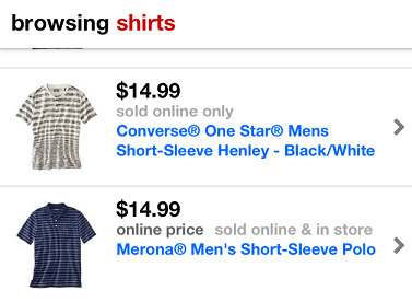
Target’s mobile app offers a simpler, more streamlined experience.
Ad revenue. Advertising platforms are adapting to responsive design, such as offering contextual advertising depending on the device used to access the site. At a minimum, to avoid impacting the ad revenue from your site, ensure the ads are displayed appropriately across different devices. For example, if an ad appears near the top of the larger site, ideally it should appear near the top when accessing it from a mobile device.
Support for older browsers. Responsive design is based on new CSS techniques that are not supported on older browsers, such as Internet Explorer 6 and older. There are, however, workarounds to this. Determine if your customers use older browsers that do not support, by default, responsive design. Then incorporate these workarounds as part of your responsive design effort.
Requires investment. Responsive design will save your business money in the long run. But in the short term it requires an investment to build the site, test it on different devices, train your team to author content for all devices, and otherwise manage it all. Some businesses try to transform their existing sites by converting one page at a time to be responsive. That, in my experience, ends up being more challenging, as customers could get a broken experience, with only a subset of pages working on their devices. Moreover, some pages may not align with the rest of the site because of the changes. It is always better to approach responsive design as a ground up, comprehensive effort.
Getting Started with Responsive Design
Before you decide to implement responsive design, review your visitors’ needs and the devices they are using to access your site. Your web analytics reports should provide you with device details. Based on these inputs, decide whether or not to support responsive design. If yes, list the devices that will be part of the testing effort.
Then, engage your team of designers or your design agency to start planning the development. This will help you estimate the investment required and how you can launch the full design. If the investment is within your budget, then move forward. But remember, you would not implement responsive design because it is cool or works on all devices. You would do it to serve your customers.


 AI Visibility Scores Are Useless
 A Subtle Google Ads Bidding Change
 New Ecommerce Tools: July 7, 2026
 RCS or SMS? It Depends on the Task
 New GA4 Channel Tracks AI Traffic
 New Ecommerce Tools: July 22, 2026