
Smart phones are everywhere. And — for many ecommerce merchants — it is not enough to have just an ecommerce website. They want an ecommerce mobile site, too.
In this article, I have collected ten examples of what I believe are effectively designed mobile ecommerce designs, as viewed from a smart phone. I hope that reviewing these mobile ecommerce sites will inspire you as you open your own mobile ecommerce store.
1. Threadless
A well designed mobile website should look different, but not necessarily require a separate platform or backend. When you visit the Threadless site from a mobile phone, you are seamlessly shown the mobile version of the site.
It is also noteworthy that Threadless does not just show you text and links. Rather its mobile site is full of rich images.
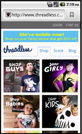
Threadless home page on a smart phone.
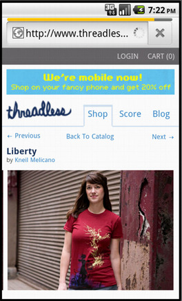
Threadless product page on a smart phone.
2. Cheapflights
The Cheapflights’ mobile website puts search front and center and makes great use of finger-friendly buttons. I also like that the site gives me the option to view the desktop version.
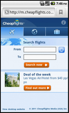
Cheapflights home page on on a smart phone.

Cheapflights search results on a smart phone.
3. Under Armour
Under Armour’s mobile site is a nice example of good mobile navigation and photography use. It is important to remember that you won’t sell products that mobile shoppers cannot see.
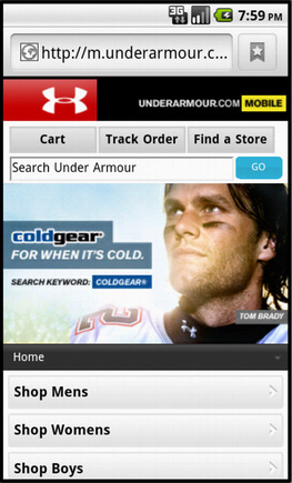
Under Armour home page on a smart phone.
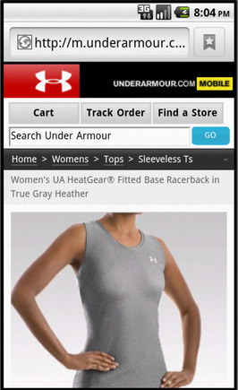
Under Armour product page on a smart phone.
4. eBay
eBay, the auction king, knows a thing or two about presenting products on mobile devices. The auto section of the site is particularly good. On my Android, the site was also very fast loading.
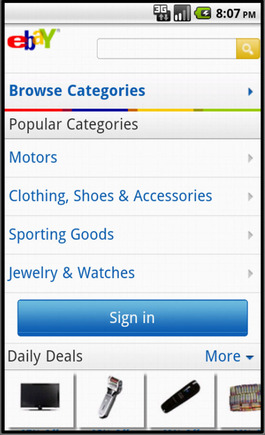
eBay home page on a smart phone.
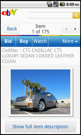
eBay search results page on a smart phone.
5. Juicy Couture
If your brand is hip and fashion forward, your mobile site needs to convey those qualities. I like Juicy Couture’s mobile site because it is an excellent extension of the company’s brand.

Juicy Couture home page on a smart phone.

Juicy Couture product page on a smart phone.
6. Costco
Best known for its massive brick and mortar stores, membership fees and discount prices, Costco also has a fast-loading mobile site.
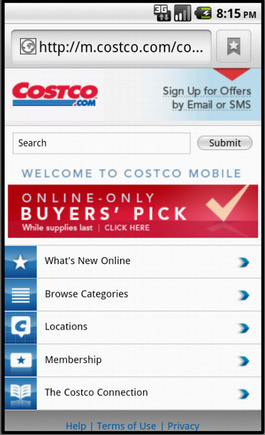
Costco home page on a smart phone.
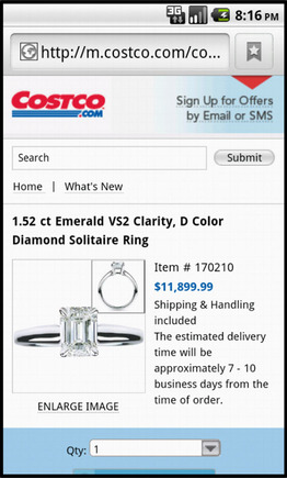
Costco product page on a smart phone.
7. Petco
Petco’s mobile site demonstrates that you can — and perhaps should — be willing to show your logo large. The site’s got “Petco” relatively big and bold throughout. Petco also makes search a priority.
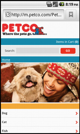
Petco home page on a smart phone.
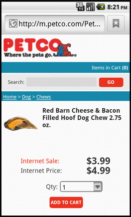
Petco product page on a smart phone.
8. Neiman Marcus
Neiman Marcus places an offer on the home page of its mobile site. This offer includes a brand-consistent photograph. Once inside the site, you find excellent labels and layered navigation.

Neiman Marcus home page on a smart phone.

Neiman Marcus product page on a smart phone.
9. Best Buy
Best Buy uses nearly identical icons and images on its desktop and mobile sites. The uniformity of design and navigation means that customers familiar with the company’s website will feel right at home on the mobile site.
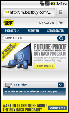
Best Buy home page on a smart phone.

Best Buy product page on a smart phone.
10. Pottery Barn Kids
The Pottery Barn Kids mobile site uses sliding tabs on its product pages, making them load faster while still providing all of the information a shopper needs to make a good buying decision.
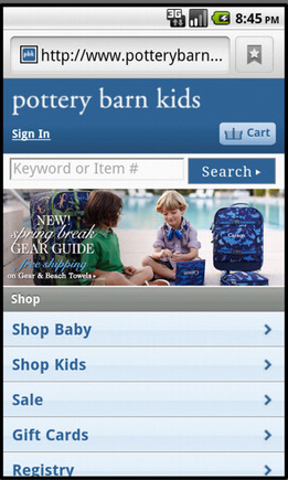
Pottery Barn Kids home page on a smart phone.
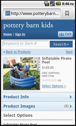
Pottery Barn Kids product page on a smart phone.


 Hostinger Reframes Site-Free Ecommerce
 AI Visibility Scores Are Useless
 New Ecommerce Tools: July 1, 2026
 India Ecommerce Paths for Foreign Sellers
 New Ecommerce Tools: July 7, 2026
 AI Forces Affiliates to Innovate or Die
 SEO for AI, Low Traffic, No Clicks