Charts and maps can increase the effectiveness and expressiveness of data. Microsoft Excel in 1985 was the first of many visualization tools to help communicate data, such as big-picture executive-level reports and detailed weekly dashboards.
Many visualization tools have emerged since then. In this article, I will evaluate three of them — Excel, Tableau, and Datawrapper — based on (i) pricing, (ii) level of training needed, and (iii) ability to generate professional-level charts quickly.
To illustrate, I’ll create the same graph on each of the three tools based on a Statista data set, below.
| Ecommerce Platforms Global Market Share (Source: Statista) | Market Share % April 2020 |
|---|---|
| WooCommerce | 28.24 |
| Squarespace Online Stores | 17.69 |
| Shopify | 10.98 |
| MonsterCommerce | 5.99 |
| WixStores | 4.6 |
| Magento | 3.44 |
| 100sklepow | 3.37 |
| Weebly eCommerce | 2.25 |
| SAP Commerce Cloud | 1.6 |
| OpenCart | 1.6 |
Microsoft Excel
Microsoft Excel is widely used for data visualization. Here is how I visualized the data after a bit of editing.
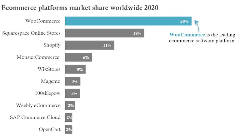
Microsoft Excel is widely used for data visualization. Its price, via Microsoft 365 Business, is affordable for most any business.
- Pricing. Microsoft 365 Business is inexpensive compared to other tools. The price is $5 to $20 per user per month with an annual commitment. The $5 option includes Excel, Word, and PowerPoint. The higher-end versions also include Outlook, Publisher, and Access.
- Level of training needed. Most office-type employees have at least a basic knowledge of Excel. They might not know how to create dashboards or an interactive visualization, but they are likely familiar with the process of generating charts.
- Ability to quickly generate professional charts. The default Excel charts are outdated and tend to be cluttered, include redundant design elements and low-contrast colors, which are inaccessible for visually-impaired users. One can always customize and improve the design, however, but it requires more effort.
Tableau
Tableau was founded in 2003. It quickly became a data-visualization leader and innovator. Tableau is the leading business intelligence software, with, reportedly, at 12.3 percent U.S. market share. Tableau’s software resides on a user’s computer. There’s also a cloud-based version.
Here is the same Statista data in Tableau, visualized almost identically to the Excel version, above.
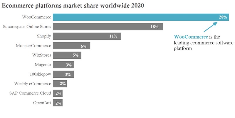
Tableau is the leading business intelligence software. The tool is robust and relatively easy to use.
- Pricing. Tableau offers three pricing options: (i) Viewer is $12 per user per month, (ii) Explorer is $35 per user per month, and (iii) Creator is $70 per user per month. Note that these prices include Tableau Desktop and Tableau Server. Desktop is the tool to build visualizations; Server is the cloud-based platform to publish and share those visualizations.
- Level of training needed. Tableau is a drag-and-drop tool. It’s relatively easy to learn. Users can drag “dimensions” (qualitative values) and “measures” (numerical values) into the appropriate locations (for colors and shapes) and select a chart from a substantial built-in library. Tableau offers extensive, free online training.
- Ability to quickly generate professional charts. Tableau has many more visualization features than Excel. For example, when the user drags a measure or dimension into the color mark, Tableau automatically recommends an overall color palette with appropriate contrasts. The chart templates are cleaner and better designed than Excel. Users can replicate an Excel chart in Tableau, as in my examples above. The difference is that Excel requires more time in editing and composing charts in terms of color, shape, position, and type.
Datawrapper
Datawrapper is a cloud-based visualization tool with more features than Excel but not as many as Tableau. Here is the Datawrapper version of the Statista data.
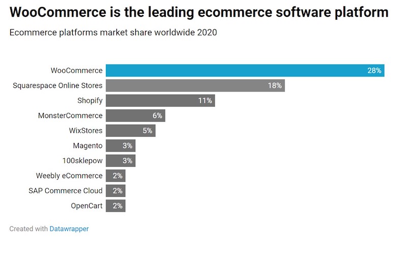
Datawrapper is cloud-based. It has more features than Excel but not as many as Tableau.
- Pricing. Datawrapper offers a free version that includes Datawrapper branding, such as in my example above. The Custom version, without the Datawrapper branding, is €499 per month. The price for the Enterprise version is not published; interested prospects must reach out to the company. The free version has limited design features and fewer chart types. The Custom version is more robust. The Enterprise version offers even more functionalities.
- Level of training needed. I created the chart above in Datawrapper with no training. The process involved four steps, called “Upload Data,” “Check & Describe,” “Visualize,” and “Publish & Embed.” Datawrapper offers support via email. Among the three tools, Datawrapper was the most intuitive and required the least amount of training.
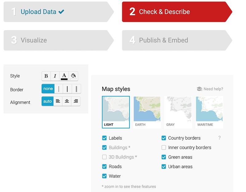
Creating charts in Datawrapper involves four steps: “Upload Data,” “Check & Describe,” “Visualize,” and “Publish & Embed.”
- Ability to quickly generate professional charts. Like Tableau, Datawrapper incorporates compelling design and offers many chart and map options. All visualizations are highly customizable, although the free version is more limited than Custom and Enterprise.