We live in a world of constant information. Our brains are on nonstop overdrive, forcing us to curate whatever is most valuable.
The curating process happens, for the most part, subconsciously. Our minds tend to make micro-decisions by asking a variation of three questions:
- What is this?
- Who is it for?
- What do I get?
Over the years, many theories have surfaced regarding the human attention span. Regardless, external elements distract or direct our minds to the next thing to assess quickly.
Websites don’t escape this process, especially ecommerce sites, since visitors are looking to spend money. Hence merchants would benefit from addressing the three subconscious questions prominently (and quickly) on their home or landing pages.
The key is to eliminate clutter and excess text to guide visitors through the questions without effort.
What Is This?
Does your website answer “What is this?” quickly, without visitors having to scroll or click?
Images carry much importance because humans process visual info faster than text. Nonetheless, our brains naturally gravitate to the most prominent text first.
An excellent example is Jones Bar-B-Q, a family restaurant in Kansas City. The company’s home page nails the “what” through clean imagery and simple, large text.

Jones Bar-B-Q is straight to the point on its home page, using imagery and large text to tell visitors what the company does.
Who Is This For?
Remember, our brains subconsciously seek answers to the three questions to decide whether to proceed. In this fast process of curation, our brains look for cues.
A site’s bounce rates could reflect whether it has addressed the questions for its intended audience.
Content plays a fundamental role, and imagery should resonate with your target age.
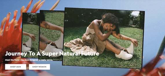
Consider Allbirds, a sustainable shoe company. The images on the brand’s home page appeal to a younger generation — likely Millennials (20s and 30s) or older Gen Zs (20s) — based on aesthetics, clothing, and style of photography.
Simultaneously, the text — “Journey To A Super Natural Future” — affirms the brand’s mission and identity. The shoe categories are based on the user’s identity: Plant Pacer, Wool Runner, and Tree Runner.

The Allbirds home page targets a younger generation — appealing to its target audience based on photography and clothing style.
What Do I Get?
A variation of “What do I get” could be “So what?” as sometimes the benefit is intangible, such as advancing sustainability or an important cause.
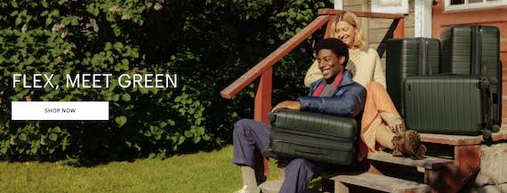
Away, a travel gear brand, uses photos to showcase its products on the home page. And the words “Flex, Meet Green” convey a simple and straight-to-the-point message, addressing what customers receive and why they should care. That text clarifies the benefits — the suitcases are flexible and sustainable.


