I’ve written a great deal about design and functionality and the important role each plays in the usability of an online store. Usability is the driving force behind conversions. Even if you offer free shipping and competitive pricing, if shoppers can’t find what they need, understand the calls to action, and complete the checkout process, nothing else matters.
In this article, I’ll focus on product pages — four examples, specifically, that do it right. I’ve been studying online stores for two decades. It takes a lot to really wow me. Use these examples as inspiration for modifying product layouts to increase sales.
Rapha: Cycling Clothing and Accessories
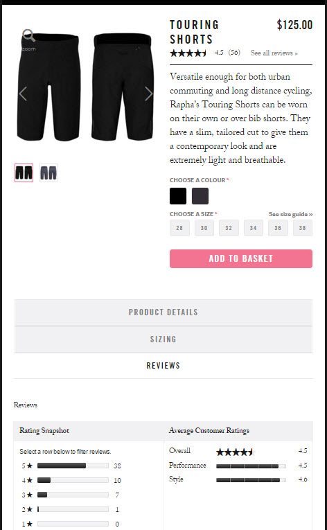
Rapha.cc focuses on simplicity, even when it comes to complicated products. It is one of the cleanest ecommerce sites I’ve studied; its responsive design focuses on conversions. Its product pages use pyramid style formatting — presenting the most important information first. A three-to-four line overview gives a clear idea of benefits, followed by simple color and size selection. More detailed information falls right beneath the core elements, including an easy-to-understand size chart.
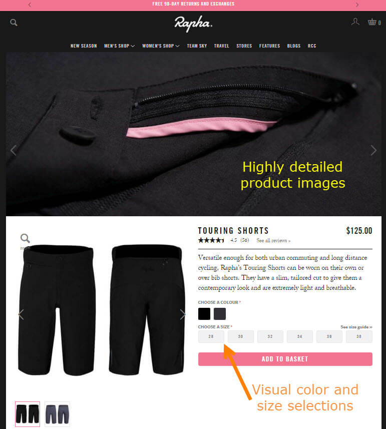
Rapha uses full-page-width photos at the top to really show detail. It also displays all available colors and sizes, versus using pull-down menus.
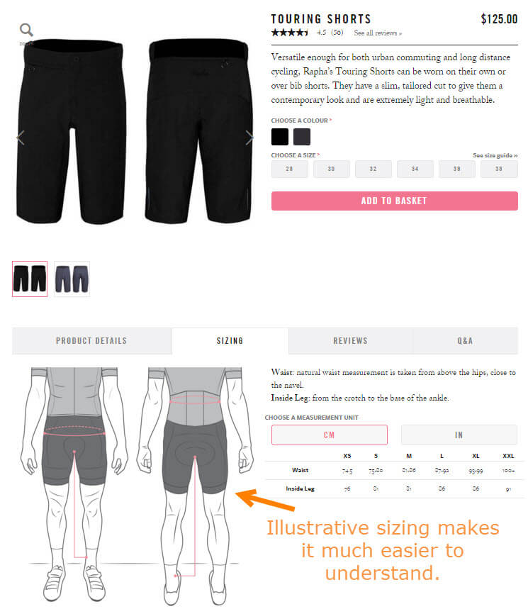
Using illustrations to explain how to measure means customers are more apt to order the correct size.
This site loses nothing on mobile. The responsiveness is so seamless that all pages are instantly recognizable. A shopper can start on a desktop and finish on a smartphone, having never missed a beat.
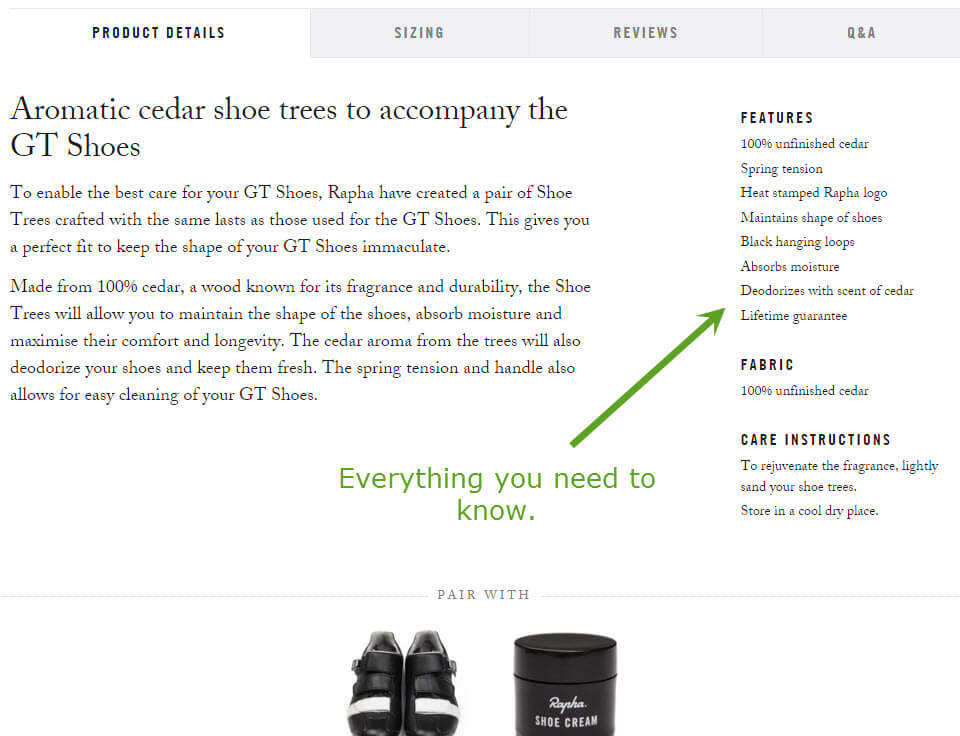
Rapha is also excellent at providing detailed descriptions. Aside from the typical product description, the site also includes lists of features, material, and care.
Fitbit: Activity Trackers
While a corporate site, Fitbit.com’s shopping pages are easy to understand. Simply choose a color or size. What makes this page compelling, though, is the use of simple icons to denote which features are available. These are mostly custom graphics, accompanied by a two-to-five word headline and a sentence of detailed text. Selling points, like free shipping and money-back guarantee, are strategically placed right beneath the add-to-cart button.
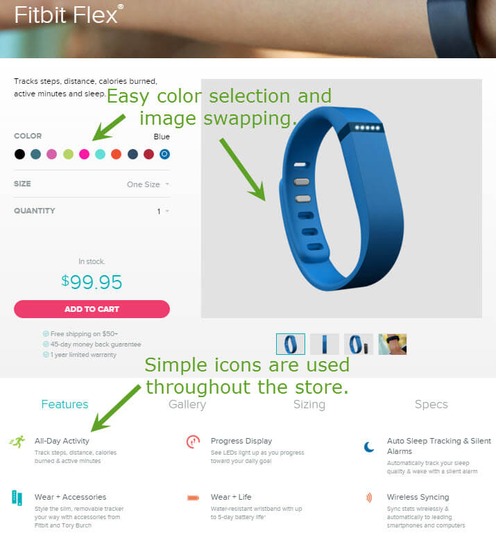
Using icons as bullets makes it easy for shoppers to understand this product’s features.
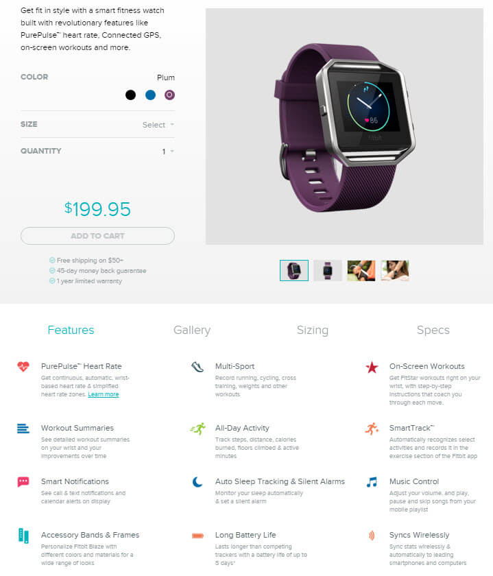
The use of icons and simple text also accommodates those who don’t want to go through a compare product process.
Bellroy: Leather Wallets
You’d think a few pictures would suffice in selling a wallet, but Bellroy shows us all the cool features of each wallet it carries, including just how much it will hold. The top of the page kicks off with a descriptive video, key features, color selection, and alternate images. All this happens above the fold on desktop, and the video slot is replaced by static images on mobile — a good idea as videos should never auto play on smartphones.
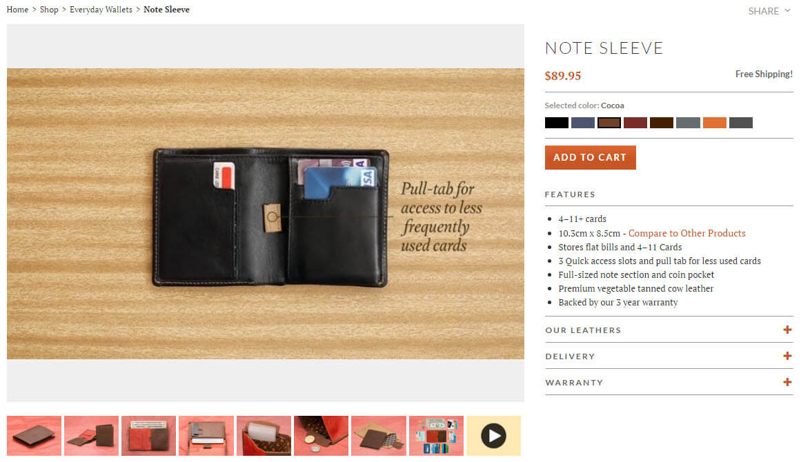
Product videos include text to accommodate those who have the sound off. Bullet-point features tell us exactly what the wallet will hold.
A unique illustration, accompanied by simple yet descriptive text, reinforces the purpose of the particular wallet, followed by a visual confirmation of how much the Bellroy Note Sleeve holds.
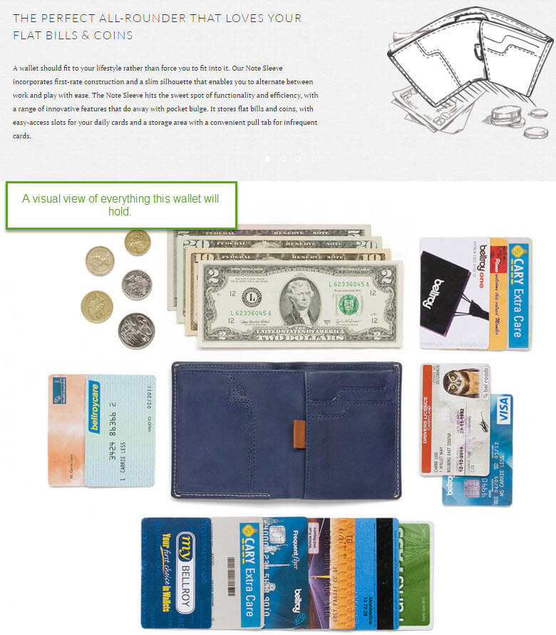
The image of contents capability may seem kind of clunky, but it’s an effective visual to reinforce what can be carried.
By answering the most pertinent questions about products that shoppers would prefer to see in person, you can get a leg up on the competition and close more sales. The more someone understands the capabilities of the item, the more he’s apt to pull out his own wallet.
Firebox: Unusual Products
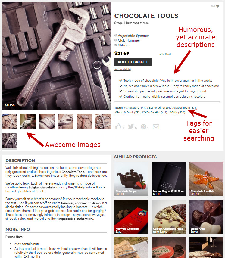
Firebox.com is a good example of how you can sell just about anything online. From a unicorn squirrel feeder to chocolate “tools,” this site integrates humor and stellar imagery to get us to buy things — even a $21.69 chocolate pipe wrench.
Using product tags — i.e., hashtags that link to other sections — Firebox is able to direct shoppers to different lines of products based on specific themes or topics. It’s a good way to introduce other items of interest above the fold without interrupting the current page. If your shopping cart doesn’t support tags, you can get a similar result by linking to all the categories to which a product is assigned.
Proof That Simple Works
While these examples don’t come close to covering all the possible combinations of designs and features, they serve as idea-starters on how even the most niche products can be presented online.
When considering changes, keep in mind that all the sites above (it was hard to narrow my selection down to just four) have something very important in common: they describe to the shopper exactly what he’ll get. They focus on product features at the simplest of levels, and they answer questions shoppers may not even think to ask. If you can do that with your own product pages, you’ll be well ahead of the game.

