Pricing should not be a mystery. Posting clear, understandable prices for the products that your online store sells should be an important part of the site’s user experience design.
In fact, few, in any, shoppers will actually make an online purchase without knowing how much that purchase will ultimately cost. And almost no ecommerce merchant forgets to include a price somewhere in a product detail page layout.
While price is simple and obvious, your online store should not overlook how a product’s price is displayed on your site’s product detail pages. Something as necessary and important as price deserves consideration in an ecommerce design. This includes following broadly accepted user experience best practices as you build price into your product detail design.
You’ll want to:
- Clearly display and update price to make it easy for your visitors to shop.
- Place price and its supporting elements in high visibility areas whether your shopper is using a desktop computer or a mobile device.
- Ensure the text used for the price is readable and accessible, featuring high-contrast colors.
What follows are five tips for your product price design. In particular, these recommendations deal with where to place product price and how product price relates to other elements.
Each of these recommendations comes from widely held ecommerce price-display conventions. But A/B test your layouts to discover what converts best for your business.
Clearly Display the Product Price
Many, if not most, online retail stores either display the product price near the product title or near the add-to-cart button or similar call to action.
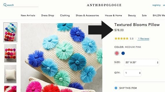
It is a common convention to place a product’s price immediately following the product’s title. This layout prioritizes price.
Designs that display the price adjacent to the title may prioritize price, showing it to shoppers at about the earliest possible moment in the layout, so that the shopper will see the primary product image, the product title, and the product price.
Other ecommerce product page designs place the price relatively near the call to action, which is typically an add-to-cart button.
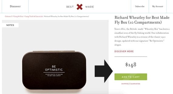
Placing the product’s price near the call to action creates a sort of call-to-action section or component.
Here the aim is to create a sort of call-to-action component that includes all of the information the shopper needs to take the next step toward a purchase.
Some sites will even show the price multiple times, placing it relatively near both of these important elements.
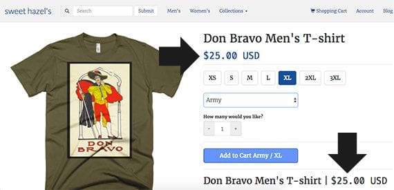
The product’s price can be repeated several times on the product detail page, so it is relatively near both the title and the call to action.
Highlight Any Product Discount
If your store puts items on sale, be clear about the sale price and the discount. An excellent example of displaying product discounts may be found on Joybird, an online furniture retailer. The call to action is for the shopper to begin customizing the chair in view.
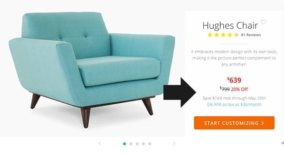
The shopper is given the discounted sale price, the regular price for the item, and the percentage of the discount.
Notice that the customer can see the price she’ll pay, the regular price for the chair, and even the percentage of discount she is being offered. Joybird also shows when the price will expire and offers a financing option.
Show Price Ranges When It Make Sense
Sometimes you will not know a product’s price until a shopper has made some choices.
Perhaps you’re selling a blazer and trousers together. The price of this combination might vary based on size, material, or even color. The most common design solution is to show the range of possible prices from lowest to highest.
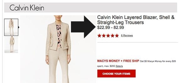
If you do not yet know what the price for a product or group of products will be, show the range of possibilities.
Once the shopper has made a selection, dynamically update the price to reflect what the shopper will pay. Provide a visible cue that the price has been updated.
Offer Shipping Estimates On-page
For many customers, shipping is a part and, well, parcel of the product price. So as you design or redesign your product detail page, consider offering an on-page shipping estimate.
You can find an example of just this sort of shipping cost and speed estimate on Overstock.com. The shopper enters his zip code and the site displays a couple of shipping options along with the cost and estimated delivery date.
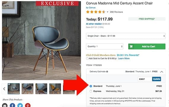
The cost of shipping is a portion of the cost of the product. It can be a good user-experience design to include a shipping estimate new the price on a product detail page.
This user interface makes good sense even if the product is eligible for free shipping since it still provides an opportunity to confirm that the customer knows his complete, all-in price.
In fact, if a particular item includes free shipping or is at least eligible for free shipping, consider including a free shipping message right next to the product’s price.
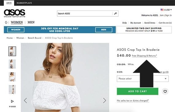
It can be a good practice to put a free shipping message very near to the product’s price.
Allow for Currency Selection
If your ecommerce site sells across borders or otherwise takes payments in several currencies, make a currency selector available to shoppers when they visit a product detail page or even on every page of the website.
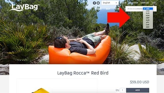
The ability to select a currency is important for a good user-experience design — if your store sells internationally.
In fact, it is common to include the currency selector in the site’s global navigation. When a shopper switches currency, the current product detail page should update to reflect the change.


