I repeatedly encounter the same six issues when evaluating a website’s accessibility, as do most consultants.
I’d like to imagine a world where companies clean up most accessibility glitches in-house and hire consultants only to solve highly technical problems.
Alas, many companies struggle with implementing the basics. Addressing the six common errors below solves many accessibility snafus, greatly helping vision-impaired users.
6 Common Accessibility Errors
The non-profit organization WebAIM periodically analyzes home-page accessibility problems of the top 1 million most-visited websites. The study uses automated testing to identify the number and type of errors.

WebAIM analyzes the home page of the top 1 million most-visited websites for accessibility errors.
As is typical with automated testing, the study catches only about a third of accessibility problems. But it’s useful to identify common errors.
In 2022, WebAIM found that 96.8% of all home pages tested had at least one error, per the Web Content Accessibility Guidelines. It also found that 96.5% of errors fell into one of six types:
- Low contrast text,
- Missing alternative text for images,
- Empty links,
- Missing form input labels,
- Empty buttons,
- Missing document language.
Low contrast text. Using similar colors for background and text lacks contrast. It profoundly impacts online shoppers with color blindness, older visitors with an age-induced vision loss, or even mobile users in bright sunlight.
Color contrast tests apply an algorithm that looks at a metric called “relative luminance,” which attempts to quantify the difference between two colors. When two colors insufficiently differ, the percentage of users who struggle to read the content is significantly higher.
An article on color and accessibility by the Mozilla Foundation is well worth reading.
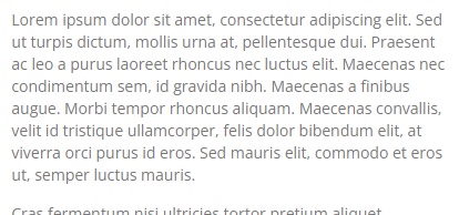
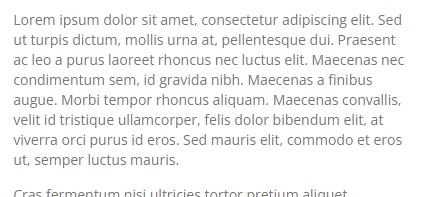
In many cases, you can correct low contrast with a modest change. In the examples below, the fix is a tweak to the text color.

This text fails the color-contrast test. The text color is hex code #777 (a shade of gray) over a background color of #fff (white).
—

Changing the text color to #757575 (another shade of gray) over a background color of #fff (white) enabled this example to pass the color-contrast test.
The difference between these two is barely perceivable visually. But legally, it is significant. Note that low-contrast brand colors are best used as accents, not text.
Missing alternative text. Every image on a web page needs an alt attribute, text representing that image. Not every image needs descriptive text, however. A deliberate empty alt attribute can be appropriate. But “empty” and “missing” are different.
Empty alt attributes appear as alt=””.
The image has a description, which is empty. Screen readers ignore these images. It’s reasonable to decide an image is decorative, requiring no text. But a button, chart, or image of text or numbers is never decorative.
A missing alt attribute means the entire field is not present. Screen readers will generally assume the image is important and will inject its file name as the alt attribute.
To help decide, refer to the alternative text decision tree from the World Wide Web Consortium.
Empty links. Links with no anchor text are “empty.” The above “alternative text decision tree” is the anchor text for that link. The problem of empty links is similar to missing alternative text.
A link forms when the a element is present with an href attribute. Whatever is inside that a element is the text of the link — which is what will read on a screen reader. In the example below, “alternative text decision tree” is the link’s text. I’ve added red for emphasis.
<a href=”https://www.w3.org/WAI/tutorials/images/decision-tree/”>alternative text decision tree</a>
When you link an image — such as a JPG or PNG or a font-based icon — the “text” of the link is the alt text. If the alt text is missing, the link is empty. Screen reader users will know it’s a link but will have no further information.
Every link needs a text label describing its purpose. Hence the alternative text for an image can change based on context.
For example, an image on the product page should have a description of, say, the angle of the item shown. But a product image that links to a product page should have the product’s name.
Form input labels. A website collecting visitor info — a search phrase, credit card number, email address — uses a form and an input. If those input fields don’t have labels, visitors on screen readers won’t know what you’re trying to collect.
But a “label” is more than visible text. It needs a description in the code, such as “Email Address.”
Thus text describing a field doesn’t mean it’s labeled. A field has no label if the text lacks an explicit connection or is a placeholder that disappears inside the form when a user adds the information.
The ideal form field has a visible label inside a <label>The W3C’s Web Accessibility Initiative has an excellent article on labeling form fields.
Empty buttons are the same problem as empty links and missing alternative text. All three lack a textual version of a visual element.
A button or link that is not plain text requires a description or name for a screen reader.
Missing document language. Screen readers speak the language of a page as configured in the visitor’s operating system, applying the appropriate pronunciation rules. Screen readers speak Spanish if visitors use their computers in that language.
The lang attribute is standard in HTML. It tells visiting technology the language of the site. A site in English, for example, should have this root element:
<html lang=”en”>
When present, this attribute informs screen readers of essential pronunciation rules.
A shocking 22.3% of the top 1 million home pages in 2022 were missing this declaration. Most users will never notice the omission. But it makes a world of difference for those who need it — with little effort from a developer.
Finding Issues
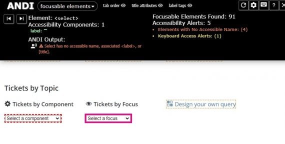
ANDI (Accessible Name and Description Inspector) is a handy tool from the U.S. Social Security Administration that quickly identifies most of these problems.

ANDI operates as a bookmark in your browser and requires just one click to run. ANDI shows incorrectly labeled forms, missing image alt attributes, empty links and buttons, and low-contrast text. Other accessibility testing tools include WAVE, the Axe browser extensions, and Tenon.io, to name a few.
None of the six problems above are difficult to solve. All are readily detectable by automated accessibility tests. So why not fix them before pursuing expert help?


