Ecommerce sites should follow design conventions that shoppers expect, to encourage sales.
Online shoppers expect ecommerce sites to follow certain design and layout conventions, including logo position and function, the placement of product navigation, and the use of a “hamburger” menu on mobile devices. When online retailers follow these conventions, shoppers’ expectations are met and, hopefully, sales follow.
A design convention is simply a description of the way that something, like positioning an element on a page, is usually done. It describes the normal, customary way of laying out an online store. Shoppers come to recognize common design conventions and expect online retailers to follow them.
There are at least seven ecommerce design conventions in wide use this year. If you are designing a new ecommerce store or renovating the one you have, follow these conventions. Creativity certainly has its place in ecommerce website design, and your brand can influence everything from color selection and typography to the product photographs you use.
But as creative as you are, don’t, for example, put your logo on the right or at the bottom of the page. Don’t create an odd, right-hand-side product navigation. Use accepted ecommerce conventions.
To help confirm that the design conventions described in this article are, in fact, widely used and are what your shoppers expect, I reviewed the first 25 online stores listed on the National Retail Federation’s current Favorite 50 Retailers listing of customer-preferred ecommerce websites.
Those 25 sites included Amazon, Walmart, Best Buy, Kohl’s, Macy’s, Target, J.C. Penney, Google Play, Sears, Old Navy, and Nordstrom.
Logo Placement and Function
Assuming that your ecommerce site is displayed in a language that reads from left to right, you should always place your store logo in either the top left or the top center of the page, with the top left position being more popular at the time of writing. Your logo should always link back to your store’s home page.
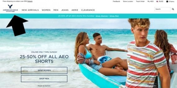
As you would expect, American Eagle Outfitters has positioned its logo at the top left of the page layout. The logo links directly back to the home page.
This logo placement helps shoppers in two ways. First, they know where to look to find your brand identity. Second, it gives them a way to restart a failed search or reorient when browsing took them somewhere unexpected.
Of the 25 ecommerce sites surveyed, all placed the logo either at the top left (22) or top center (3) and all of the logos linked directly back to the site’s home page.
Product Navigation
Product navigation, which typically takes the form of a list of product category names, should either be placed on the left side of the page or in the center or near the top of the page.
Of the 25 ecommerce sites surveyed for this article, eight used left side product navigation and 17 placed the product navigation in the center of the page in the header. The sites that used left side product navigation, including Amazon, tended to have a relatively greater number of product categories.
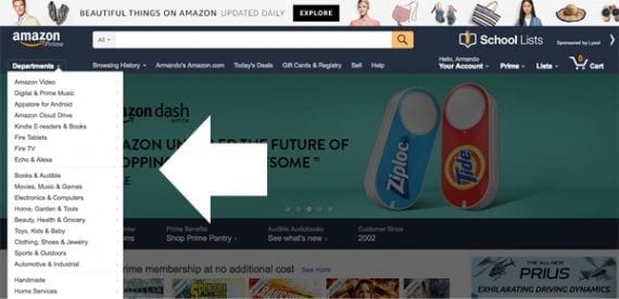
Amazon follows a standard ecommerce site design convention, placing product navigation on the left side of the page. Sites that use left-side product navigation tend to have a relatively greater number of product categories.
Search in the Header
Ecommerce sites should include a search function in the header section of the page layout. Depending on which study you like, somewhere between 40 and 60 percent of online shoppers prefer search to find products.
Every one of the 25 sites surveyed included a search feature in the header section of the page.
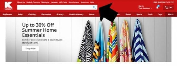
Kmart has placed a large search form right in the page header, just where customers would expect to find it.
Shopping Cart Link or Icon
Place a shopping cart or checkout link in the upper right corner of the page. When shoppers are ready to buy they do not want to have to guess about how to find the shopping cart or basket or bag.

Macy’s shopping bag link is placed just where shoppers expect it to be. Following this convention should make it easier for shoppers to check out when they are ready.
All but one of the 25 sites surveyed placed either a checkout or shopping cart link in the upper right quadrant of the page layout.
Standard Icons and Symbols
Online shoppers have seemingly come to recognize a set of standard web symbols. With some variation, all of the sites surveyed used one or more standard symbols or icons in page design. The most common icons represented search or the shopping cart.
When you need to use icons, use standard web shapes that almost all of your customers will recognize.
L.L.Bean uses standard icons to represent search and the shopping bag.
Product Detail Page Layout
Product images should be placed on the left side of product detail pages on relatively large screens and on top of the page just below the header and product title on relatively small (mobile) screens.
The sites surveyed were unanimous about product image placement.
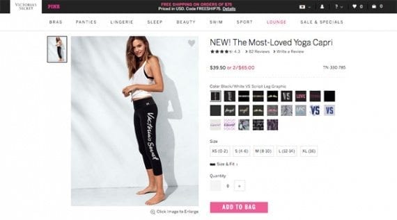
This product detail page design and layout follows specific conventions.
Product information, descriptions, specifications, and similar content should either be placed to the right of the product image or below it.
Finally, the add-to-cart button should be positioned to the right of the product image on relatively larger screens and immediately below the product image on mobile devices.
Mobile Hamburger Menu
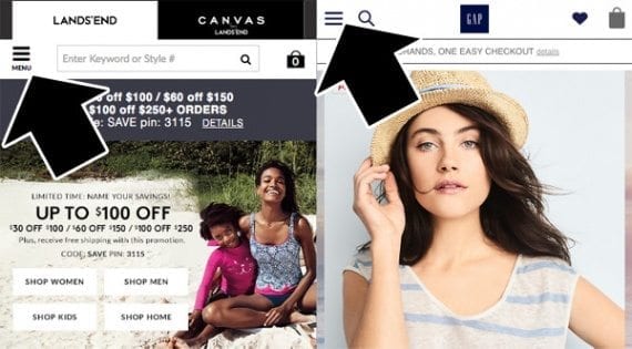
Nearly every site surveyed used a hamburger menu when displayed on a mobile device.
Some 22 of the 25 sites surveyed used the so-called hamburger menu convention when the site was displayed on a mobile device.
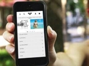
The hamburger menu consists of two or three horizontal lines. When a user taps the menu, a series of easy-to-tap links are displayed. The menu’s purpose is to save space on a relatively small mobile screen.


