Today’s consumers usually start shopping in an online store by typing the desired item in the search tool. Shoppers have learned that most sites are too large to simply browse through the various categories. Shoppers know that search tools are typically robust and fast.
In my experience, however, search tools are not always effective.
I’ve written about this topic before, at “Key Site Search Features that Drive Conversions.” When I researched the topic at the time, I was disappointed by what I found.
This article updates that research, comparing the current state of search on Target.com, Walmart.com, and Amazon. As I describe below, Target.com and Walmart.com deliver the world-class search experience I expect. Target.com delivers more relevant results, but Walmart does a better job of merchandising its search results.
Amazon’s search does not perform like an industry leader. Had I really been shopping, I would have left the site immediately.
The Ecommerce Search Experience
I am a heavy user of search. I rarely use category navigation. Therefore the search experience and results pages need to be feature rich without being cluttered, so I can quickly find the products I’m looking for. At the same time, I prefer quick access to accessories and alternative choices. I expect to find the product I’m looking for within 2 to 3 search refinements.
I expect to have the following features.
- Suggested products as I type my search query.
- Ways to quickly narrow my search to specific categories even before I start to type.
- Faceted search to allow me to further narrow search results by attributes like brand, condition, availability, price, color, size, material, and ratings.
- Well-presented filtering options to further narrow my search by specific criteria.
- Synonyms to assist, if I don’t know the correct name or use different conventions than the store operator.
- Numbered listing of how many products are in a given faceted or results list.
- Sorting options to prioritize results by price, best sellers, and best match.
- Consistent images: size, quality, representation.
- Layout options to choose between a simplified presentation or a more detailed one.
- A way to quickly view more details on a given product without leaving that page.
- A feature to quickly compare items.
- An add-to-cart button — not very common today, I should add.
- Very relevant results if I type in a specific product name, UPC code, or part number.
- Fast results.
- Mobile friendly.
For this article, I searched on “ipad mini retina.” Here are the results and my observations for all three sites.
Target.com
Target’s search tool is prominent. It includes a pull-down menu to choose a category, if desired. Target suggested a very relevant list of terms as I typed in my query. By the time I typed “ipa”, it suggested a list of terms, one of which was “iPad Mini Retina.”
Here are the search results that were delivered in less than a second.
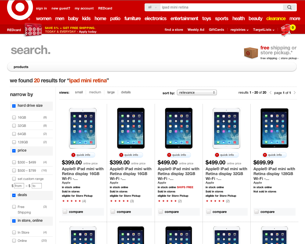
Target.com’s search results for “ipad mini retina.”
First impression. The page layout is visually appealing with large images and an appropriate amount of product information. The results were extremely fast.
Pros
- Target.com produced the most relevant results of my test. Twenty items returned that were all Apple iPad Minis with retina displays.
- Quick and concise filtering in the left navigation to narrow my search by the most common attributes: storage, price, deals, and availability.
- A concise amount of detail offered for each item: product title, price, and a pop-up “quick info” link with more product details and a larger image. An add-to-cart button is on that pop-up.
- An optional sort by various criteria, including relevance (whatever that means), featured, price, best sellers, and newest.
- A compare feature.
- A way to change the view (see “Cons,” below).
Cons
- There are no links to related items or accessories.
- Though there are alternative layouts available, they are really just small, medium, large (the default), and a detail view, which, incidentally, locked my browser and failed to load.
- Google ads below the search filtered in the left navigation and at the bottom of the page. Aren’t there more relevant things Target could come up with like accessories or alternate products rather than encouraging me to leave the store?
Walmart.com
Walmart.com’s search tool is prominent, too. It offers a category pull down to narrow an initial search range. The suggested terms were quick and virtually the same as Target.com.
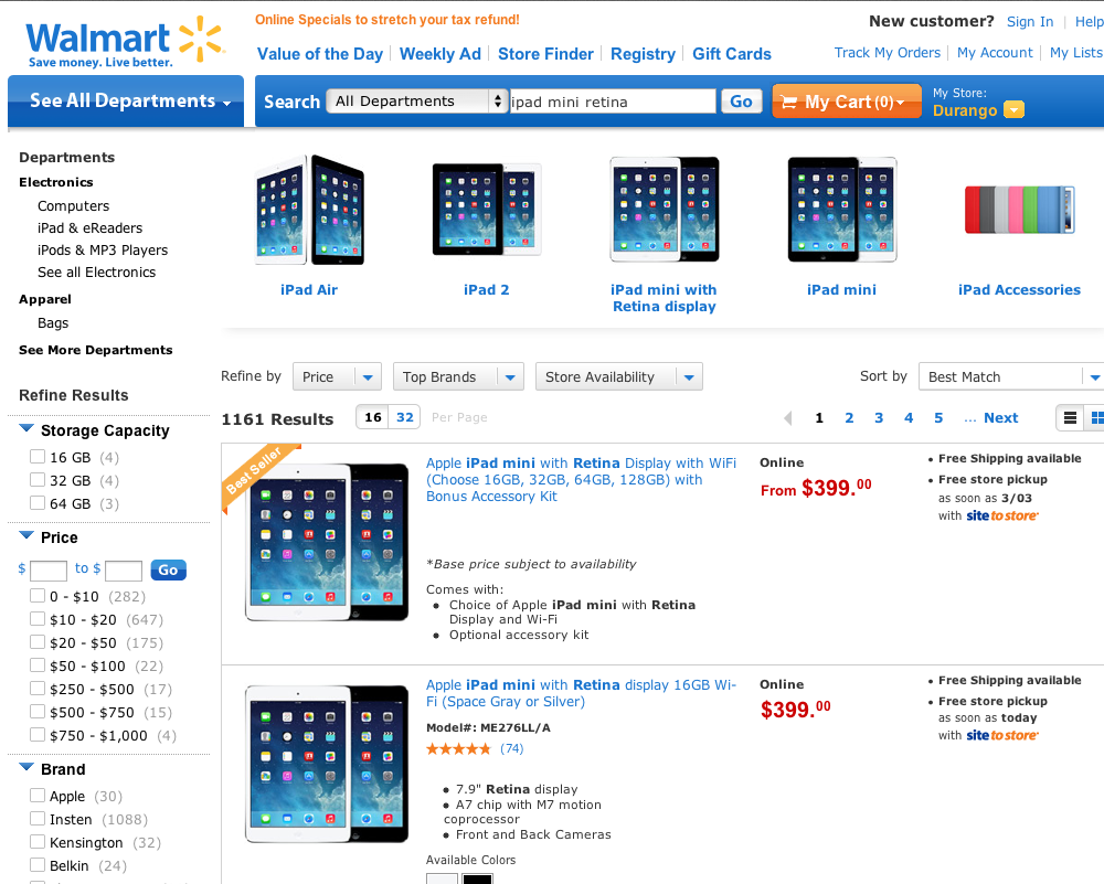
Walmart.com’s search results for “ipad mini retina.”
First Impression. The search results appeared in less than a second. The overall search results page was better than Target’s. Though I typed in “ipad mini retina,” Walmart also offered image links to the iPad Mini and other very closely related items.
Pros
- Alternative item links at the top.
- Search filter options in the left navigation.
- The option to instantly toggle between a list view (as seen above) and grid view (similar to Target.com).
- Options above the results to refine by Store Availability and Price.
- Sorting by several methods: Best Match, Price, Ratings, Best Sellers.
- A quick look that brings up product details along with an image zoom.
- Alternative search terms at the bottom of the page (before banner ads).
- Include specific departments with results.
Cons
- Too many results. 1,161 items is too many for a specific query like “ipad mini retina.”
- No add-to-cart button unless you go to the product detail page itself, and even then Walmart tries to upsell me to a bundle, rather than just letting me buy an iPad Mini Retina.
- The default list view is unbalanced with excessive white space on the right side under the “free shipping available” notice. I switched to the grid view immediately
- The ads in the left navigation. I don’t want to see ads when I’m shopping in a store.
Amazon
Amazon, the benchmark for online customer experience, failed in this experiment. Had I been shopping, I would have bounced instantly, especially after finding what I was looking for so quickly in the other two sites.
Amazon’s search box is the most prominent of the three. Because I am familiar with Amazon’s overwhelming number of item results, I immediately narrowed my “Department” (at the top right, below) to “Electronics.”
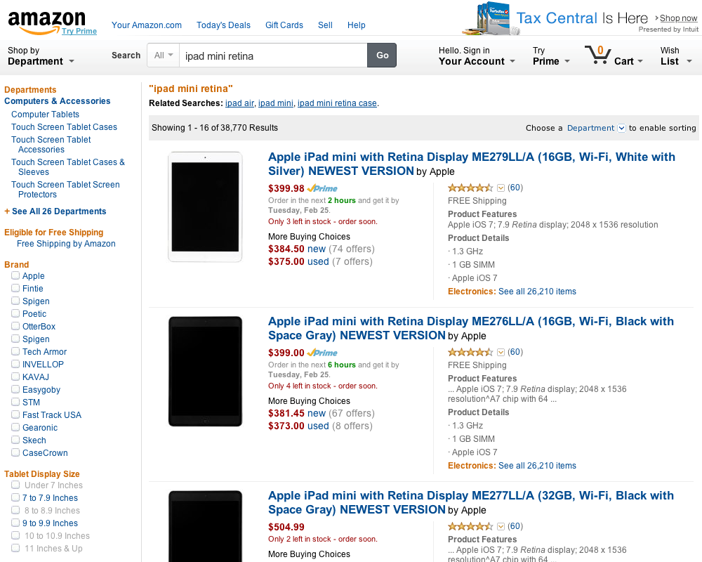
Amazon’s search results for “ipad mini retina.”
First impressions. Amazon’s type-ahead search was fast, though not as fast as the other sites. The next step is where Amazon’s search faltered. Here are the results — after reloading the page several times.
Pros
It is hard to find any pros relative to the other sites, but here is what I saw.
- Related search links directly below the restatement of my search query.
- A quick toggle to a grid — or “image view,” as Amazon calls its grid.
- Sorting options similar to the other sites.
- The number of reviews available by item.
Cons
- Too many results. 22,000 search results. Really? For the query “ipad mini retina”?
- The image load failure.
- The “Brand” filter appearing as the first search filter in the left navigation. There are no choices for features that are relevant to shopping for an iPad Mini, such as storage and Wi-Fi options. How am I going to quickly find the model that I’m looking for?
- No “quick look” for more details.
- No add-to-cart button, largely because Amazon offers alternative suppliers and prices in every presentation.
- No comparison feature.
Conclusion
If your site search is comparable to Target.com and Walmart.com, you are well positioned to compete. Many site search engines can deliver those experiences. The key is to support different facets and filtering. Remember, you want your shopper to find a product within two passes: an initial search and a single refinement.


