According to Forrester Research, mobile commerce sales will grow from $10 billion in 2012 to $32 billion in 2016, accounting for more than 7 percent of total ecommerce sales. With the adoption of smartphones and tablets accelerating worldwide, that percentage could be even higher.
For smartphones, there is an ongoing debate about whether to develop an optimized website or an app for commerce. I think that debate should be reframed. All retailers should have a mobile-optimized ecommerce site, period. Whether they invest in an app is the question. Many observers believe that with the adoption of HTML5 and CSS3, there is less need for mobile apps to create the desired customer experience. I suspect that argument will shift over time as app development environments become more robust.
On tablets, one could argue that the shopping experience for most stores is similar to one on a laptop. However, with more statistics showing that the use of tablets is highly concentrated on leisure and shopping activities, there is a ripe opportunity to develop tablet apps that take advantage of its features.
The decision to develop a mobile-optimized site or a mobile app can depend on target customers, products you sell, competition, investment required, bounce and conversion rates, and many more. A key consideration is the number of screen formats, resolutions, browsers, and the operating systems that are behind them. It reminds me of the ongoing battle with having your web browsers — Internet Explorer, Safari, Firefox, and Chrome — render the same.
This article examines a few of the variables for small and mid-sized ecommerce companies to consider for smartphones.
Smartphone Website Options
Below is an example of an ecommerce website that is not smartphone optimized. I’ve spoken with many ecommerce executives who think this is acceptable, as they receive a few orders from smartphone shoppers, in spite of having a site that doesn’t render well on those devices. My question to them is, “How many orders did you lose?”
Shipwreck Beads’ non-mobile site as displayed on an iPhone.
Option number two is to use your shopping cart’s mobile capabilities. Many carts now support responsive themes that allow stores to render on smartphones.
For example, here is a CoreCommerce webstore that has the basic smartphone features enabled. There are formatting issues, among other glitches. There are some variables that can be tweaked. But to build this out properly and test on a variety of Android and Apple devices would be a substantial amount of work. The store is functional, but not optimized by any means. In the example below of a basic product listing page, I found problems with viewing product reviews — there was no obvious way to adjust the template and CSS to accommodate them. I also found issue with several symbols that did not render properly as I probed deeper into some of the available settings.
Example of a CoreCommerce mobile webstore.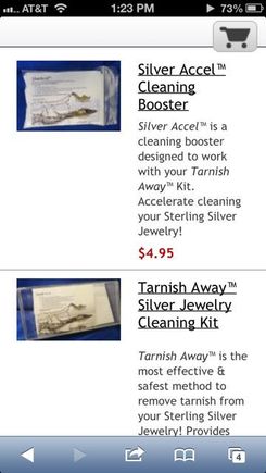
The third option is to use a mobile ecommerce hosting platform. This seems viable for many small businesses. Here is an example of a store, DrLeonards.com, hosted by mShopper.com, which provides a SaaS solution to host your store, provide a mobile-store manager, with basic order management functions. It uses your product data feed to generate the catalog for the store, so you can likely adapt your existing feeds for Google, Amazon, and other marketplaces. In the example below, notice the faceted search capabilities you generally will find on more sophisticated stores. Some other helpful features include coupons and free shipping options.
The disadvantage of this approach is that the orders do not come into your existing ecommerce platform. You can likely automate that process with custom development. Also, customers will need to recreate their accounts and will be disconnected from their order history. But, if you believe you are attracting new, incremental customers, this may not be important.
DrLeonards.com, as hosted by mShopper.com.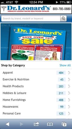
The Big Etailers
For large retailers, the customer experience is the same on a standard browser, smartphone browser, and an app. This is typically because the retailers use powerful ecommerce platforms, like Oracle’s Endeca, to deliver a seamless customer experience. Consider Target.com as an example. Below are examples of its standard website, smartphone website, and app.
Target’s full home page.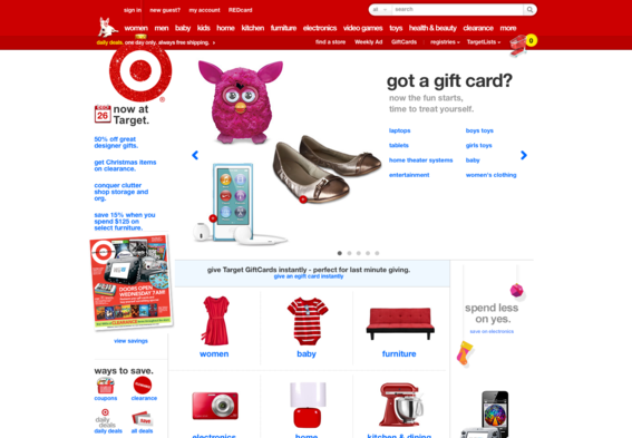
Target.com on an iPhone 5. Note the promo — which is located on every page — to download its iPhone app.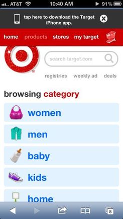
Target’s iPhone app.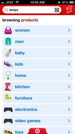
Notice that the customer experience is consistent, with the same icons, categories, and order. As you drill down, you will find the same guided search on all three platforms.
The app contains helpful features that the smartphone-optimized version does not.
- Usability. Better user-interface elements for many parts of the design. See example below for filtering the search results.
- Consistent navigation. The bottom of each page — hidden behind the Target logo — takes you to featured items, products, weekly ads, lists, stores, and “my Target.”
- Barcodes. You can use barcode scans for search — leveraging showrooming in other stores for a price check on Target.com
Target’s implementation of filtered search in its app.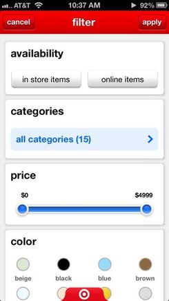
Beyond Target, however, I tested several mobile websites and their related apps. This includes The Gap, CDW, and Amazon. In all cases, the apps were more elegant and offered features that were not available in the mobile websites. Speed was roughly equivalent on an iPhone 5.
Here is an example of a more elegantly designed item-detail page within Amazon’s app that delivers a better experience than its website. I like the page for its simplicity relative to their standard website detail page.
Amazon’s item detail page on its iPhone app.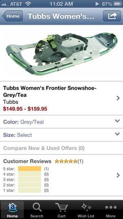
One of the helpful features on smartphone apps is the ability to add sliders for product promotions and features. Here is a slider that is used on the CDW’s app, on the home page for featured items. Notice the feature to deliver quick access to order status and quotes. One feature that is lacking on CDW’s app and smartphone-optimized site is the ability to choose or add payment options. You must do that through an authorized user login from a full-browser website, which is common.
Mobile apps allow for convenient sliders.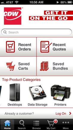
One other feature that was common to all sites — standard browser, smartphone, and an app — was the multichannel nature of their stores. They offer options to filter and find items available in local stores as well as fast access to the locations of their stores. This is critical to anyone with physical stores.
Summary
The verdict is still out on whether you need a mobile app. There is an expense involved, and as you build out the app on iPhone, Android, Microsoft, and Blackberry platforms the investment goes up substantially.
Whatever you do, plan for your mobile website now. You will need it to keep your competitive edge in the coming years.


