Overview
Product presentation is more important for an online store than it is for a brick-and-mortar store. Rather than being able to touch an item, inspect it for quality, or try it on as the case may be, an online shopper has only two-dimensional images on which to base their decision of whether or not to buy. The more impressive the images are that are available to the customer, the better decisions your customers can make and as a result, the more you will sell. Successful retailers have known this for a long time, yet it is surprising how often we are faced with online stores that feature a blurry product against complicated wallpaper and poor lighting. In this tutorial we will cover some simple tricks to help you optimize your product images using Adobe Photoshop.
What does it mean to optimize an image? If we look at how a product image is presented to a potential customer, we are faced with two immediate challenges. Our first challenge is to engage the customer visually with the best looking photo that we can present. The second challenge is to make sure that the image has a reasonable file size so that it will download quickly.
To meet the first challenge we will cover some simple techniques in Adobe Photoshop that can make our products stand out. We will be removing the background from a product image in order to show it on a white backdrop with some shadowing. We will then adjust the sharpness, contrast, and levels of the image to best display our product. Finally, we will resize and crop our product image to ensure that it looks it’s best at the size it will show on a website.
The second challenge that we face in presenting a product image to a customer on a website lies in the file size of the image. While larger images allow a better view of your product, they tend to have a large file size as well– which can mean long download times. Any time you leave your customers waiting, they are likely to go somewhere else. This is true in any business, online or off. In order to make sure that our product image will have a reasonable file size, we will finish by exporting our image from Photoshop as a JPEG, which will be ready for use on our website.
Maintaining a professional look and presentation of an online store is crucial to building consumer confidence, and standing out among your competition. By presenting your customers with impressive product images you ensure that your design and marketing efforts are not being undermined, which will lead to increased sales. Making sure that your images download in a timely manner means that your visitors will spend less time waiting, and decrease the chances that they will leave your store. In the end, product presentation is everything, and these simple steps will introduce you to some of the tools available for optimizing your product images.
Instruction
 This tutorial assumes that you have at least some basic familiarity with Adobe Photoshop. Our first step will be to open the image that we have of our product, in our case a picture of Practical eCommerce magazine that was taken against some carpet. As you can see, this is not a very attractive image, and will not do much in the way of product presentation. In order to make our image look better, our first goal is to get rid of the carpet in the background so that we can put the magazine on a white backdrop.
To begin removing the background, we will use the marquee tool to select the area around the magazine. Click on hold on the Lasso tool in Photoshop, located at the top left of the toolbar. You will be presented with the other available lasso tools– the Polygonal Lasso Tool and the Magnetic Lasso Tool. 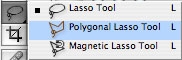 Since the lines around our magazine are all straight, we will choose the Polygonal Lasso Tool. With this tool selected, we will now click on one of the corners of the magazine. Clicking around to each of the other corners will create a selection around our magazine. However, we want to delete everything outside of this selection, so we will need to go to
 SELECT > INVERSE, which will select all of the pixels outside of the magazine. Click DELETE to erase the carpeting. Create a new layer beneath this and fill it with white by going to EDIT > FILL. We have just removed our carpeting rather quickly, and are left with the magazine against a white background as shown below.
 However, this still does not reflect the professionalism that we want to convey with our product presentation, so we want to go a bit further. By placing a shadow behind the magazine image, we can add some depth and visual intrigue to the image. Let’s start by creating a new layer behind the magazine, but above our white background. Next we want a selection of the magazine layer, so we will cmd-click the layer that has the magazine in it. This will create a selection around the contents of that layer, which at this point is just the magazine. Making sure that our new shadow layer is selected, go to
 EDIT > FILL and fill the selection with black. Next we want to blur our shadow to make it more realistic. Go to FILTER > BLUR > GAUSSIAN BLUR to blur the layer. We want our shadow to be kind of subtle, so I used a value of 15 pixels in the blur. You can experiment with the settings to get a look that you like.
 This is looking a bit better, but it is still kind of plain and bland, so let’s move the shadow a bit to get a better look. With the shadow layer selected, go to
 EDIT > TRANSFORM > DISTORT to change the shape of the shadow. Notice in the image below that I have moved the top of the shadow layer down quite a bit to provide depth, and also pulled the top corners out from the center a bit to provide perspective. Move your shadow into a position that you are comfortable with, and click the check box at the top to commit the transform. By distorting the shadow layer in this manner we can simulate the look of a shadow being cast onto a surface.
 Now that we have a nice shadow we will finish the effect by lowering the opacity of the shadow layer. Essentially we are lightening that layer out a bit by making it semi-transparent. To do this make sure that the shadow layer is still selected, and at the top right of the Layers Palette you can change the opacity. I have lowered it to 30% to make the shadow very light and subtle. After all, we want the shadow to add a little depth and intrigue to our image, not take focus away from our magazine. As you can see, we end up with a much improved product image compared to where we began.
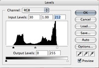
 However, we are not finished yet. You have probably noticed that the magazine does not look as vibrant and crisp as it should, which makes it look a bit amateur and unprofessional. In the case of our magazine, it prevents the person seeing it from recognizing the text, and is not very pleasing to the eye. Our next job is to focus on the magazine layer, which should be the on top still. With this layer selected, let’s first adjust the levels of that layer by going to
 IMAGE > ADJUSTMENTS > LEVELS. This feature of Photoshop let’s us change the settings of each color channel in an image, which can be very complicated and is better explained in another tutorial. However, by default we will be presented with a histogram of all the color channels combined, which is what we want to work with. Simply grab the triangle markers on the left and the right and move them to the edge of the histogram, as shown below.
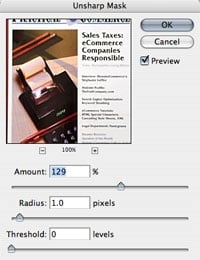
 Of course, you should experiment with different settings to find what works best for your image, but in general this simple technique will provide an easy way to dramatically improve your images. As you can see, our image is now a bit more vivid, but still needs some work. The first thing that I notice is that the magazine is a bit blurry, probably from the camera trying to deal with all the carpet that was in frame. To fix this, we will go to
 FILTER > SHARPEN > UNSHARP MASK to see if we can’t clean it up a bit. The Unsharp Mask is almost the opposite of a blur, and certainly has a confusing name. Take a look at the settings that I used below, but experiment to find the best settings for you.
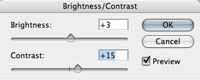
 You can see that our image is really starting to look much better, and that it is now a lot crisper than it was before. One last thing that we want to do to really put the finishing touches on this image is to adjust the brightness and contrast, which will let us match the white on the cover of the magazine with the white background, and let us make the magazine stand out just a tiny bit more. So with the magazine layer still selected, go to
 IMAGE > ADJUSTMENTS > BRIGHTNESS/CONTRAST. You can see the settings that I used below, but again make sure to experiment.
Now if we look at our product image, we have made a dramatic improvement in the visual presentation of our product. We have cleared away the carpet from the background, created a shadow to add some depth, sharpened the image and made adjustments to make it more vivid. With only a few minutes in Photoshop, we have a made a night and day change in the way that this image looks.
 The last thing that we want to do is make sure that our image will be the smallest file size that we need. The first step is to resize the image into the size that your shopping cart software expects. To resize the image, go to
 IMAGE > IMAGE SIZE and enter the dimensions that you want. Another option is to crop an image to the correct size, which is done by making a selection with the Rectangular Marquee tool at the top left of the toolbar, and then choosing IMAGE > CROP. This will crop away everything outside the selection that you made. Once you have gotten your image to the proper size, we need to take care in exporting it to ensure that the file size is not too large.
 To export for the web in Photoshop we need to choose
 FILE > SAVE FOR WEB which will bring up a new dialog box with lots of settings in it. There are really only two choices when creating images for the web as far as file format– GIF or JPEG. Please see out previous tutorial on web graphics for an explanation of which to choose. In this case, since our magazine has many different colors, we are going to choose JPEG. So at the top right of our dialog box we want to choose “JPEG High” as the preset for our image. You may notice that this puts the image quality at 60 percent, which is just fine. Unless you are intending to use this image in another application, there are very few instances when anyone will notice the difference between 60 and 100 percent. To give you an idea of what this does for us, this image will export into about a 7 kB file at 60 percent, but creates a file twice that size when exported at 100 percent. That is a tremendous file size saving without really affecting the visual image. Save your image file and we are finished.
Hopefully this tutorial was able to expose some of the tools available to make your product images look better. While not every image requires this amount of editing, it is important to be aware that there are simple techniques that only take minutes that can make a monumental difference in your images.