 Oftentimes a site owner will pour his heart into a home page. And this is rightly so. If a shopper isn’t hooked on your home page, he or she will likely exit before taking a look at what you have to offer.
But if you are an ecommerce site owner, save a little mojo for your product pages, too. Your customers are likely to make their buying decisions on your product pages, and you want to be sure to keep your presentation simple and compelling with minimal clicks, making the shopping experience easy for your users. Here is a list of tips that will help you transform your product pages into sales magnets.
1. Carry Over the Messaging from Your Home Page
If you are running a holiday sale or a free shipping promotion, make sure you have included visual or text elements on your product pages that reinforce your message. This is especially important if you’ve already done a good job of SEO and have site visitors coming directly to your interior pages. You want to make sure they have some inkling about your specials or unique selling points without having to click back to your home page.
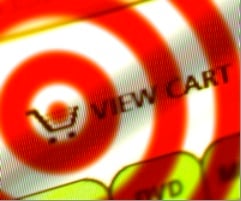
2. Put A Cart Button In A Prominent Location
Typically the action you want to encourage on each product page is for the shopper to click the “Add to Cart” button. How easy have you made it for your users to find the button? There are no absolute rules for button placement, but here are some key factors to consider.
- Put the button high up on the page so the user is not forced to scroll.
- Use a color for your “Add to Cart” button that stands out.
- Make the size of the text larger or use a distinctive icon.
3. Use Top-Quality Product Images
People love to see what they are going to purchase. Take the time to prepare great images. For a minimal investment in a good digital camera and adequate lighting in a home-based photo studio, you can product great photos.
Multiple photos per product are an excellent idea. Likely you will want to use an image swapping script or possibly have a main image high on the page and additional images lower down. As a general rule, the smaller a product is, the larger the photo should be. To sell a piece of jewelry, a large photo will give a shopper the details they will likely want to see to make a buying decision.
4. Make the Price Obvious
We already talked about the placement of the “Add to Cart” button. The price should be in close “geographic” proximity. If a shopper can’t easily find the price of the product, he or she will likely become frustrated, or worse, distrustful.
5. Create Clear, Concise Product Descriptions and Page Titles
Maximize the keyword “richness” of your product pages to enhance your SEO efforts. Focus each page on a specific keyword phrase or two. The phrase should be reflected in the page title and it should also be included in the product description. Typically a two-to-three sentence description along with bulleted points explaining the product’s benefits or key characteristics will give your users what they need and provide the search engines with enough “meat” to determine the relevance of your pages.
Some shopping cart systems automatically put your product names in the page titles. This can work against you if your product names tend to be obscure. For example, if you have a miracle face cream called “Galaxa” that nobody has heard of yet, you will likely want to have something beyond “Galaxa” in your product page title. “Galaxa anti-aging face cream” would be much more effective.
Writing engaging product copy can also pay great dividends; but it takes some skill and dedication.
6. Always Review and Test
So, take a few minutes to review at your product pages with fresh eyes. Are you really leading your users to click the “Add to Cart” button? Have you made the case for a customer who comes directly to this page to purchase your product? If not, now is the time to adjust and test.
Resources
- The book Always Be Testing: The Complete Guide to Google Website Optimizer by Bryan Eisenberg and John Quarto-von Tivadar is an excellent overview on how to take a scientific approach to improving your website results.
- Marketing Experiments Journal is an online laboratory that helps you learn about what works well in website marketing and what doesn’t.
Related articles