Text is the primary method of Internet communication, making web typography important for merchants to understand. This article will cover some of the basics of typography and provide some things to consider while working with text.
I’m going to assume that readers are familiar enough with word processing to skip the basics, such as text alignment and italic and bold-faced fonts. I’ll instead address lesser-known concepts, which might be familiar, even if the terms are new. Learning the terminology will help you better identify and control what is happening when you work with text.
Typefaces vs. Fonts
A common misconception in typography is that fonts are the same as typefaces. In actuality, a typeface is a set of fonts, or a “font family,” that contains all the variations of that font. For example, in the typeface Arial, you will find the fonts Arial, Arial Bold, Arial Narrow, Arial Narrow Bold and so on.
In regards to the web, certain typefaces are considered “web safe,” while others are not. In other words, there are certain font families that will display on all browsers while other font families won’t. Keep this in mind when working with text for the web.
Serif vs. Sans-Serif
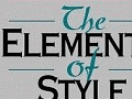
“Serif” and “sans-serif” describe whether a font has serifs — the additional strokes at the ends of certain characters. I refer to serifs as “feet.” It follows naturally that a serif font will have serifs while a sans-serif font — “sans” being the French word for “without” — will not. Arial is an example of a sans-serif font and Times New Roman is an example of a serif font.
You can see an example of a serif represented by “8” in the diagram below. You may also notice that there is a lot more to typeface anatomy than just serifs. You don’t need to worry about typeface anatomy unless you are seriously interested in typography. I intend to stick to just the basics here.
Construction of a serif font.
Serif and sans-serif fonts are more than just fonts with or without “feet.” For most readers, serif fonts are easier to read in printed material than sans-serif fonts, as the serifs help lead your eyes from character to character and from word to word. However, the opposite is generally true when dealing with digital text, making sans-serif fonts the preferred choice for web body text.
This does not mean that serif fonts should never be used on the web or that sans-serif fonts should never be used in print. You just need to consider what you plan on using the font for. If you are publishing all of your website’s body copy in a serif font, you may want to reconsider.
Kerning, Leading and Tracking
Here are three very useful concepts that are often overlooked by those new to typography. These concepts are also frequently confused for each other — in fact, I recently learned that what I had been calling “kerning” for my entire career was actually “tracking.”
The first and simplest of these concepts is leading — pronounced “ledding.” Leading is the vertical spacing between lines of text. Leading can be adjusted to improve readability or to add aesthetic value to bodies of text.
Vertical space can improve readability.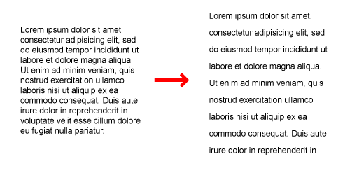
Tracking, which as I mentioned is often confused for kerning, is the spacing between characters in a line of text. You can think of tracking like leading, but it deals with characters in the line instead of the line itself. Tracking is a great way to balance out several lines of text without losing a desired font size, as seen below.
Tracking is uniform spacing between all letters.![]()
Kerning is similar to tracking except it only adjusts the space between specific sets of letters. This can be confusing, but I think the Wikipedia example below does a good job at illustrating the difference between tracking and kerning. Most high-end typefaces will have kerning already specified within the font. Note that while they are different, tracking can be used to manually accomplish kerning.
Kerning adjusts the spacing of particular letters for better visual balance.![]()
General Usage Principles
Now that I’ve covered some of the very basics of typography, it’s time to look at how typography can be used in a design.
Contrast
An important thing to consider with typography, particularly with web typography, is contrast. Because computer monitors use light to generate images, displaying text with too little or too much contrast can be straining on the eyes. Think back to the early days of the web when colored text on black backgrounds was popular. Remember how reading anything on those sites was difficult? That is an example of too much contrast.
Contrast can be used to make text legible without becoming an eyesore.
There is no universal rule that dictates contrast and typography. There may be instances where you want to use white text against a dark background. My advice would be to consider how much text you are dealing with and if too little or too much contrast is going to cause additional strain on the eyes. You should have an immediate reaction to how readable high or low contrast text is.
Typographic Hierarchy
Another essential part of text and design is “typographic hierarchy,” the systematic size, weight, spacing and placement of text to emphasize or de-emphasize information on a page. This is something we see all the time with text and is crucial in web design. The goal of a typographic hierarchy is to create a flow throughout a document or page while drawing attention to important information. This is done by using consistent formats for information of equal importance.
For example, in web design we define H1, H2, and H3 HTML tags to render text in a specific level of our hierarchy. H1 tags will be at the top of our hierarchy. All H1 tags have the same font size, weight, color and style on a given web page. H2 will follow, having a different font size, weight, color and style than H1.
Not only are typographic hierarchies an excellent way to handle the importance of information, a good hierarchy will guide a reader through a page by creating a natural path for their eyes to follow. Look at any newspaper today and you should be able to spot a typographic hierarchy.
Consistency
Consistency goes with hierarchy, but it needs to be addressed here, simply because of some misconceptions. You may have heard that you should only use one font for your site. While there is a bit of wisdom here, this is not the whole truth.
Many new designers fall into the trap of using too many fonts on a page. Even with specific fonts assigned to specific levels in a hierarchy, too many fonts begin to compete with each other and interrupt the flow of a page. However, that is not to say that you shouldn’t use more than one font on a site. The goal is not to have competing fonts.
Working within a typeface is a good place to start. This will provide you with many font variations to start building your site with. It’s okay to use multiple typefaces as long as they don’t interrupt site continuity. For example, a flowery scripted font could contrast too much with a blocky sans-serif font. At the same time, avoid using two or more typefaces that are too similar, as this can also cause confusion.
You can get away with using more obscure fonts for the site title or logo without detracting from flow of the rest of your site. When you start noticing multiple fonts from several typefaces running throughout your site, you might want to consider simplifying things.
Again, there is no universal rule to dictate font choice. As an example, here is a site that uses several fonts without disrupting the overall site flow.
An example site utilizing varied typography.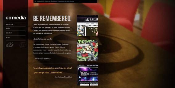
If this all seems confusing, I recommend limiting the number of font faces you use for now and just try to get a feel for the flow and hierarchy of your site as it relates to typography.
The Wonderful World of Type
The world of typography is vast. We’ve just barely scratched the surface here. If you’re still interested in typography, I’d encourage you to explore more advanced typographic techniques and maybe even consider creating your own font. Meanwhile, pay attention to typography on your ecommerce site. It is crucial to good design — and communication.