Editor’s Note: This is “Part 2″ of a 3-part series on factors that contribute to effective ecommerce design. “Part 1: Key Components” we published previously.
In “Understanding Ecommerce Design, Part 1: Key Components,” I reviewed the difference between good and elaborate design, and the visual factors of an ecommerce sites that influence shoppers to buy products. The overall purpose of this series, as I noted in the first installment, is to focus on the steps to take once you’ve hired a company to design your ecommerce site. The key to a successful relationship is to plan ahead and have a basic idea of what you want before approaching any designer. The more you know and understand, the less you’ll leave up to the interpretation of those building your website and the better the experience will be for all parties involved.
Rotating Banners
Rotating banners are also called “animated banners,” “image carousels,” “sliders,” and “sequence banners.” No matter the name, there is much debate about their effectiveness as a promotional vehicle. One commenter to my last article stated, “Rotating banners are a known conversion killer.” In fact, some conversion rate optimizers believe that rotating banners are distracting and removing them can see conversions lift by 10 to 25 percent.
There are many negatives to utilizing these banners.
- They take up valuable screen real estate.
- Visitors ignore them, since the banners look like advertisements.
- Banner messages aren’t usually relevant to what a consumer might be searching for.
- Rotations frustrate visitors, who cannot read and click quickly enough.
- Multiple banner choices confuse shoppers, and reduce conversions.
- Most rotating banners are invisible to search engines as they consist solely of images.
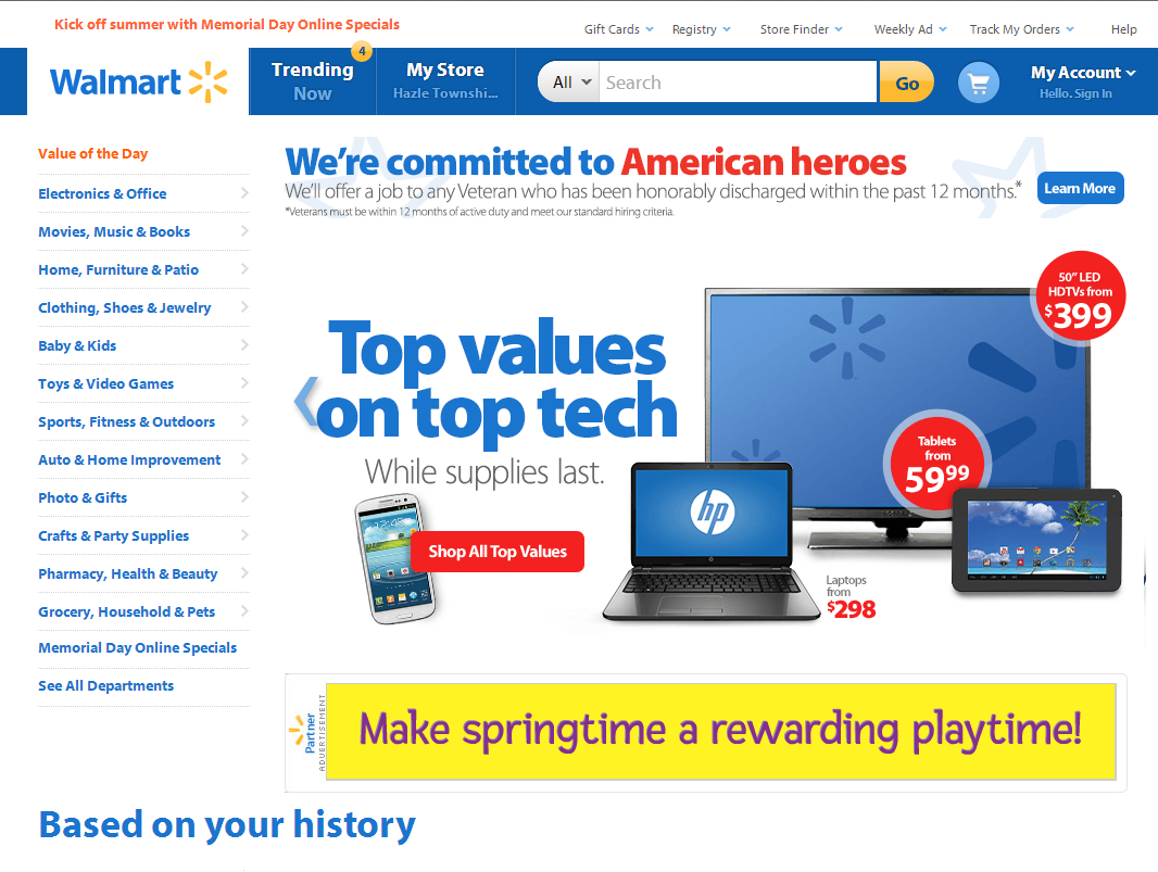
In spite of the many drawbacks, however, most ecommerce packages support rotating banners and there are still quite a lot of retailers — such as at Walmart.com and Petsmart.com, below — that utilize them.
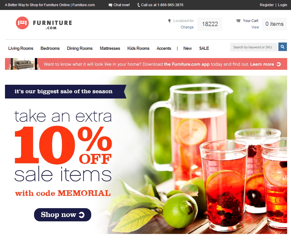
A trend is emerging in which stores are beginning to use static banners, not rotating, as in the case of Furniture.com.
Others, such as Amazon, are experimenting with manually rotated banners, providing the user with the ability to sequence through sales promotions at their own pace.
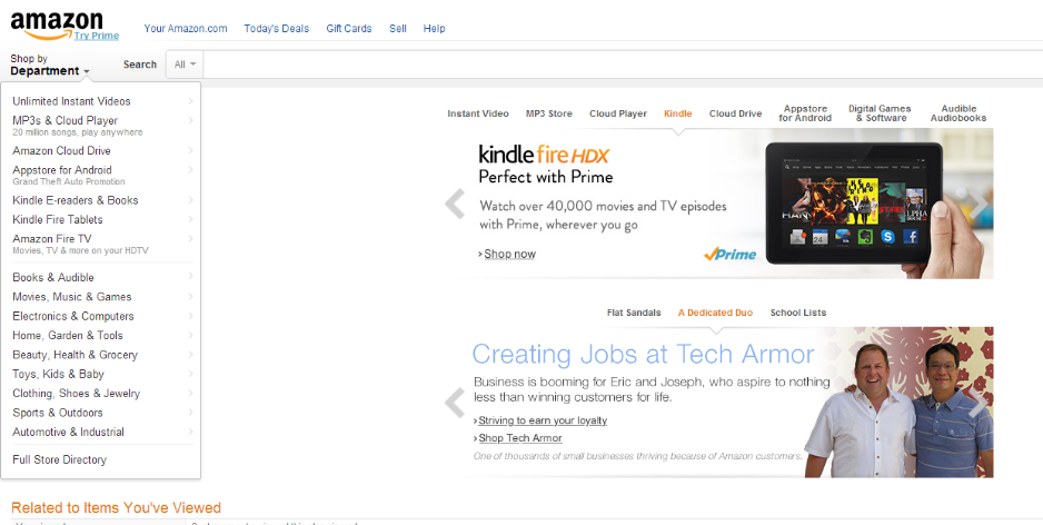
Amazon is experimenting with manually rotated banners, providing users with the ability to sequence through sales promotions at their own pace.
Why Use Rotating Banners?
Why do stores use rotating banners at all if they reduce conversions? Many designers believe banners add visual appeal to the top of a site, and allow a merchant to feature sale items, new inventory, and so forth.
So, if you haven’t yet been steered away from utilizing banners in your own commerce design, follow these steps to implement.
- Make rotations manual, not automatic. No one should have to take a speed reading class to view your banner’s message.
- Keep the number of images to a minimum. Less is better.
- Messages should be short and to the point. Even if users can manually rotate the banner, do not overload with text. Let the users click to a page to read more.
- Include calls-to-action on your banners. This could include “Click Here,” “Learn More,” “Shop Now,” “Click for Deal,” and so on.
- Keep your banners near the top of the site. This is often difficult, as screen resolutions greatly vary across desktops and tablets. I use this site to check on the average screen resolutions in current use.
- Holiday-themed banners tend to have higher conversion rates.
Callout Boxes
Callout boxes serve some of the same functions as banners. These static boxes are used to emphasize products or services (such as a sale utilizing a specific discount code) or the fact that the company has been business for, say, 90 years, or even something as simple as it ships via UPS and FedEx.
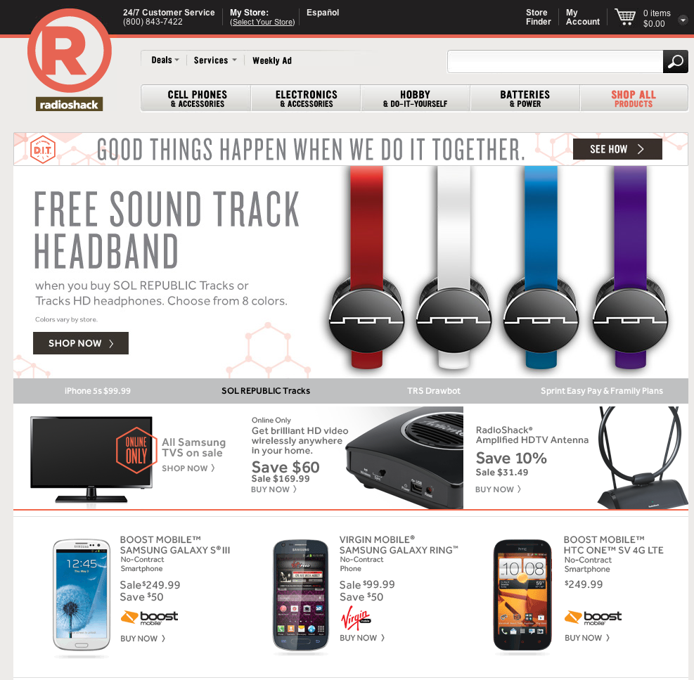
Callout boxes are usually positioned underneath or on the side of banners, but are sometimes located farther down the page or in place of actual banners. Note the three callout boxes, below, at RadioShack.com for mobile phones.
Unlike the majority of banners that tend to consist solely of images, callout boxes typically use a simple image and text.
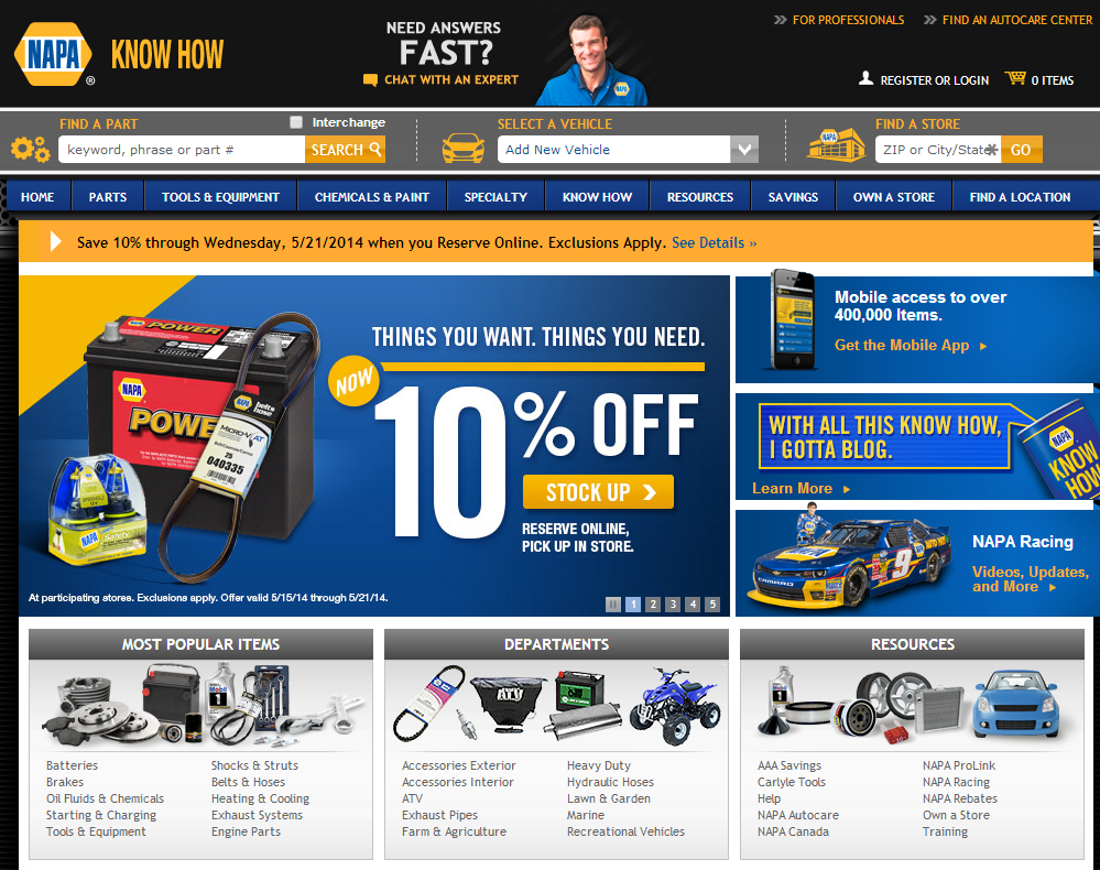
NapaOnline.com home page, with callout boxes to right of main battery image — addressing mobile access, the know-how blog, and NAPA racing.
When creating callout boxes, consider the following.
- Most sites usually contain two or three callout boxes. This provides you with a unique opportunity to push various messages out to your user. Be wary though to avoid making your callout box look like an advertisement.
- Create copy for these boxes with search engines in mind, for SEO benefit.
- Keep message simple and provide clear calls to action, as with rotating banners.

