
CSS Grid is a two-dimensional layout model that can be combined with CSS media queries to produce complex and responsive website layouts, including layouts for ecommerce stores.
The Internet and the devices we use to access it have grown up. Websites have become interactive applications with significant capabilities. An online retailer’s customers, for example, can shop from screens as small as a watch face, as large as a television, and everything in between.
Unfortunately, the web pages used to present these applications on the various devices have not always been well suited to the task.
“By using a combination of tables, JavaScript, or careful measurements on floated elements, authors discovered workarounds to achieve desired layouts,” wrote the editors of the World Wide Web Consortium, at “CSS Grid Layout Module documentation.”
“Layouts that adapted to the available space were often brittle and resulted in counterintuitive behavior as space became constrained. As an alternative, authors of many web applications opted for a fixed layout that cannot take advantage of changes in the available rendering space on a screen.”
Grid Systems vs. CSS Grid Layouts
In the quote above, the W3C is being a little hard on some of the current and popular layout “workarounds.” Let’s consider a common ecommerce layout: a category page with seven products.
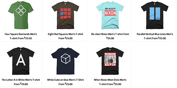
A product category page is an example of a common ecommerce layout.
You could use a popular CSS framework that includes a “grid system.” Grid systems are one of the layout “workarounds” that typically rely on carefully measured floats. A grid system should not be confused the similarly named CSS Grid Layout, or CSS Grid as it is often called.
The former employs floats to create grids and nested grids. The latter is a layout module first published as a W3C draft in 2011 and now supported by all leading web browsers including recent versions of Chrome, Firefox, Safari, Edge, Opera, Chrome, and also the Android browser.
Here is some sample HTML markup to show you how a grid system might work.
<section class="container-fluid">
     <div class="row">
           <div class="col-sm-3">
                <img src="https://cdn..." alt="Four..." />
                <h2>Four Square Diamonds Men's T-shirt</h2>
           </div>

               ...

     </div><!--end row-->
</section>
The section element with the class name of “container-fluid” and the div element with the class of “row” both add space around the elements contained, which in this example are the products we want to appear on the product category page.
The “col-sm-3” class relates to this grid system’s 12-column layout and a set of CSS media queries that employ different style declarations, depending on how wide the user’s screen is. This class might say that on screens of 768 pixels wide or wider the div element should take up three of the available 12 columns. Effectively, this would list four products across the row.
In the style sheet, this class is set to take up a quarter of the available space and “float” left, meaning it will be aligned on the left side of its container (parent element). The floated element is removed from the normal flow of the page.
.col-sm-3 {
      width: 25%;
      float: left;
      position: relative;
 }
This particular div element — with the “col-sm-3” class name — will be repeated for every product on the page.
To ensure the products lay out just as expected, you would close the “row” div after 12 columns were used and reopen a new row for the remaining items. Given seven products, you’d need two rows.
<div class="row">
      <div class="col-sm-3">
           <img src="https://cdn..." alt="Four..." />
           <h2>Four Square Diamonds Men's T-shirt From <sup>$</sup>23.50</h2>
 </div>

          ...// three more products


 <div class="row">
      <div class="col-sm-3">
           <img src="https://cdn..." alt="Eight..." />
           <h2>Eight Red Squares Men's T-shirt</h2>
 </div>

...// the remaining two products
You could forego the row divs, and with just seven products the page would probably lay out without a problem. But if you had 47 products the grid system could become “brittle,” as the W3C put it, and the layout might break. Your rows would become disjointed, and the floats might not line up.
If your product category pages were dynamically generated, which is common for ecommerce sites, you would need some logic in your page template to close and open rows. This would probably entail having a variable to store a product count. After every fourth product, conditional code would run, adding the row elements.
The markup needed to produce the same product category page with the new CSS Grid Layout is similar.
<section class="product-grid">

     <div class="grid-item">
           <img src="https://cdn..." alt="Four... />
           <h2>Four Square Diamonds Men's T-shirt From</h2>
 </div>

</section>
In this example, the section with the “product-grid” class replaces both the “container-fluid” and the “row” elements.
.product-grid {
      display: grid;
      grid: auto / repeat(4, 1fr);
      grid-gap: 40px 20px;
 }
The grid declaration for the “product-grid” class sets the height of the rows to “auto” and defines four columns, each taking up an equal portion of available free space — fr is a measure of free space.
The products are defined in a div that has the class name of “grid-item.” It is worth mentioning that one could have used any class name or no class name here.
.grid-item {
      justify-self: center;
      align-self: center;
      text-align: center;
 }
This class does nothing more than center the product image and title vertically and horizontally.
This layout will render correctly whether there are seven products or 7,000. It does not require any scripting to decide when to add a row.
Handle Complex Layouts
If all that the CSS Grid Layout model could do was simplify things like rows of products, it might still be worth using in many cases. Fortunately, however, it can do a lot more.
In fact, CSS Grid really shines when you start to develop relatively more complex layouts.
Product rows, as an example, are just one part of a typical category page on an ecommerce website. That page will have, at the very least, a header, a side bar for sorting products, and a footer section.
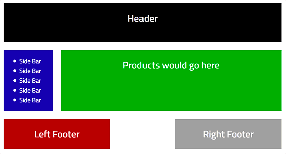
A product category page is likely to include more than just rows of products. There will be a header element, a side bar, and in this example layout a split footer.
If we returned to a grid system (again, a grid system not the CSS Grid), this would begin to require some fairly complex HTML markup that can be somewhat difficult to read given the number of div elements, class names, and levels of indentation.
<div class="container">
      <div class="row">
           <header class="col-sm-12">
                ...
           </header>

     </div>
      <div class="row">
           <aside class="col-sm-3">
                ...
           </aside>
           <section class="col-sm-9">
                ...
           </section>
      </div>
      <div class="row">
           <footer class="col-sm-12">
                <div class="row">
                     <div class="col-sm-5">
                          ...
                     <div>
                     <div class="col-sm-5 col-sm-offset-2">
                          ...
                     <div>
                </div>
           </footer>
      </div>
 </div>
Because the CSS Grid Layout is part of the cascading style sheet specification, the HTML markup required is simpler and, perhaps, easier to understand.
<div class="page">
      <header><h2>Header</h2></header>

     <aside>
           <ul>
                <li>Side Bar</li>
                     ...
           </ul>
      </aside>

     <section class="product-grid">
           <h2>Products would go here</h2>
      </section>

     <div class="left-footer">
           <h2>Left Footer</h2>
      </div>

     <div class="right-footer">
           <h2>Right Footer</h2>
      </div>

</div>
The style declarations for this layout don’t include any floats or widths. Instead, the layout uses named template areas to describe how things like the header or footer should appear on the page. The period or dot (.) in the template area between the left and right footer represents an empty column.
.page {
      display: grid;
      grid: 100px auto / repeat(5, 1fr);
      grid-template-areas:
           "header header header header header"
           "sidebar products products products products"
           "left-footer left-footer . right-footer right-footer";
      grid-gap: 20px;
 }

header {
      grid-area: header;
 }

aside {
      grid-area: sidebar;
 }

.product-grid {
      grid-area: products;
 }

.left-footer {
      grid-area: left-footer;
 }

.right-footer {
      grid-area: right-footer;
 }
As you examine the styles, notice that the page is set to display as a grid and that areas of the grid are specified by name.
grid-template-areas:
      "header header header header header"
      "sidebar products products products products"
      "left-footer left-footer . right-footer right-footer";
Items can also be explicitly positioned on the grid. Here is an even more complex category page layout. Notice there are several empty spaces and elements with differing widths and heights.
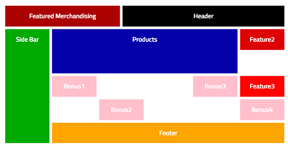
The CSS Grid Layout also allows for elements to be placed at exact locations on the grid. This makes it possible to created complex layouts.
The layout pictured has 11 sections. There is certainly more HTML required, but it is still easy to understand.
<div class="page">
      <header><h2>Header</h2></header>
      <section class="featured">
           <h2>Featured Merchandising</h2>
      </section>
      <aside>
           <h2>Side Bar</h2>
      </aside>
      <section class="products">
           <h2>Products</h2>
      </section>
      <div class="feature2">
           <h2>Feature2</h2>
      </div>
      <div class="feature3">
           <h2>Feature3</h2>
      </div>
      <div class="bonus1">
           <h2>Bonus1</h2>
      </div>
      <div class="bonus2">
           <h2>Bonus2</h2>
      </div>
      <div class="bonus3">
           <h2>Bonus3</h2>
      </div>
      <div class="bonus4">
           <h2>Bonus4</h2>
      </div>
      <footer>
           <h2>Footer</h2>
      </footer>
 </div>
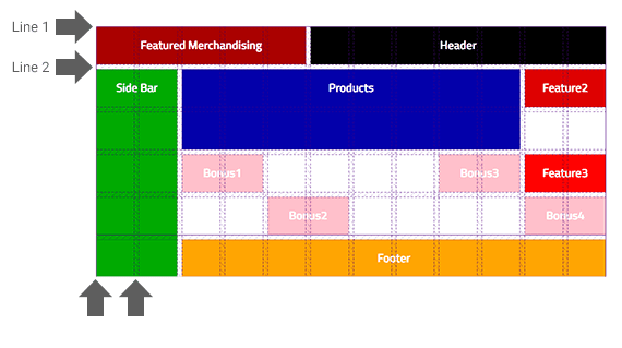
Elements are positioned on the grid using line numbers.
The CSS declares the specific position of each element using a system of numbered (or named) grid lines. Each column and row is fitted within these grid lines.
.page {
      display: grid;
      grid: repeat(5, 80px) / repeat(12, 1fr);
      grid-gap: 10px;
 }

header {
      grid-column: 6 / span 7;
 }

.featured {
      grid-column: 1 / span 5;
 }

aside {
      grid-column: 1 / span 2;
      grid-row: 2 / 7;
 }

.products {
      grid-column: 3 / span 8;
      grid-row: 2 / 4;
 }

.feature2 {
      grid-column: 11 / span 2;
 }

.feature3 {
      grid-column: 11 / span 2;
      grid-row: 4 / 5;
 }

.bonus1 {
      grid-column: 3 / span 2;
 }

.bonus2 {
      grid-column: 5 / span 2;
      grid-row: 5 / 6;
 }

.bonus3 {
      grid-column: 9 / span 2;
 }

.bonus4 {
      grid-column: 11 / span 2;
      grid-row: 5 / 6;
 }

footer {
      grid-column: 3 / span 10;
 }
Consider “bonus4.” It starts at column line 11 and spans two columns. Vertically, it begins at row line 5 and extends down the grid to row line 6.
.bonus4 {
      grid-column: 11 / span 2;
      grid-row: 5 / 6;
 }
Similarly, “feature3” also starts at column line 11 and spans two columns, but is placed between row lines 4 and 5.
.feature3 {
      grid-column: 11 / span 2;
      grid-row: 4 / 5;
 }
If you wanted to change the positions of these elements, you would not need to edit the order of the markup at all; rather, just change the style declaration. Making this change using a grid system or similar techniques could be challenging, but the CSS Grid Layout makes it easy.
CSS Grid Layouts Matter
This brief introduction to the CSS Grid Layout model has hardly done the specification justice. I’ve sought to explain what the CSS Grid is and provide a couple of examples.
This layout model has the potential to change how we present ecommerce content. It could make it possible to develop new ecommerce design patterns and conventions. It helps designers to add the layout diversity and complexity to a web design that they might otherwise employ for print.


 Hostinger Reframes Site-Free Ecommerce
 AI Visibility Scores Are Useless
 New Ecommerce Tools: July 1, 2026
 India Ecommerce Paths for Foreign Sellers
 New Ecommerce Tools: July 7, 2026
 AI Forces Affiliates to Innovate or Die
 SEO for AI, Low Traffic, No Clicks