Editor’s Note: This article was originally published by Web Marketing Today. Practical Ecommerce acquired Web Marketing Today in 2012. In 2016, we merged the two sites, leaving Practical Ecommerce as the successor.
Color affects our moods and states of mind. It can influence customer buying habits, making color psychology an important part of ecommerce. This article will address color psychology basics and ways you can use color psychology with your ecommerce efforts.
Color, Culture, and Context
Remember that color psychology is not an exact science. It depends on a person’s culture and the context with which the color is presented. For example, Japanese culture associates yellow with courage while Western culture sometimes associates yellow with cowardice.
Context also plays an important role in how color affects us. For example, we also use yellow in stoplights and warning signs to indicate a need for caution. Context can make yellow more closely associated with danger or caution than with cowardice.

Context provides additional meaning to colors.
Warm and Cool Colors
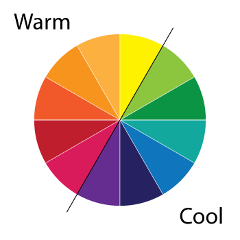
Colors are often classified as being either warm or cool. Warm colors include red, orange, yellow, while cool colors include blue, green, and purple. Warm and cool color groups have a psychology of their own. Generally, warm colors are thought of as being energetic and exciting while cool colors are thought of as being calming and even sad.

Warm and cool colors have their own psychology.
Remember, color psychology is not exact science. Given the right context and color combinations, colors from the warm spectrum can be “sad” and colors from the cool spectrum can be “exciting.”
The Meaning of Color
Red. Excitement, energy, urgency, love, passion, anger, violence, aggression, strength.
Red is a good example of context being important. “Love” and “anger” are contradictory feelings, yet both are ascribed to red. Thinking about red in the context of Valentine’s Day makes you associate red with love. Thinking of red in the context of bullfighting makes you associate red with anger.
Red can also have a physiological effect. Seeing red has been shown to increase heart rate, adrenaline, metabolism, and respiration. Imagine yourself in a completely red room versus a completely sky-blue room. You might become anxious just thinking about the red room.
Orange. Joy, aggression, energy, warmth, enthusiasm.
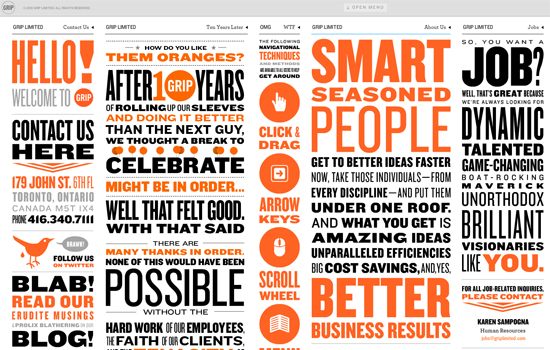
Orange fits nicely between yellow and red on the emotional spectrum. Orange is stronger than yellow but friendlier than red. Orange evokes a positive excitement. But it is also often associated with autumn, especially when combined with browns and reds.
Yellow. Hope, life, optimism, cheerfulness, energy, happiness.
Yellow can be a very cheerful color. It can also be associated with caution and cowardice. Bright yellow can strain the eye.
Blue. Trust, security, responsibility, efficiency, calm, friendly, intelligence.
Blue is a very popular color among financial institutions as it can denote trust. The meaning of blue varies more greatly based on shade and hue than other colors. For example, a darker blue might evoke greater feelings of security while a lighter blue feels much friendlier.
Green. Nature, natural energy, life, growth, environment, fertility wealth.
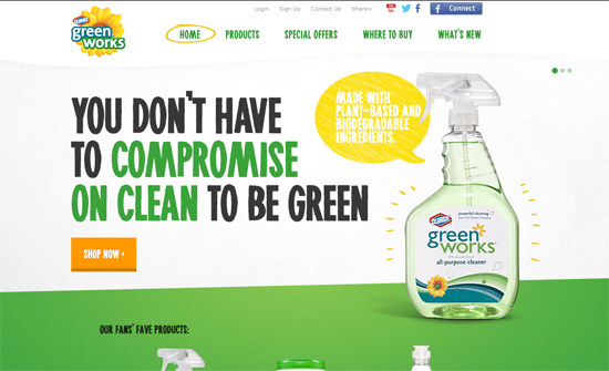
Green is closely tied with nature and the environment. Green is a very popular color with any business focused on environmental living and sustainability. Green can also be associated with wealth, often with mint greens.
Purple. Royalty, wisdom, dignity, status, creativity, luxury, mystery.
Purple is historically associated with royalty. Purple dye was more expensive in ancient times and only the wealthy could afford it, leading to purple being known as a royal color.
Pink. Romance, love, calm, femininity, gentleness, fragility.
In Western culture, pink is most often associated with femininity and is avoided as a color used to target men. Sports teams have been known to paint the “away” locker room pink because of the color’s calming effect.
White. Purity, innocence, cleanliness, efficiency.
White has a strong connection with purity and innocence in Western culture and is traditionally used in weddings. But remember that color is closely tied with culture. Japanese culture traditionally reserves white for funerals.
Black. Power, sophistication, prestige, security, emotion.
The meaning of black changes greatly depending on what other colors it is used with. On its own, black has strong ties to elegance and prestige. Think of credit card companies that offer “black cards” as their most prestigious credit card.
Gold. Prestige, wealth, energy, luxury.
Gold takes on many of the emotional connections of the precious metal of the same name. Gold is often used as a secondary color in design to emphasize wealth. On its own, gold can be very similar to yellow.
Silver. Prestige, cold, scientific.
Silver is similar to gold but with less luster. Where gold is bright and exciting, silver is cold and scientific.
Color Combinations
Just as individual colors have meanings, color combinations also have meaning. Again, these combinations are often cultural — like red, green, and white being associated with Christmas or black and orange being associated with Halloween in the fall. Think about the psychological difference between combinations of black and red and combinations of white and red. The colors black and white change the way we perceive the color red.
Selling with Color
Consciously and consistently using color psychology can lead to increased sales and a stronger brand identity. The first place you should consider color psychology is your website. What message might you be sending based on the colors you use on your site? How could color psychology applied to call-to-action buttons, important text, or key pieces of the site increase customer interaction?
Next, consider your brand as a whole. What do the colors you use say about your brand? Do you consistently use the same colors throughout your marketing material? Color has been shown to have as much as an 80 percent increase on brand recognition.
Think about brands like Facebook, Twitter, and Google+. Each has a unique color associated with its brand and you could probably even identify each company based solely on its color.

Some businesses can be identified based solely on their brand color.
While color is often culturally and contextually understood, color does have an effect on our perceptions. A conscious use of color psychology can result in more memorable impressions, increased readership, and more sales.


