Designers commonly claim their role is critical to ecommerce success. Yet non-designers often counter by citing Amazon and other high-converting sites that are, seemingly, design agnostic.
Designers are right in that appearance and layout play a key role in conversion but not how many have understood it.
Trends and styles may look attractive at first, but they often become obsolete or ubiquitous or are hard to achieve or maintain. And many are just good on the eye at the expense of conversions.
The goal should not be the trendiest website or the best-looking but to allow the design to speak to the right audience, increasing conversions based on a defined strategy.
Three factors determine the design of a high-converting ecommerce site: audience, strategy, and content.
Audience
Narrowing your audience is the first step. It dictates the actions you want your ideal customers to take and what speaks to them visually.
And the wider the audience, the larger the budget to gain and maintain traction.
A well-defined audience allows laser focus to gain momentum faster and create raving, tribe-like fans.
Start by defining the age of your ideal client, considering that design preferences change from generation to generation. Examples are font size, font style, and color choices.
Those differences influence not just how users navigate websites but also how they read the content.
Psychographics — interests, options, activities — are also important.
Picture your ideal client sitting across the table from you in a coffee shop. The closer you can get to visualizing this person’s face and imagining her life story, the easier it will be to define the strategy and content.
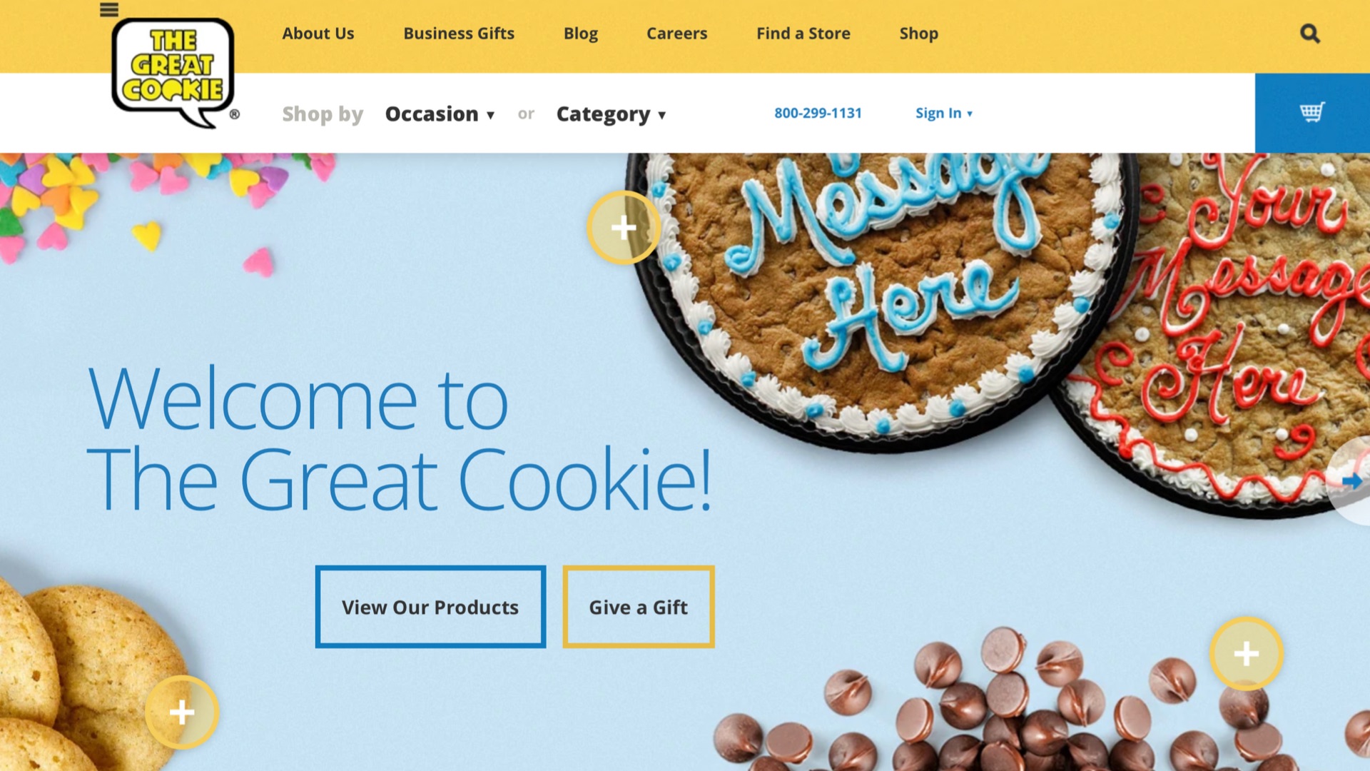
Take The Great Cookie, for example. It appeals to Baby Boomers (age 60 and older, roughly) with larger fonts, an old-fashioned logo, and easy search by occasion.
—
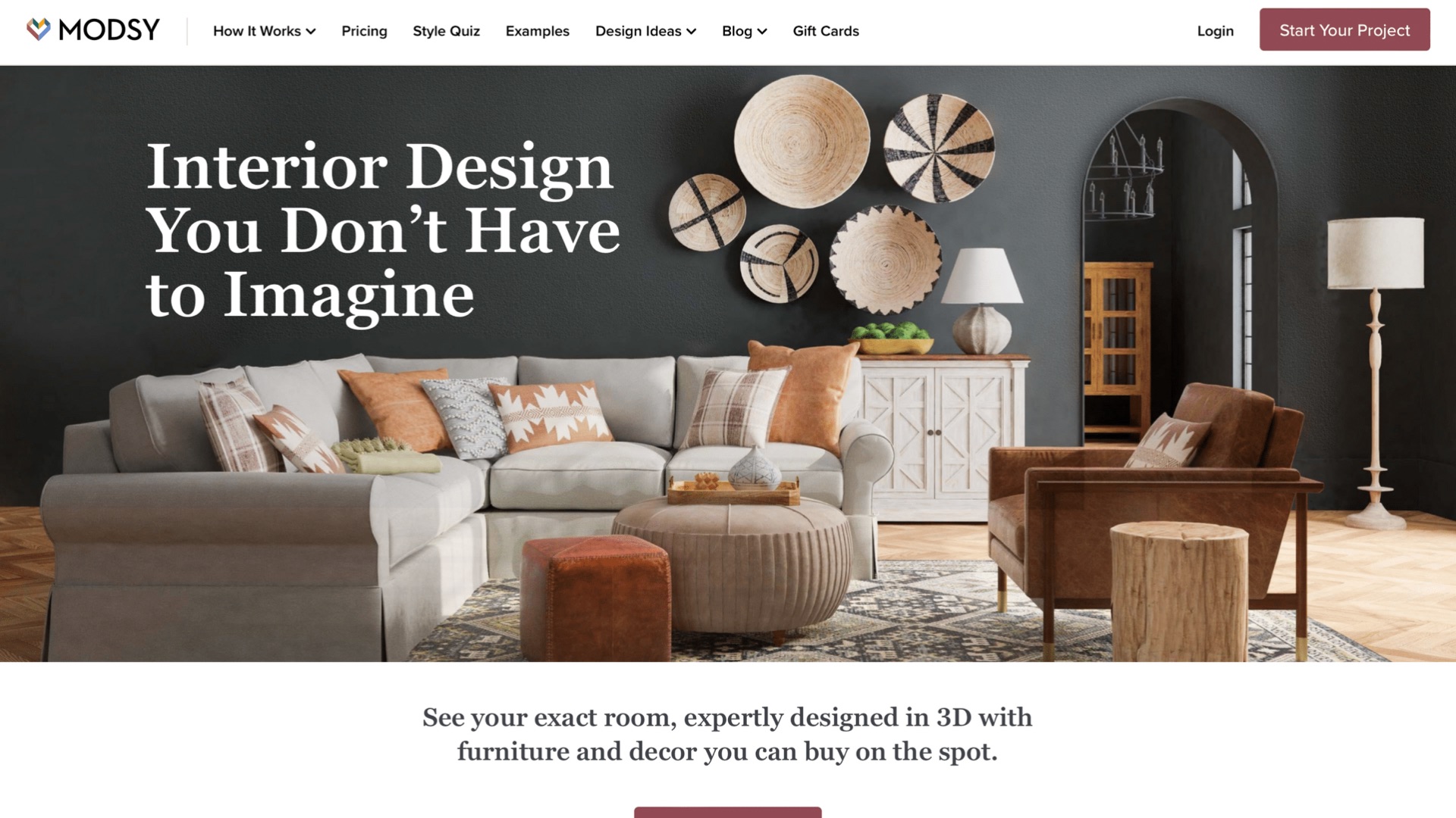
Modsy, an online interior design firm, focuses on results. This appeals to Gen Xers (age 40 to 60), who also relate to the site’s smaller font in dark grey instead of black.

Modsy’s focus on results appeals to Gen Xers, as does the site’s smaller font in dark grey. Click image to enlarge.
—
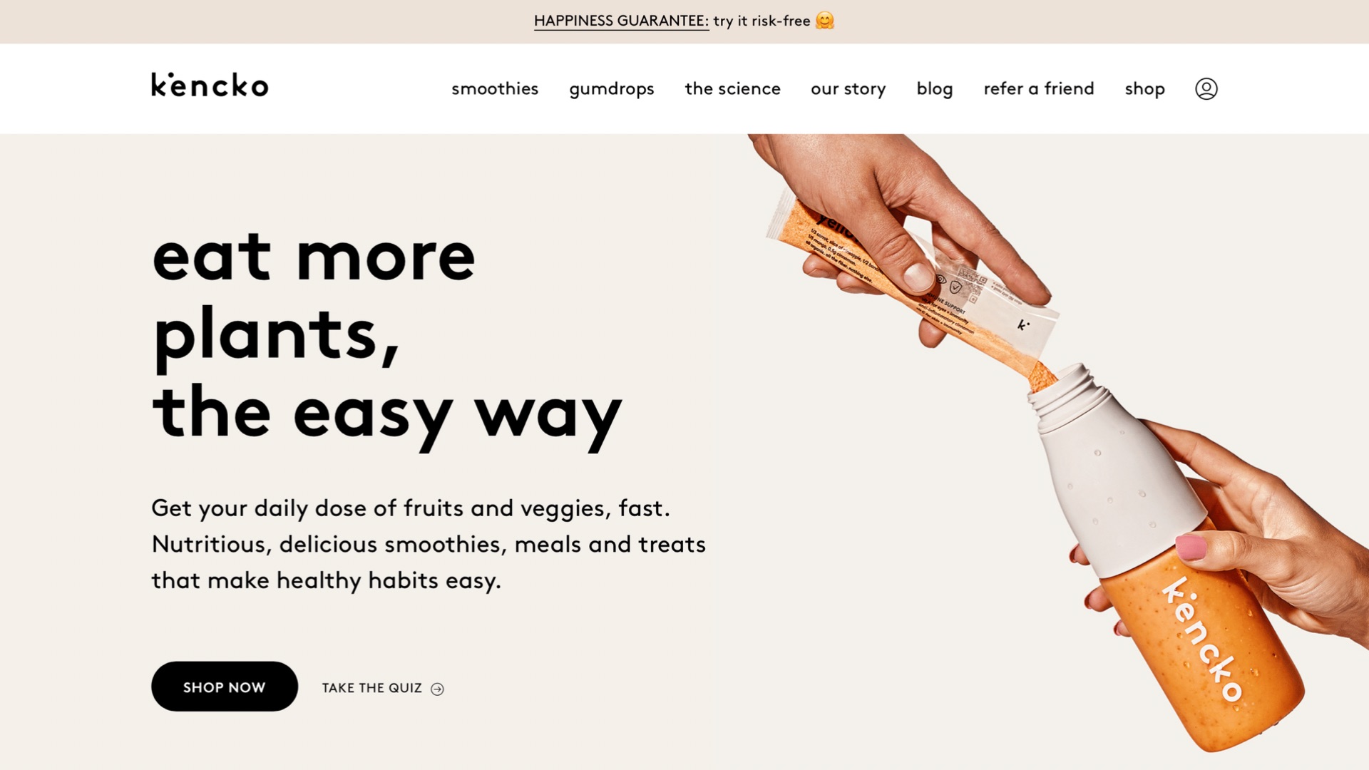
Kencko, which sells nutritious food products, applies emojis and no-caps sentences and words that mimic the messaging tools Millennials (age 25 to 40) use daily. The short video with no audio addresses the habits of that generation, too.

Kencko applies emojis and no-caps sentences and words that mimic the messaging tools Millennials use daily. Click image to enlarge.
Strategy
The primary goal of an ecommerce site is to sell. However, depending on your industry, product, and target customer, you likely have intermediate mini-goals that increase trust and lead to sales over time.
These goals include:
- Newsletter sign-ups,
- Free file downloads,
- Free samples,
- Social media follows,
- Free consultations,
- Strategy calls.
Mini-goals should impact the design of your site. This is where templates tend to fall short.
Your strategy should determine visitors’ workflow. Start by listing the potential actions someone can take on your site and decide which is the priority for each page. Calls-to-action and outcomes may vary from page to page. But limit each page to two calls-to-action, making clear via the design which one is primary, so they don’t visually compete.
Content
Design requires content.
A common mistake is to design before knowing the elements. Although templates are marginally valuable as a reference, content determines the ultimate layout, including the important pieces and their priority to visitors.
Having identified your audience, it’s easier to create and organize the content available to the designer, always prioritizing the strategy.
Content is still key. Start with a site map and list your required pages. Don’t forget the 404 page, confirmation pages, and policy pages such as privacy and terms and conditions.
Every page of your site can have a call-to-action. For example, a confirmation page after a newsletter sign-up can prompt subscribers to follow your company on social media.
Consider a tagline that focuses on the benefits and value of your product or store. Craft the headlines, body text, and calls-to-action with your audience in mind.


