Editor’s Note: This article was originally published by Web Marketing Today. Practical Ecommerce acquired Web Marketing Today in 2012. In 2016, we merged the two sites, leaving Practical Ecommerce as the successor.
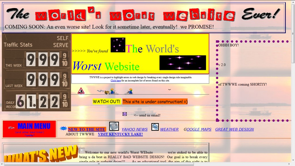
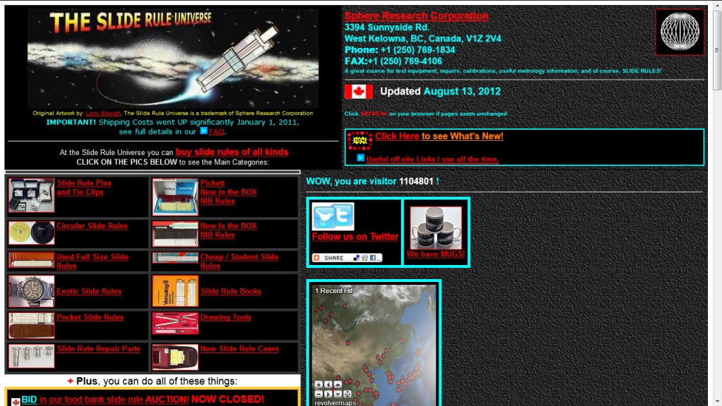
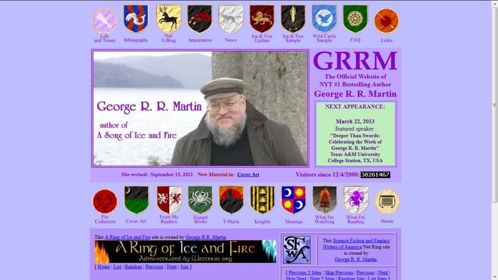
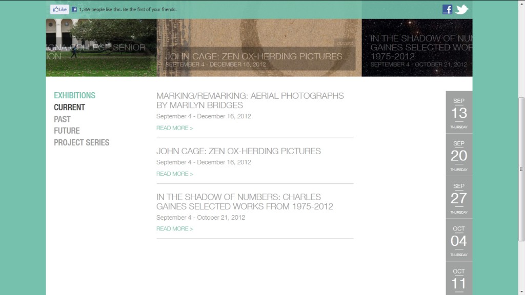
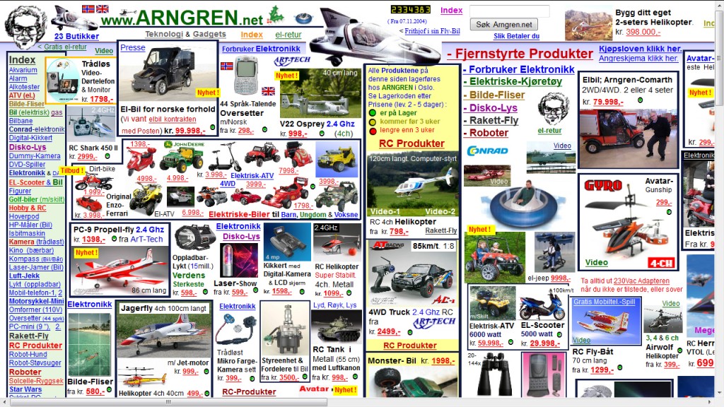
Recognizing bad web design is often easy. But it can be difficult to know what makes it bad. In this article I will give you examples of bad web design and explain what good design practices could be used instead. Note that many of these examples are extreme cases of bad web design and there is more than one mistake in each example image.
A Few Basics
Many design mistakes can be corrected. However, there are a few cardinal sins in web design. This includes scrolling marquee text, pop-up flash animations, flashing animated GIFs, and automatically playing music that cannot be disabled. These are all examples of what not to do.
Function vs. Design
Function should always take precedence over design. It does not matter how good something looks if the user is unable to use it. Things like browser compatibility, site load time, and Flash usage should be carefully considered when designing a site. The backbone of any site is functionality.
Always test your site in multiple browsers, optimize site load time, check that your site scales correctly, and make sure your site can be viewed on mobile devices.
Lack of Site Structure and Alignment
Structure and alignment is important in all design — web design is no different. A website will look jarring if its design elements and content do not follow some kind of layout. One way to avoid this design pitfall is to use a grid system, such as a 960 or 1140 pixel grid. At the very least, have a predetermined structure for your site to dictate logical placements for design elements and content.
—
Bad Typography
Typography mistakes occur in several ways. Text can be too small to read or too large to fit within the site. Too many fonts look chaotic and disjointed. Sites can use font faces that do not fit with the theme of the site. Sites can use non-web safe fonts that don’t display correctly.
When using typography for site design, choose a consistent font or set of fonts that fit with the theme of the site. Use font stacks — i.e., a list of fonts that browsers can use on your site — to ensure fonts display correctly in every browser. Make sure your text isn’t too small to read or larger than is necessary.
—
Inconsistent Styling
A common web design pitfall is inconsistent styling. All headers, sub-headers, and content should have the same design attributes. For example, if your title header is an orange, sans-serif font on one page, it should be the same orange, sans-serif font on every other page. If one of your links is red with a dark red rollover state, all of your links should be red with a dark red rollover state. Mixed-and-matched design elements create chaos.
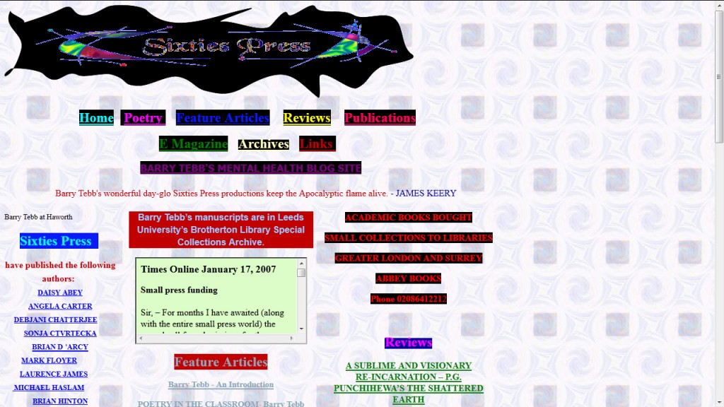
Sixties Press lacks consistent site styling.
—
No Navigational Hierarchy
This is the perfect example of function taking precedence over design. Site navigation is one of the most important pieces of functionality provided to a user. Keep your navigation links in one place and link to important information first. Use fly-out or dropdown menus to give your navigation a hierarchy and keep your site from becoming cluttered.
—
Poor Color Schemes
Color sets the mood of a site and can even influence user behavior. Too much color can look obnoxious while not enough can look bland. Site colors should work well together to highlight your site without competing for attention.
—
Poor Use of Contrast and White Space
Contrast and white space help lead users eyes through your site. Sites with too little contrast are difficult to read and strain the eyes. Sites with little white space feel crowded. On the other hand, sites with too much contrast are also difficult to read and sites with too much white space feel empty.
—
Too Many Links
Just as too much text can be overwhelming, too many links can also detract from a site. I have already mentioned how navigation links should be arranged hierarchically with additional links provided in fly-out or dropdown menus. The right amount of well organized and identified links gives users a sense of direction. Too many links will only confuse and overwhelm users.
Summary
While many of the site examples here are extreme cases of mistakes in web design, the same principles can be applied to any site. The next time you visit a site and feel like something is “off,” try and pinpoint what is not working about the design and learn from the experience.

