

On Cyber Monday 2017, mobile saw its first $2 billion day, claiming roughly one-third of the money spent online. No longer are consumers using smartphones just to research.
For years, we’ve been hearing about the importance of responsive design and mobile-friendly features. Many small business etailers remained unconvinced of the power of mobile users as buyers. This made some sense, as data often showed that most users were using mobile devices (i.e., smartphones) primarily for research, and then finalizing purchases on tablets or desktop computers.
This all changed during the past holiday season. On Cyber Monday 2017, mobile saw its first $2 billion day, claiming just under a third of the money spent online. According to Business Insider, smartphones accounted for 37.6 percent of retail visits on Cyber Monday, and 21 percent of the revenue. Smartphone conversion rates were up by roughly 10 percent.
It’s difficult to take action on internet-wide statistics. They include data from huge companies, after all. But according to Adobe, small retailers saw a 30-percent higher conversion rate via smartphone than the big guys.
Consider the screenshot below for analytics of an actual small-business ecommerce site. For the past five years, this site has noticed a steady increase in mobile traffic. Only recently, however, did mobile begin to play a big role in overall sales.

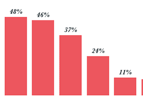
In the top 10 “Device Category” connections in the Google Analytics report (Audience >Technology > Browser & OS > Secondary Dimension = Users > Device Category = Mobile), mobile accounted for 34.76 percent (20.46 + 10.74 + 1.79 + 1.77) of this online store’s revenue from Nov. 1 through Dec. 22, 2017.
Smartphones to Dominate
Smartphones will soon dominate online conversions.
- By the end of 2018, about 36 percent of people worldwide will own a smartphone.
- According to a report by Ofcom (the U.K.’s Office of Communications), 16 percent of adults worldwide use only a smartphone to access the internet. This includes many millennials who have never owned their own computer. This number is expected to increase as more social and productivity apps are released. In the past two years, even employers have gone to app-based scheduling and communication systems.
- The increased popularity of Apple Pay, Google Wallet, and PayPal for mobile makes for quick and seamless transactions. The speed and security of using a thumbprint or other ID method trumps entering credit card numbers.
- An onslaught of mobile apps and improved retailer apps will attract more mobile users that actually purchase.
- An increase in mobile-only or app-only deals provided by larger retailers will convert more shoppers to use smartphones to purchase.
- More businesses and public areas are offering free Wi-Fi. This, in conjunction with unlimited cellular data plans and expanded service areas, means more people will be able to connect, from anywhere.
Go Mobile
It’s time to make a key decision. Are you going to fully embrace the power of mobile shopping? Or are you going to succumb to competitors and large retailers? To remain in the game, an online store must be mobile-friendly in both design and features.
- Go responsive. A responsive site loads differently on a smartphone than on a desktop computer. Here, we can see how a website coded solely for a desktop can cause problems on a smartphone, primarily due to illegible font sizes and difficult navigation.

The responsive example on the right loads is much easier to read on a smartphone than the desktop version, at left. Source: Google.
A responsive site also eliminates the need for device checking from the server side. When you code two separate sites — one for desktop and one for mobile — the server has to understand which type of device is connecting. Unfortunately, this method is not foolproof and some users will see the incorrect version.
At the very least, consider the following must-haves for mobile implementation.
- Streamline the process. Make navigation, search, and checkout as quick and painless as possible. Mobile shoppers are often pressed for time. When they’re ready to buy, make sure the site responds fast and leaves them with no questions about what to do next.
- Implement popular mobile payment methods. They’re faster and provide more security. For example, Apple Pay creates a unique transaction for each session without the shopper having to enter his card number. Moreover, single-use transaction “card numbers” are attractive to the mobile buyer and are becoming the preferred way to pay online. And don’t ignore third-party payment apps, like PayPal.
- Allow for autofill. The faster that shoppers can create accounts and check out, the higher the conversion rate. Make the process a breeze by letting the user have control over how he enters information. Activating oAuth logins (such as Facebook or Twitter) can also help, as can hosted payment services, such as Amazon Payments and PayPal Express, which autofill the customer’s name and address back to the shopping cart.
- Keep up with the trends. Mobile shopping is ever changing. Hopefully, your shopping cart software keeps up with the latest requirements and features. Regardless, take time to understand the latest wants and needs when it comes to consumers who shop with smartphones.


 Hostinger Reframes Site-Free Ecommerce
 AI Visibility Scores Are Useless
 New Ecommerce Tools: July 1, 2026
 A Subtle Google Ads Bidding Change
 New Ecommerce Tools: July 7, 2026
 New GA4 Channel Tracks AI Traffic