Editor’s Note: This article was originally published by Web Marketing Today. Practical Ecommerce acquired Web Marketing Today in 2012. In 2016, we merged the two sites, leaving Practical Ecommerce as the successor.
Our psychology affects how we interact with websites. Designers can use this to their advantage. Here are a few ways to use psychology when designing your site.
Establish Trust
Establishing visitors’ trust is among the highest priorities of a website. People are often initially skeptical of websites — especially sites trying to sell them something. It only takes a few seconds for a visitor to make a judgment about your website. Establishing trust is important.
Whether or not you are a designer, you can likely determine the quality of a site design — even if you can’t pinpoint what makes one site better than another. Poor design is one of the top reasons for visitors to distrust a site, which directly impacts conversions. Your site should be up to date and displaying relevant content and images. If you are having doubts about whether your site needs an update, then it probably does.
Another way to gain trust is to have your business purpose clearly identifiable when someone lands on your site. Your purpose doesn’t have to be spelled out in plain text, but it should be clear what your business is and what products or services you sell. This will help visitors quickly get their bearings.
People are more likely to accept information if it comes from an authority or expert source. Take advantage of this by displaying trust badges on your site for your accepted payment methods or your Better Business Bureau accreditation. If you have worked with other well-known or prominent businesses, consider adding a “customers” section to your site with recognizable logos that will give your business authority.

Ecommerce solution, Magento, displays its prominent customers on its home page.
Social Psychology
Social psychology — i.e., the way we interact with others — can also help when designing for the web. For example, we frequently look for group validation by making judgments based on what those around us are doing. In web design, this means having a comparable design to other businesses in your industry. This doesn’t mean you shouldn’t try to stand out. The point is that people will expect some consistency across architecture websites that they wouldn’t expect from bakery websites, and vice versa.
Along with looking for group validation, people also seek community and belonging. You can leverage this desire by using language and imagery that make site visitors feel included in your business. Make your site visitors feel like they belong to a community and really matter.
Another bit of social psychology that can help in web design is reciprocity, the idea that individuals will respond to positive actions with another positive action. If you give a visitor a small gift like an ebook, discount coupon, or even a free product at checkout, they will likely reciprocate the positive action. When designing your site, look for opportunities to position giveaways as “positive actions” that could be reciprocated.
Pattern Recognition
The human brain is incredibly adept at recognizing patterns — sometimes even when patterns aren’t there. Use this to your advantage by designing consistently across your site. Use consistent colors, image styles, fonts, and page layouts. If you have contact information, make sure it is consistent and clearly associated with your business. For example, use email addresses associated with your business URL if possible. If you are using a generic solution like Live Mail or Gmail, be sure to include your business name in the address.
Also keep in mind the larger patterns established by the rest of the Internet. For example, most Internet users are used to seeing logos in the top left corner of a site and for those logos to be linked to the home page. Not doing this with your site breaks that familiar pattern.
Hyperlinks are another good example of a larger design pattern. Internet users are used to links being underlined or a different color from the rest of the site text. Google has even run tests proving that blue links receive more clicks than links of other colors. Maintaining patterns like these will add to your credibility and increase your site’s usability.
Color Psychology
Color psychology looks at how different colors and color combinations effect individuals’ moods and behaviors. Color psychology is important in web design and you should take care when choosing color for your site. See “Color Psychology and Ecommerce,” my previous article, for more.
Emotional Triggers
Emotion is a strong motivator. Using emotional triggers — text or graphics — can influence visitors’ behavior. Fonts and colors can influence the emotional triggers that text or an image presents. Consider what kind of emotional response might lead to increased conversions and try to communicate that through your design. Use A/B testing to determine the best emotional triggers for your site.
Visual Hierarchy
Create a visual hierarchy with the information on your site. Visitors tend to jump among prominent items when viewing a site. Use this to your advantage by guiding them to the information you want them to see. Remember, people are naturally drawn to objects that stand out.
Keep culture in mind when creating a visual hierarchy. For example, in English-speaking countries, people tend to view information from left to right and from top to bottom. However, people from Asia or the Middle East view information differently.
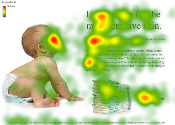
Use faces to your advantage when creating a visual hierarchy. Humans typically prefer faces than other objects or pieces of information. Further, if we see a face that appears to be looking at an object, we tend to look at that object too.

Humans are naturally drawn towards faces and sight lines. Study by UsableWorld.
If you are curious about where people are looking on your site, consider getting a heat-map of your page. Heat maps show hot spots where visitors rest their eyes most often to show you the popular areas on your page.
Use Negative Space
It’s sometimes tempting to fill up as much web space as possible with content, so visitors won’t have to search for information. While this sounds good in theory, it can actually overwhelm site visitors with too many choices or make visitors feel claustrophobic. Hick’s law states that the more options a user is given, the longer it will take them to make a decision. Use ample negative space to frame important content and limit choices.


