It’s rare to encounter a website that is not usable on a mobile device.
All major site builders and platforms, including ecommerce, automatically adjust the content to screen sizes, enabling simultaneous mobile and desktop versions. But the process is typically faulty. Most platforms merely arrange and scale the desktop layouts into mobile. The mobile versions are an afterthought.
Look closely at your analytics. The number of mobile visitors is likely growing, but the percentage who convert into customers remains low.
It’s time to adopt a mobile-first approach to web design.
A mobile-first design can future-proof a site by ensuring it remains engaging and relevant. Start with key elements right away. Here are five ecommerce examples.
Mobile-first Design Examples
Goorin Bros., a hat maker, applies a category menu with product images for the mobile site that is not present on desktop. It offers easy navigation with a finger.
—
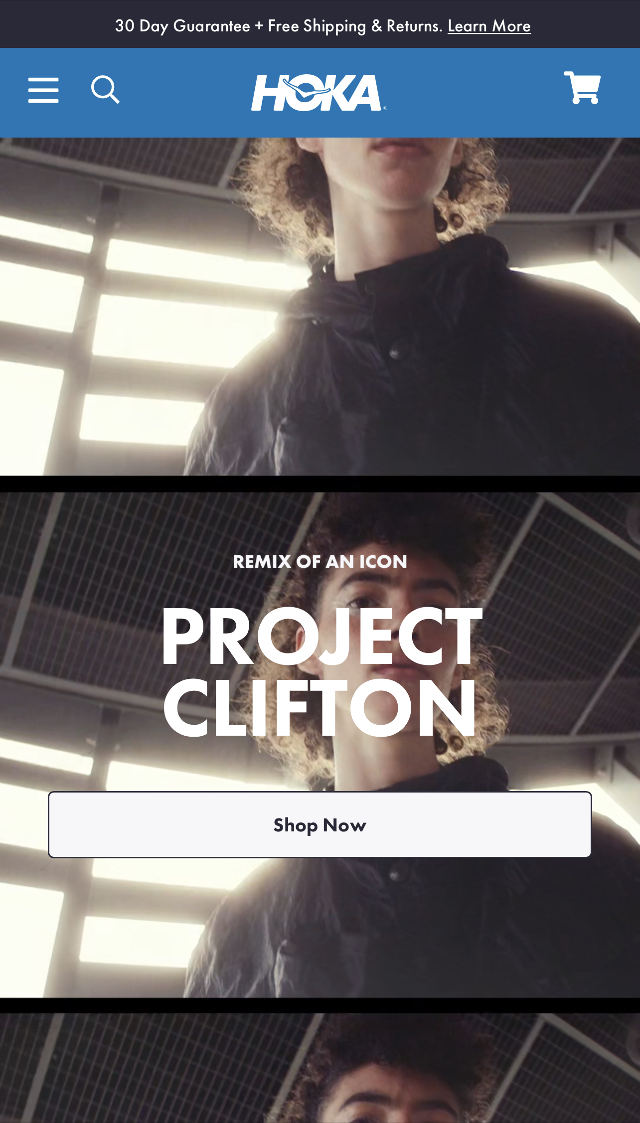
Hoka, a shoe company, repurposes its desktop home-page video to occupy the entire vertical space on mobile rather than simply scaling it to fit the width. It creates an impactful mobile effect that’s not on desktop.
—
Figs, a medical scrubs company, has also incorporated vertical video on the first page of its mobile site versus shrinking it from the desktop version. Parts of the video indicate it was shot vertically for mobile and cropped for desktop.
—
Paka apparel uses a different video altogether on the home page of its mobile site compared to desktop. The mobile one is more lifestyle-focused.
—
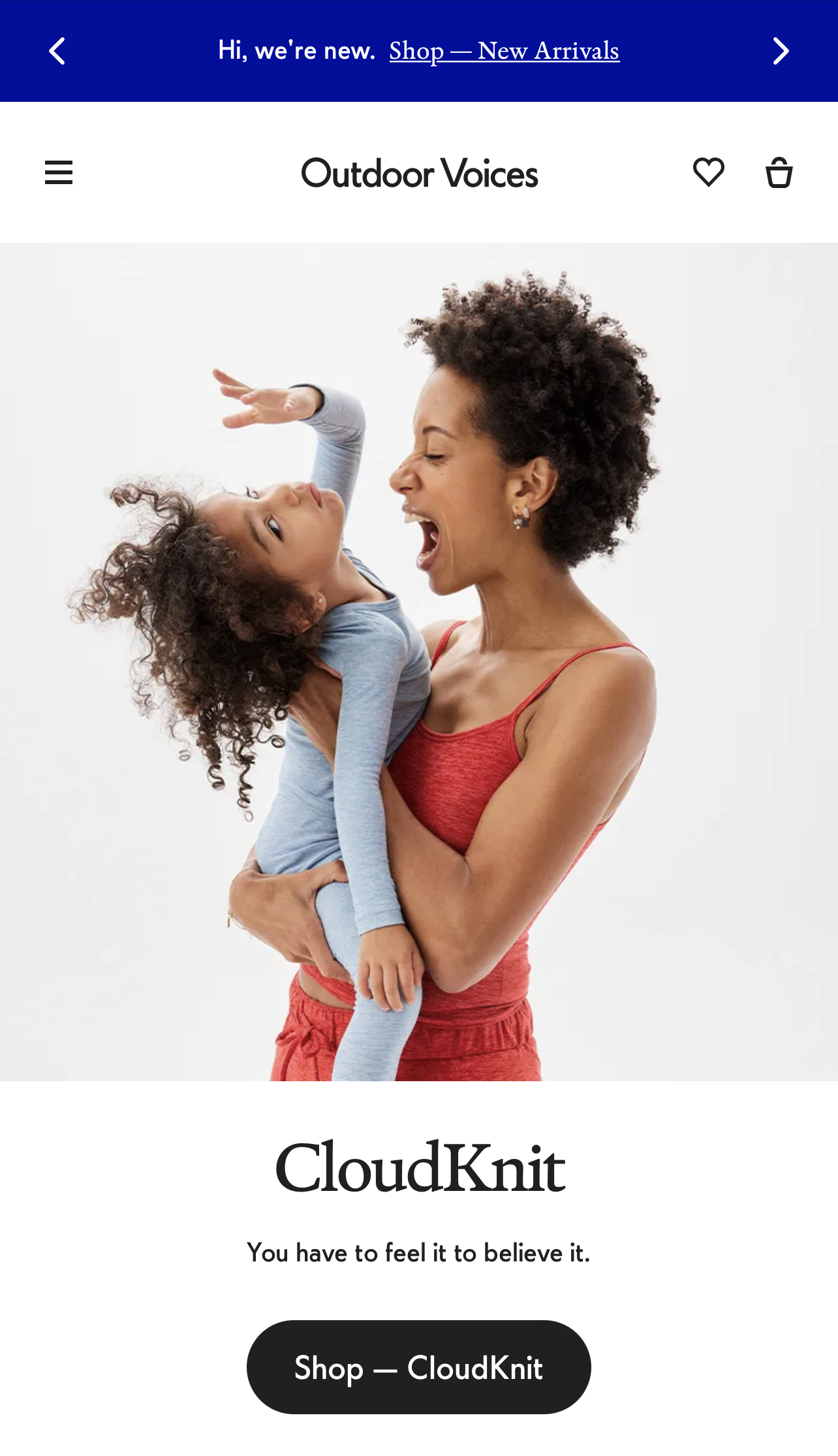
Outdoor Voices, another apparel merchant, has a dedicated static image for mobile, different than for desktop. Instead of trying to fit a wide shot into a vertical device, the site chose a different (vertical) image from the same photo session. This simple and easy tactic is increasingly common, but many companies overlook this affordable option.


