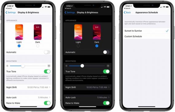
Dark mode is a reverse color scheme that turns light-colored elements on a screen dark and vice versa. It is available in most operating systems, applications, and social media sites.
I use dark mode for almost everything, including email and text messages. Dark mode adoption is reportedly as high as 82% on mobile devices.
Dark Mode Benefits
- Improved reading experience. The dark background reduces the blue light and screen glare.
- Better at night. The black background lessens eye strain when reading in low-light environments.
- Saves battery power. Dark mode can reduce energy usage by up to 63%.
- Improves email accessibility. While the light mode is suitable for most people, dark mode helps folks with visual impairments.
- Better for your health. Some folks who use dark mode report reduced eye strain, less dry eyes, decreased migraines or tension headaches, and improved sleep.
A drawback of dark mode is visibility in bright light conditions. While helpful in low light, dark mode can make reading texts more challenging outside on a sunny day.
Design Tips
Dark mode should be the focus of your email design and development plan.
Surprisingly, an email that does not render well in dark mode can trigger spam filters and reduce your sender’s reputation.
Here are some pointers to keep in mind when designing email for dark mode.
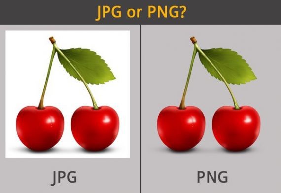
- Use PNG images. JPGs have faster load times due to their smaller file size. But they may not be as clear, and they don’t support transparent backgrounds. PNGs weigh more and have slower loading times. But they are more defined and of higher quality. Plus, PNGs support transparency, which is critical for dark mode.

Using PNG images in dark-mode email helps ensure clarity and background transparency.
- Increase image padding. Images that are not transparent should have proper padding around the cropped area.

Ensure that images that are not transparent have enough padding to remain legible.
- Add outlines or drop shadows. Put a white border around your darker letters to make them easier to see in dark mode.

Make letters pop in dark mode by adding a white border to the text. Image: Email on Acid.
- Use off-white. Many email clients target true black (#000000) and white (#FFFFFF) to automatically invert or modify the rendering. However, off-white (#FEFFFF) could be the right choice to avoid a drastic color change. This alteration might not be noticeable to the human eye, but it’s evident to email service providers.
- Limit the number of colors. The more colors, the more variations, and the more issues you’ll likely encounter.
Testing
There is an excellent email community on Twitter — #emailgeeks — that help make your dark-mode dreams a reality. Here are dark-mode testing resources as cited by the community:
- Accessibility Contract Checker by WebAIM,
- Color Inverter and Opposite Color by Invert Colors,
- Dark Mode Simulator by Proofjump,
- Email Client Previews and Rendering by Litmus.
Dark Mode on Mobile
Apple iOS
- Go to Settings, then tap “Display & Brightness.”
- Select “Dark” to turn on Dark mode.
Android
- Open your device’s Settings app.
- Select “Accessibility.”
- Under “Color and motion,” turn on the Dark theme.
Dark mode isn’t going anywhere, so always design for it. Test often and accept that your designs will be susceptible to changes in email rendering. The result is a better experience for recipients and higher opens and clicks for marketers.


