
Email design has evolved to reflect changes in technology and consumer behavior. The goal is to elicit the desired action from the recipient, such as a click or conversion. In this post, I’ll address tips on designing high-performing emails for ecommerce.
Every email marketing message should contain specific elements. For U.S. senders, the message must be compliant with the CAN-SPAM Act of 2003, which requires a clear unsubscribe link and a valid “from” address that is representative of the sender.
Beyond those requirements, the message and images are up to the marketer, so long as both are not misleading to the recipients. Common design elements include:
- Logo or brand name, linked to the home page;
- A primary image;
- Text-based message (not embedded in an image);
- A thoughtful balance of text and images;
- Clear call-to-action;
- Contact information and social media accounts;
- Compelling “From” line, subject line, and preheader.
An email template can help streamline the production process. A consistent template also helps recipients navigate and respond to the message.
Email Templates
In my experience, a visual hierarchy produces the best layouts. Images are powerful. They impact recipients’ actions and attitudes. Templates should reflect the natural way people comprehend and interpret information, such as an inverted V pattern with a large image on top, then text, and then a call-to-action.
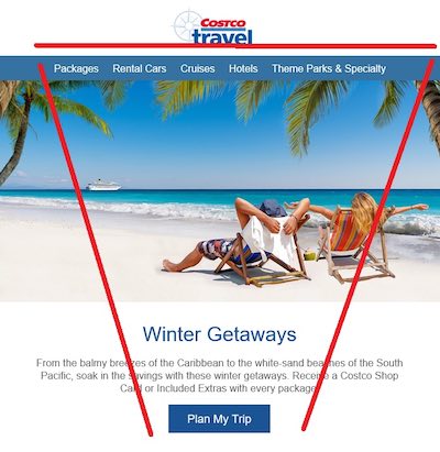
This email from Costco uses an inverted “V” design.
Another popular layout is a “Z” pattern, where the recipients read left to right, mimicking standard reading patterns.
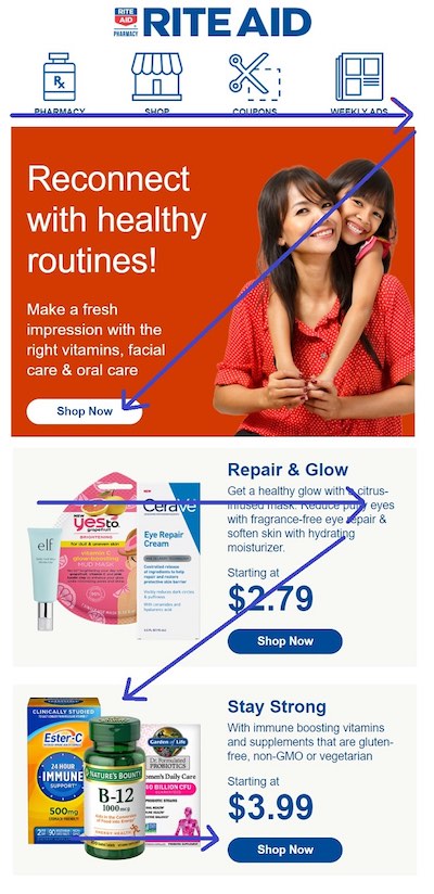
This email from Rite Aid uses a “Z” design pattern.
Hero section. The so-called “hero” section of an email typically appears just under the logo and top navigation. It conveys the main objective of the email. Hero text should be large enough to read easily. Buttons should facilitate a finger on mobile.

This “hero” example from Famous Footwear is easy to read and conveys the overall theme.
White space. Adequate white space around an image, text, and call-to-action is critical. It makes the entire message less intimidating and easier to digest, especially on mobile.
Buttons. Again, all buttons should be large enough for a finger on a smartphone and not too close. Many designers utilize a “bulletproof button.” It is not an image. It’s text on top of a background, such as a solid color. This enables recipients to read the call-to-action if images are turned off or take too long to download. Campaign Monitor, for example, offers a widget for building bulletproof buttons.
Experiment and Test
Maintaining email design consistency can help recipients know what to expect. But change is good, too, to avoid design fatigue. Test new design layouts against performance — opens, clicks, conversions.
One idea is testing “dark mode” in an email. That’s a setting on smartphones wherein users swap light colors for dark and vice versa. The purpose is to preserve battery life and ease viewing in low-light situations. Certainly all emails should by default render well in dark mode. But marketers can also test a native dark version with white text on a dark or black background.
Another test is inserting interactive or dynamic content, such as animated buttons, product carousels, countdown timers, surveys, or polls. Accelerated Mobile Pages (“AMP”) for email was introduced in 2018 to integrate live or custom content into the body of an email. AMP has not taken off due to limited support from email service providers. But Gmail does support it. I’ve addressed the possibilities at “Does ‘AMP for Email’ Impact Ecommerce?“


 Hostinger Reframes Site-Free Ecommerce
 AI Visibility Scores Are Useless
 New Ecommerce Tools: July 1, 2026
 India Ecommerce Paths for Foreign Sellers
 New Ecommerce Tools: July 7, 2026
 A Subtle Google Ads Bidding Change
 SEO for AI, Low Traffic, No Clicks