For decades grocery stores have used “eye-level” selling tactics. Eye-level marketing is such a big deal that manufacturers pay top dollar to make sure we see their products on the shelves. They do the same for kids — placing cereals and fruit drinks at the perfect height for a child to see.
Unfortunately, eye-level selling is not so simple with ecommerce. Heatmaps and eye-tracking technology can provide good ideas about where to place calls-to-action and critical information. As page content changes, though, so do the results. The size and location of a product photo or video can affect where the average shopper’s eyes are drawn first.
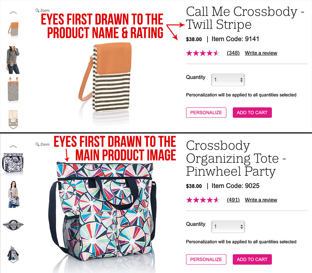
Two product pages with the same layout can cause different “eye-level” reactions, based primarily on images. Source: Thirty-one Gifts.
Adjusting layouts on a per-product basis is costly and time-consuming. It makes sense instead to focus on the most crucial elements of the page — to communicate benefits to the highest number of product-page visitors. Here are six ways to do that.
6 Tweaks to Enhance Product Pages
Maintain whitespace consistency on main product images. The primary image for each product should fill a defined block. In the example above, a wearable wallet photo is much smaller than a tote. The main image should show detail in its largest format. Secondary images of models wearing both items provide ample details about sizing.
Rather than include inconsistent whitespace on images, crop them tightly. It makes for better presentation across multiple device types and saves work when redesigning page layouts.
Make key buying points prominent on every page. Relying solely on navigation and landing pages to get key selling points across can cost you sales. Google Analytics for one small ecommerce store revealed that of roughly 53,000 visitors weekly, about 23 percent landed directly on a product page. That means nearly 12,000 people bypassed optimized landing and category pages.
Use fixed headers and footers. Fixed elements will stay in place when users scroll the page. This is especially useful for mobile sites. In the screenshot below, retailer MVMT Watches uses a fixed header to promote free shipping but allows the user to close the message at any time. It also uses a fixed footer for “Add to Cart” so it’s always prominent.
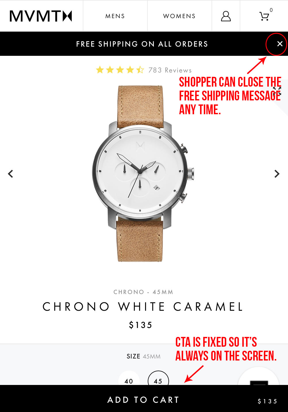
A fixed CTA is hard to miss, and so is a fixed header promoting free shipping. Make less important messages collapsible so shoppers can choose to see more content on the page. Source: MVMT Watches.
Convey a product’s scarcity. Using simple icons and text to show a limited supply of a product can help close a sale quickly. Use inventory trigger levels to display important low-stock messages.

Van Halen Store uses simple icons and text to show that a product is limited or exclusive.
Hype an item’s popularity. Don’t be afraid to label products as popular. This useful annotation helps gift buyers. Some shopping carts allow you to display how many people are currently viewing an item, which can lead impulse buyers right to checkout.
Make clicking the CTA a no-brainer. Even if free shipping and special offers are mentioned at the top of the page, reinforce the deals where it matters most: directly above or below the add-to-cart button. Studies show that about two-thirds of shoppers admit to making an unplanned purchase after being presented with a discount. That percentage is higher when it comes to making a first-time purchase with a store.

Keurig reminds shoppers — right by the add-to-cart button — which products ship free. The site also provides coupon details on the product page.
Generously listing coupon codes on product pages serves another purpose. It helps deter even savvy online shoppers from leaving the site to hunt for any discounts.


