Editor’s Note: This article was originally published by Web Marketing Today. Practical Ecommerce acquired Web Marketing Today in 2012. In 2016, we merged the two sites, leaving Practical Ecommerce as the successor.
Web forms are often one of the last things considered in a website’s design, but it is one of the ways people interact with a site most frequently.
Whether it is a checkout form, registration signup, or simple contact form, the following seven web form mistakes can hurt your chances of a getting a prospective customer to do business with your company.
1. Asking for Too Much Information
Everyone’s time is valuable so don’t waste it by asking for unnecessary information. If you only need minimal information to get in touch with a person, don’t add fields for secondary phone or alternate email addresses, for example. Instead, use progressive profiling, which will ask additional questions after a user has visited a form multiple times.
Ask the most important information first so that people feel that they aren’t just giving you contact details for marketing purposes. If you are filling out a request for a quote, ask questions related to the challenge, budget, and timeline before asking for first and last name or email address.
2. Confusing Label Placement
Ensure that your form field labels are placed correctly so users aren’t confused as to what information is being requested. Labels that are left aligned to fields are hard to follow for users after they begin completing a form.

Labels that are left-aligned to fields are hard to follow.
Most mobile devices will zoom to a form field once a user begins filling it out, hiding all the left-aligned labels. This forces a user to zoom out and check fields each time he moves to another input.
A better solution is to use responsive queries, to make labels top aligned on mobile, yet right aligned on the desktop. Trying making all labels bold so they are more prominent than other form text.
3. Only Using Placeholders Instead of Labels
A new addition to input fields, with HTML5, is the added “placeholder” text attribute, which provides a short hint as to the expected value of the field. The placeholder text is displayed in the input field before the user enters a value, and then disappears when the user begins typing.
Many designers have done away with form labels and only use placeholder text to describe input fields. That may lead to a cleaner design, but it does so while sacrificing on user experience.
This becomes problematic in situations where a user may begin typing in a field but becomes unsure of his answer or the format needed. Once a user begins typing and all the placeholder text is removed, it can’t be restored without refreshing the page.
One compromise is to hide labels, using CSS, and show them only after an input field becomes active. Shopify, for example, provides a solution that hides labels and then positions them above the input fields when a user begins typing.
4. Poor Spacing and Layout
Create a good flow for users by providing ample spacing around fields and sections.
Group similar fields such as first and last name with phone number and email under the heading “Contact Information.” This gives more context to the requested fields. Try using small dotted or solid lines to separate groups and headings, for better organization.
You may also consider using a two-column form layout. Put all required fields in the left column so that no items get missed, and then place the submit button in the right column, to ensure people won’t miss information that they should have filled out that is located in the second column.
5. Confusing Validation and Error Messages
Encountering errors when filling out forms can hurt conversions and frustrate users. Errors can occur when users miss a required field or incorrectly format an email address or phone number.
To avoid this issue, display error messages at the top and bottom of your form so users don’t miss that something is wrong with their submission. Highlight all fields with errors by a border and text color. Also, explain why their submission is incorrect by describing what the correct entry looks like.
6. Hard to Enter Captchas
Form spam can be extremely frustrating and can cause errors in lead generation reporting. Most people combat this with the use of a captcha or a device used to determine if the form is being answered by a computer or human.
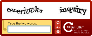
Use captchas to determine if it is a computer or human completing the form.
Captchas can be confusing and challenging for users to decipher. Use them only if you receive a large amount of form spam. Also, provide users with the ability to refresh, or play an audio file of the words, for best accessibility.
Another solution to combat form spam is to use a “honeypot” or hidden field that only spambots would fill out. This technique actually prevents the bot from completing the form.
7. Not Giving Users Confirmation or Success Messages
Once a user has taken the time to complete a form, provide instant feedback, to let the person know that his effort was successful. I also recommend that you send the user an email confirmation that contains his submission information. Also, set expectations on how long it will take someone to respond so that the person isn’t left wondering if and when someone will be in contact.