
Ecommerce retailers who contemplate mobile commerce must ask several questions. One is whether to develop a mobile-optimized site or a mobile app. Another is whether to include special mobile search. And there are other questions, too. One ecommerce firm that developed its own mobile-optimized site is The Catholic Company, a seller of religious products based in Charlotte, N.C. Its mobile version was launched in March 2010, and we discussed the experience with its director of marketing, Nicholas Cole.
The Catholic Company home page from a desktop browser.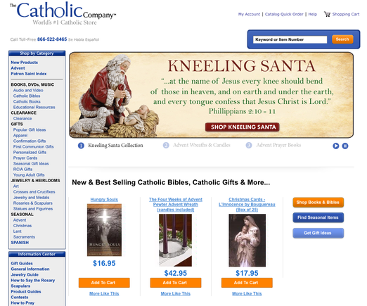
The Catholic Company home page from an iPhone.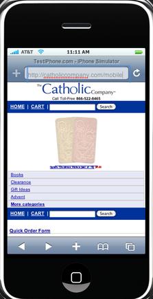
PEC: Please give us a little bit of background on The Catholic Company.
Nicholas Cole
“We’ve been selling online since 2001. We’re privately owned. We started mailing a catalog in January of 2007 (bucking the trend by moving to print after being online), and that has since grown from mailing five catalogs in 2007 to 15 catalogs a year in 2011. We’re mailing monthly and we’ve also added a book catalog.”
PEC: Can you give us an idea of the company’s size?
Cole: “We are not big enough to be on Internet Retailer’s Top 500 list. We are a staff of about 20 people.”
PEC: How many SKUs do you have on your site at any one time?
Cole: “More than 18,000. So, we have a lot of products. That’s challenging to manage at times.”
PEC: What shopping cart platform does The Catholic Company use?
Cole: “We have used an in-house system since the beginning. We’ve got an internal team of developers that we use to program all of our systems.”
PEC: Why did The Catholic Company decide to launch a mobile-optimized site?
Cole: “We were spotting the trends. We were looking at the numbers of ecommerce sales that were being done on mobile phones in 2009, and how it was slated to grow. We saw the usage of smartphones on the rise.
“In our marketplace, we have a fairly favorable demographic in terms of age and income. So, we felt that a lot of our customers probably have higher end phones; and as corporate BlackBerry users, we found that mobile-optimized sites were a lot easier for us to use. It really came down to seeing Amazon and others having these sites that are optimized for mobile devices, and how we’re using them and how we feel other people are using them. We knew people were browsing our site and shopping our site with mobile devices. It really came down to a gut feel, knowing that that was a move for us to make.”
PEC: Why did you decide to integrate a mobile browser versus a mobile app?
Cole: “It was a ‘reach’ decision. Not everybody had apps. Apps are a thing of smartphones. At the time, 80 percent of the phones on the market were non-smartphones that really didn’t make use of a lot of apps. Most of these phones, though, had mobile web. And, if I remember correctly, 4 percent of U.S. adults use apps, whereas, 5 to 10 times the amount have access and use mobile web. So, really, it’s a reach decision.”
PEC: Did the mobile-optimization involve a CSS switch?
Cole: “There’s some CSS and there’s some other programmatic changes. We developed it in-house and we felt that was a really good decision. It was less expensive, it was faster, and we integrated it into our systems so it’s a seamless account. Someone can shop on their home computer and shop on their mobile phone and all that purchase history is in one account.
“We were able to integrate our site search and other processes from the web to the mobile site. So, the catalog shopping function we’ve put on the mobile site gives people [a similar] experience on the full site to what they would get on the mobile site. And it is hosted internally.”
PEC: What have you learned since launching the mobile-optimized ecommerce site?
Cole: “It’s still very new. Traffic’s still relatively low. We’re still in a data gathering stage, but we did a little test with a sniffer browser. We would tell people on mobile devices, ‘Hey, we’ve got a mobile site. You can go to the mobile site now if you’d like.’ Otherwise, they could just browse the full site on their mobile device.
“We’ve found a lot of people are not going to the mobile site. They just stayed on the full site and converted at whatever rate they are converting at. Several weeks ago, we switched that to where the sniffer would automatically forward mobile users. We found that more people were then browsing the mobile site, but certain people were going back to the full site. So, people that were more comfortable, or maybe had more sophisticated phones, could go to the full site and get the full shopping experience that they can’t necessarily get on the mobile site.”
PEC: How does the conversion rate for the mobile-optimized site compare to your traditional site?
Cole: “Mobile [conversion] is quite a bit lower. It’s definitely lower than the main site.”
PEC: Can you tell us about the mobile search function on your site?
Cole: “We felt that search would be a pretty good tool to have on the mobile site. We’ve got almost 18,000 products on the mobile site, so it could be challenging to browse through those products on a little mobile phone.
“We use SLI Systems as our search vendor on the main site and the mobile site. It’s fairly basic, but we’re in the process of revamping it. We didn’t have a lot of the facets turned on where people could sort or narrow their search, but we did have a lot of functionality built into that. People could add-to-cart from search.
“We’ve tried to optimize it by not displaying as many products on the landing page or the search results page as we do on the main site. Everything is optimized for the smaller screen. At the time, we were optimizing for the iPhone in a vertical orientation. So, if you’re looking at it on a BlackBerry Pearl, it doesn’t look as good, but it’s still highly usable and shopable on those devices. We don’t have a lot of statistics on the mobile search side of things, but we do know people are using it and it is converting shoppers.”
PEC: Did bandwidth enter into your discussions as you were developing your mobile-optimized site?
Cole: “We didn’t get that technical to be honest, but we did optimize for speed. As a retailer would optimize for speed on a broadband connection to their full site, you’ve got to do a little bit more for the mobile site. Our site is heavily dependent on links and there’s not a lot of graphics.
“On our product page, for instance, we’ve got a small product image, but we’ve got a link to see an enlarged image. We have the review snippet that just shows the star rating and then we’ve got a link to read reviews. We don’t display the product description on the main product page, but we have a link to read the product description. We’ve got our little add-to-cart button (which is absolutely necessary on the product page–you can’t get rid of that), and then when you go to those pages, we’re delivering exactly what the customer expects to get. We’re delivering the image, the product description, the add-to-cart button, and all of the product reviews that have been submitted on that particular product.
“Though we didn’t get real technical into download speeds and that, we did optimize for speed. We designed for the iPhone on a 3G network in early 2010. So, the typical user would be on a 3G network.”
PEC: Do you have any final thoughts for our readers as they contemplate their mobile strategy?
Cole: “Now is the time to get your feet wet. There are a lot of different things out there–SMS, apps, mobile web–I recommend to get into mobile web. It’s fairly straightforward for an in-house design team to take their CSS and design it for a 400-wide pixel screen, taking in the crucial points for a shopper to browse, decide and purchase.
“But, now’s the time to get started. It’s changing so quickly. If you’re just waiting to get in, you’re just going to sit on the sidelines and wait and watch mobile pass you by. Timeframes and everything are so short. You’ve got to design quickly and just get out there and start learning on your own.”


 New Ecommerce Tools: June 10, 2026
 Build an AI Flywheel for Ecommerce
 How Reddit Drives GenAI Visibility
 New Ecommerce Tools: June 17, 2026
 How Brands Win at India's Quick Commerce
 One Metric for Total Marketing Spend
 SEO for AI, Low Traffic, No Clicks