Last November, while stuck in a waiting room, I shopped for Christmas presents via my smartphone. Few of the stores I visited had a mobile site, making the navigation and checkout process time consuming and frustrating. I gave up on several, seeking out their competition.
Some recent studies say more than 80 percent of smartphone users shop with their devices. But those statistics shouldn’t be your primary motivation for investing in a user-friendly mobile store. Your competition is the main reason you need to focus on the “now”.
Two common excuses small business owners make for not investing in a mobile version are: (1) Their customers don’t shop from smartphones; and (2) the existing store can already be shopped from mobile devices.
When compared to mobile versions, shopping on standard websites with smartphones and other mobile devices doesn’t convert as successfully, largely due to usability issues, such as the inability of some devices to parse specific types of scripts — like Flash.
Take a look at these screenshots from BestBuy.com, showing the difference between shopping the typical website and the mobilized version.
Screenshots of Best Buy’s website (left) and its mobile version (right).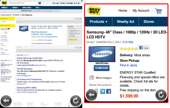
Best Buy’s full website (left) contains a lot of useless data and requires zooming and panning. The mobile version of a product page (right) focuses on the product itself.
The mobile version of an online store isn’t so much a scale-down as it is a simplification. In fact, users should still be able to perform all the same tasks as on the full store — the difference being that key elements are more prominent.
11 Ways to Convert Via Mobile Devices
-
Reduce to 7 Key Elements
Visit the mobile site of nearly any U.S. airline and you’ll find a simple way to search and book flights, as well as view flight statuses. While online stores are more involved, the concept still applies: By simplifying the process people can find what they want quickly and give you their money faster.
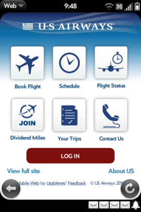
The US Airways mobile site makes it easy to book flights, check statuses and contact the airline.
Common key elements for online stores include parent categories, home, cart with checkout, sale page, search, and contact information.
-
Auto Detection and Toggling
A script should determine if someone is shopping from a mobile device and load the mobile version automatically. Unfortunately, it’s not entirely foolproof, so providing a link to a mobile version can help convert someone using a device that isn’t recognized as “mobile.”
Some users may want to navigate the full site. Tablet users are more apt to do this because of the larger screen size. Always include a way for shoppers to toggle from the mobile version to the full version, and vice versa.
-
Put Search at the Top
Mobile users are more apt to be shopping for something specific, so expect to see a bigger ratio of searching, versus browsing. Make sure the search box is in a prominent location and is labeled with the word “Search”.
-
Use Prominent Calls to Action
Product buy buttons should appear on the screen before any scrolling is necessary. Many of big business sites miss this all-important issue, requiring the shopper to scroll downward. The call to action is what promotes impulse buying.
-
Use Percentage Sizing
Just as with desktop monitors, not all smartphones display at the same resolution. By using percentages rather than fixed heights and widths, images and text can auto-size based on the screen type. This means someone shopping on an iPad will see larger text and graphics than someone using an iPhone. But it displays the entire content upon initial loading, and the user can always pan and zoom as necessary.
-
Spotlight Product Images
Images for products should be proportionately larger than any other graphic. Avoid fancy backgrounds. The shopper should be able to easily identify the product solely by the name and graphic.
For example, in the image below, Drugstore.com puts focus on the product image, which is key. Unfortunately, the price and call to action aren’t so apparent.
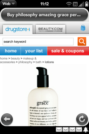
Mobile version of Drugstore.com.
Want to show additional images or video? Move them below price, ratings, and the product description, putting the most important elements first.
-
Use an ‘Email This’ Feature
Many mobile users shop on the go. The ability to email information about a product is an essential part of conversion because it’s a more prominent reminder of where they shopped. Most people pay more attention to an email than a bookmark.
-
Send Them to the Cart
When a shopper places an item in the cart, load a simplified cart page. The cart page should include:
- Product Delete;
- Quantity Update;
- Prominent Checkout button.
Anything beyond that should be further down the page.
For example, Amazon.com’s mobile checkout is simple. You can save, delete and update your cart, as well as quickly checkout. Additional features are listed below the primary calls to action.
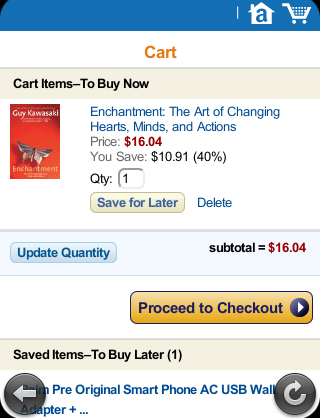
Mobile version of Amazon.com.
-
Simplify the Checkout Process
Only ask for the information you need to fulfill the order. Any extras should be accessed via a link to a longer form.
Ask yourself if it is really necessary for mobile shoppers to tell you how they found your site. If it’s an optional question at checkout, eliminate it. The goal is to push the sale through quickly.
-
Make Them Feel Secure
Many mobile users think shopping via a mobile device is less secure than shopping via a desktop or laptop. While security is also dependent upon device configurations, the store’s server processes information the same way. So be sure to display the site’s clickable security certificate.
-
Accept Alternative Payment Methods
For users feeling wary about taking out a credit card in public places (and providing it to third parties), payment methods like PayPal and Amazon Checkout can help increase sales via mobile devices.
Summary
While there’s no uniform template that suits every type of business, successful mobile stores have more in common because of simplicity. It’s your job to make sure shoppers can locate, review and purchase items quickly, especially when the call for boarding a plane is just moments away.