
When vying to increase conversion rates, many storeowners mistakenly put primary focus on the checkout process. While a simplified checkout with ideal options — i.e. various payment and non-inflated shipping choices — will definitely help increase the percentage of visitors who complete a purchase, the shopper first needs to add items to his cart.
The bridge that connects the product or category page to the checkout process is often overlooked. Directing visitors to a particular item — whether via search engines, social media or site navigation or search — is actually a simple process compared to enticing them to take further action.
First, Identify the Conversion Problem
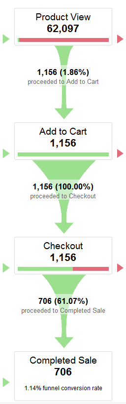
Analytics will explain where shoppers are dropping out, whether it’s on a particular page or during a specific process. For example, a simple, visual funnel will tell us how many shoppers take action on the product page.
With Google Analytics we can see that only 1.86 percent of this store’s shoppers actually added an item to the cart, indicating that the problem initially lies with something on the product page. Enlarge This Image
For this store, customers are taken to an editable shopping cart that resides on the checkout page itself. This is why we see 100 percent of those who added items to the cart continue to checkout.
A low percentage of action tells us that visitors aren’t enticed to purchase products from the pages being tracked — in our case, from the product page. While the excuses could be plentiful, there are five primary reasons shoppers leave action pages without buying:
-
Lack of trust. The shopper doesn’t feel comfortable purchasing from you. This is usually due to lack of contact information, security & privacy seals/info, or policies that raise red flags.
-
Poorly described products. The product description must be detailed and simple to understand. Text, supported by stellar images is a must. Supporting content, like video, audio and customer reviews, is a plus.
-
Prices are too high. New shoppers who are not recommended by others are less forgiving about higher price points.
-
Poor page/site layout. Design matters, as does a logical layout. Shoppers need to be guided to take action.
-
Unexpected results. Shoppers should never have to guess what to do after clicking the “add to cart” button. The most common complaint about “add to cart” functionality? No apparent message that the action was successful.
User testing will explain shoppers’ lack of action in more detail, as will visitor comments. We addressed inexpensive user testing previously, at “Using Real People to Test a Website.”
Keep in mind that the majority of visitors will never take the time to contact you. This means a single visitor asking a question about an item might actually represent scores of others who wound up shopping elsewhere.
Adjust in Stages, Track Progress
Save for urgent fixes, making changes in stages allows you to better track what works and what doesn’t. Bi-weekly analysis tends to work best because shoppers’ habits vary depending on the days of the week and times of each day.
While there are no canned layouts and functions that work for every online store, the most common changes that garner results in a short amount of time are the following.
-
“Add to Cart” button placement. A prominently placed, hard-to-miss (but not too “in your face”) action button usually yields better results.
-
“Add to Cart” button functionality. An apparent message on the screen, or loading of the actual cart page, lets the shopper know his click was successful. Less frustration increases the chance of conversion.
-
Placement of special offers. Placing messages of discounts or free shipping thresholds within the actionable area tend to yield better results. For example, a volume discount chart immediately before or next to the quantity box will make more shoppers think about buying more than one.
-
Placement of guarantees. If you have a liberal return policy, noting this at the product level rather than just in the navigation can help close more sales.
-
Stock status. A simple “IN STOCK” message makes shoppers more apt to buy right then because the risk of a delayed shipment is greatly reduced.
Real data from an online store one week after placing a “Free Shipping when you spend $59 or more” banner within the product details area. There was an increase of more than 2.5 percent on product adds, and an increase of nearly 2 percent to the overall conversion rate. Enlarge This Image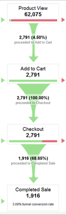
It is important not to attribute an increase solely to a particular change. Many other factors can affect overall conversion rates, including indirect events.
For example, a nightly news story about a product can trigger increased searches and, ultimately, purchases. This is why it’s important to regularly review site data and make adjustments based on your store’s particular needs.
And, finally, many types of events can trigger increased traffic and increased sales, yet still result in a lower conversion rate. While most businesses measure success by the percentage of sales versus actual visitors, putting focus on increased numbers of orders and total dollars helps guide us to more logical, long-serving changes.


